Booking options
£41.99

£41.99
On-Demand course
8 hours 43 minutes
All levels
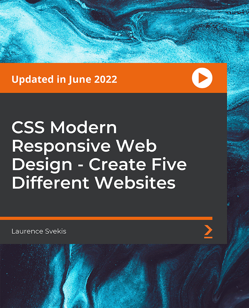
This course will help you learn about the process of building mobile-friendly and responsive websites using CSS. You will learn about CSS Grid, CSS float, Flexbox, and mobile navigation bars by creating five websites from scratch.
Today, websites come with a variety of designs that are completely different from each other. As a web designer, the more exposure you have to different designs, the better. In this course, you will learn to create five different modern websites from scratch using floats, CSS Grid, and Flexbox. To understand the process behind creating reusable grids using floats and CSS, you will create a single-page responsive website. Next, you will create a single-page Flexbox website with auto-scroll JavaScript. You will then get to work with a responsive collapsible navigation bar by creating a CSS Grid website. Moving along, you will create a fully responsive website using the features of responsive float. Finally, you will create your fifth website-a CSS Flexbox website-to understand the implementation of navigation sub-menu items. By the end of this course, you will have gained the practical skills to develop real-world responsive websites using the features of CSS. All the resources for this course are available at: https://github.com/PacktPublishing/CSS-Modern-Responsive-Web-Design-Create-5-Different-Websites
Create a custom grid to add columns and structure content
Add JavaScript auto-scroller to your websites
Find out how to make images responsive
Become familiar with modern navigation bar designs
Use CSS Flexbox to create responsive websites
Use JavaScript to create dynamic interactions
This course is for you if you want to become a web designer, web developer, or coder, or if you want to learn how to use CSS Grid, CSS float, and Flexbox to design and construct mobile-friendly websites. To get started with this course, you will need a basic understanding of HTML, CSS, JavaScript, and programming.
This course focuses on developing responsive web applications with the help of practical activities rather than just depending on theory. You will create five interesting websites to learn everything about CSS Grids, Flexbox, JavaScript auto-scroll, and a lot more.
Become familiar with CSS Grid, CSS float, and Flexbox * Understand how to create modern and responsive mobile-ready navigation bars * Get ready to create five amazing responsive websites from scratch
https://github.com/PacktPublishing/CSS-Modern-Responsive-Web-Design-Create-5-Different-Websites
Laurence Svekis is an experienced web application developer. He has worked on multiple enterprise-level applications, hundreds of websites, business solutions, and many unique and innovative web applications. He has expertise in HTML, CSS, JavaScript, jQuery, Bootstrap, PHP, and MySQL and is also passionate about web technologies, web application development, programming, and online marketing with a strong focus on social media and SEO. He is always willing to help his students experience what technology has to offer and looks forward to sharing his knowledge and experiences with the world.
1. Create 5 Websites From Scratch Modern Web Design HTML CSS JavaScript
2. Modern Responsive Website using Floats and CSS to create reusable grids
3. Single Page Flexbox website with auto Scroll JavaScript
4. No JavaScript Checkbox Responsive Navbar Website from scratch CSS Grid Website
5. JavaScript Collapsible menu Website Mobile Ready and Fully Responsive Float CSS
6. CSS Flexbox website with responsive Nav sub menu items
