We’ve redesigned the Organisation page to make it clearer, more consistent, and easier to manage — especially if you work with detailed organisation records. The layout now matches the updated Contact page, with structured sections, improved navigation, and better use of screen space.
What’s new
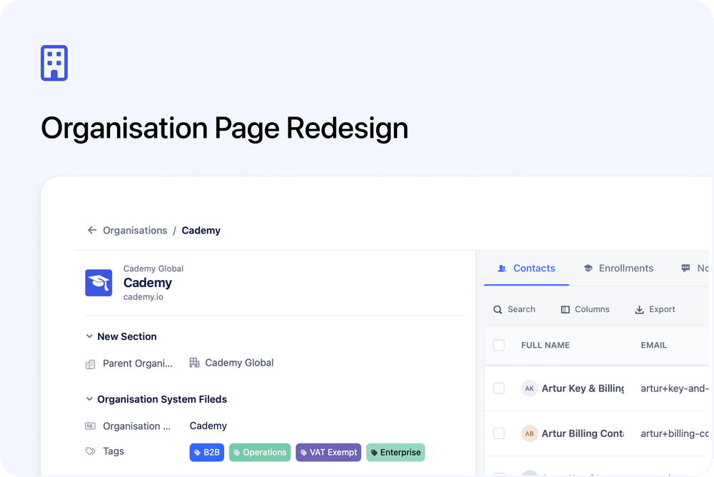
🧭 Improved header and navigation
The page now includes a sticky header with breadcrumbs, making it easier to move between Organisations and individual records. Key actions, including delete, are available from a streamlined menu.
🧩 Sectioned organisation fields
Organisation fields are now grouped into clear sections, helping you scan and manage information more efficiently. These sections appear consistently across contacts, bookings, inbox, and organisations.
🏷️ Tags as a system field
Tags are now treated as a standard organisation field. You can position them within your field layout and manage them like other fields for greater flexibility.
🖥️ Better use of screen space
On wider screens, organisation fields automatically expand into a two-column layout, allowing you to see more information at a glance.
📝 Dedicated Notes tab
Notes now live in their own tab alongside Contacts and Enrollments. This keeps the main organisation view clean while making notes easier to access and manage.
🎨 Refreshed visuals and labels
Updated icons, cleaner labels, and improved spacing make the page easier to read and navigate.
These improvements are designed to make day-to-day organisation management faster and more intuitive.