We’ve redesigned the View Booking / Order experience in the Admin dashboard to make it clearer, more consistent, and easier to manage. Sections are now organised into structured cards, billing details are easier to edit inline, and the layout adapts intelligently to wider screens.
This update improves day-to-day admin workflows without changing how bookings and orders behave.
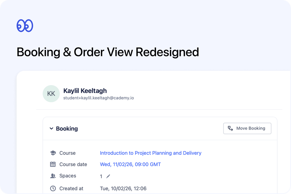
What’s new
🗂️ Structured card layout
Bookings and orders now use consistent, collapsible card sections with improved spacing and visual clarity.
- Booking Info / Order Info
- Payment
- Contacts
- Notes
The layout is now aligned with other redesigned admin pages for a more consistent experience.
🖥️ Smarter wide layout
When the sidesheet is expanded:
- The layout switches to a two-column view
On narrower screens, sections stack cleanly without overlap.
This makes it much easier to review billing and participant details at the same time.
🏷️ Tags moved into Info section
Tags are now located at the bottom of the Booking Info / Order Info card.
- The separate “Booking Tags” or “Order Tags” card has been removed
- Tags can be edited inline
- Changes save immediately and persist after closing
💳 Refined Payment section
The Payment card has been redesigned for clarity and consistency.
- Header styling now matches other cards
- Invoice reference and payment status controls remain easily accessible
- “Paid on” and “Payment due on” now appear in a clearer meta column
- “Paid outside Cademy” is shown under Payment Method details
- Totals (subtotal, discounts, tax, paid/to be paid) remain accurate and clearly summarised
🧾 Inline billing details editing
The Billed to section can now be expanded and edited directly within the Payment card.
- No separate invoice dialog required
- Save and cancel behave predictably
- Due date updates work independently
- Billing mode (Individual / Organisation) autofills sensibly and remains editable
This reduces friction when updating invoice information.
👤 Improved Contacts section
The Contacts card has been streamlined for faster access and better visibility.
- Attendance, progress, and certificate controls are available directly in the header
- Progress now uses a compact visual trigger
- Certificate actions remain accessible via icon menu
- Contact details display immediately when expanded
- Collapsed section preferences are remembered
On wider layouts, contact fields switch to a two-column format, matching the Contact and Organisation pages.
📐 Clearer field ordering
Booking and Order Info sections now follow a consistent structure:
- Course
- Course date
- Spaces
- Created at
- Other details
For self-paced orders, course date displays appropriately.
Additional improvements
- Collapsible sections maintain state across sessions
- Resizable sidesheet continues to work with new layout
- All core actions remain fully functional (edit spaces, edit expiry, payment status updates, notes, contact actions)
- UI refinements for spacing and consistency