- Professional Development
- Medicine & Nursing
- Arts & Crafts
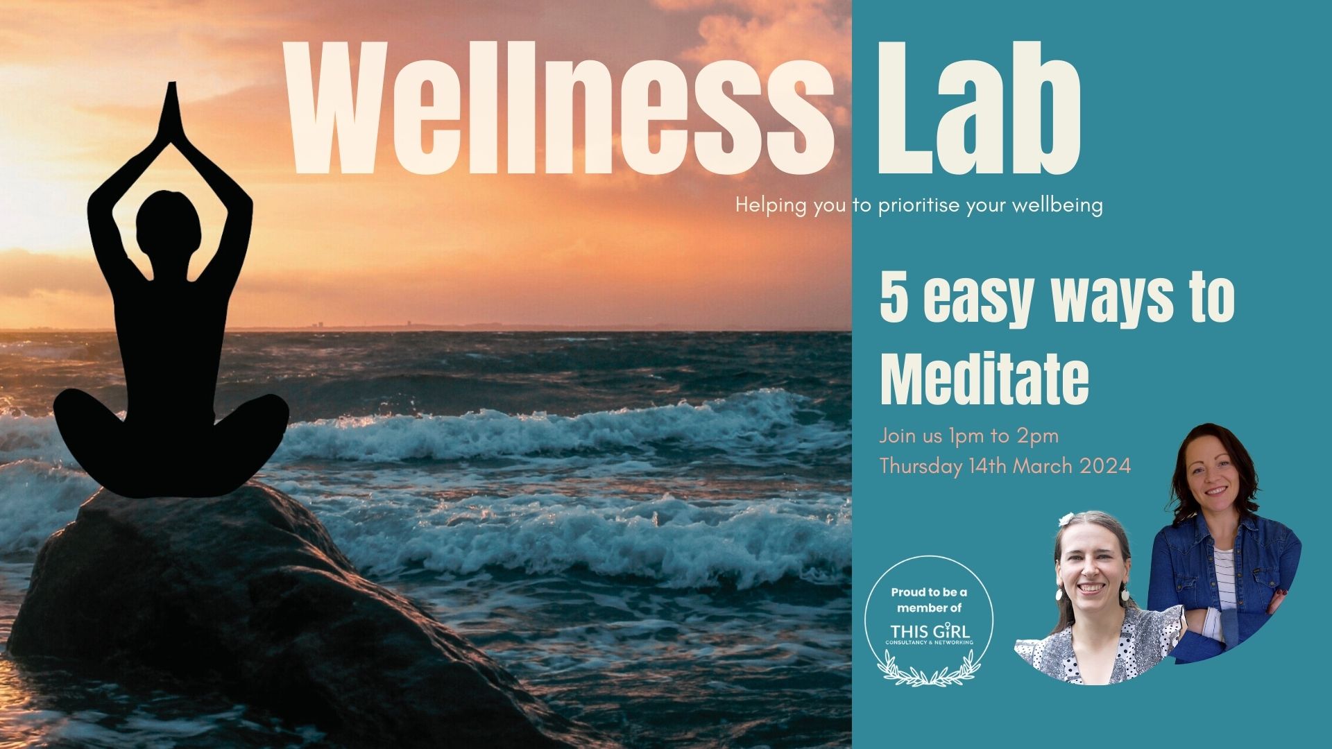
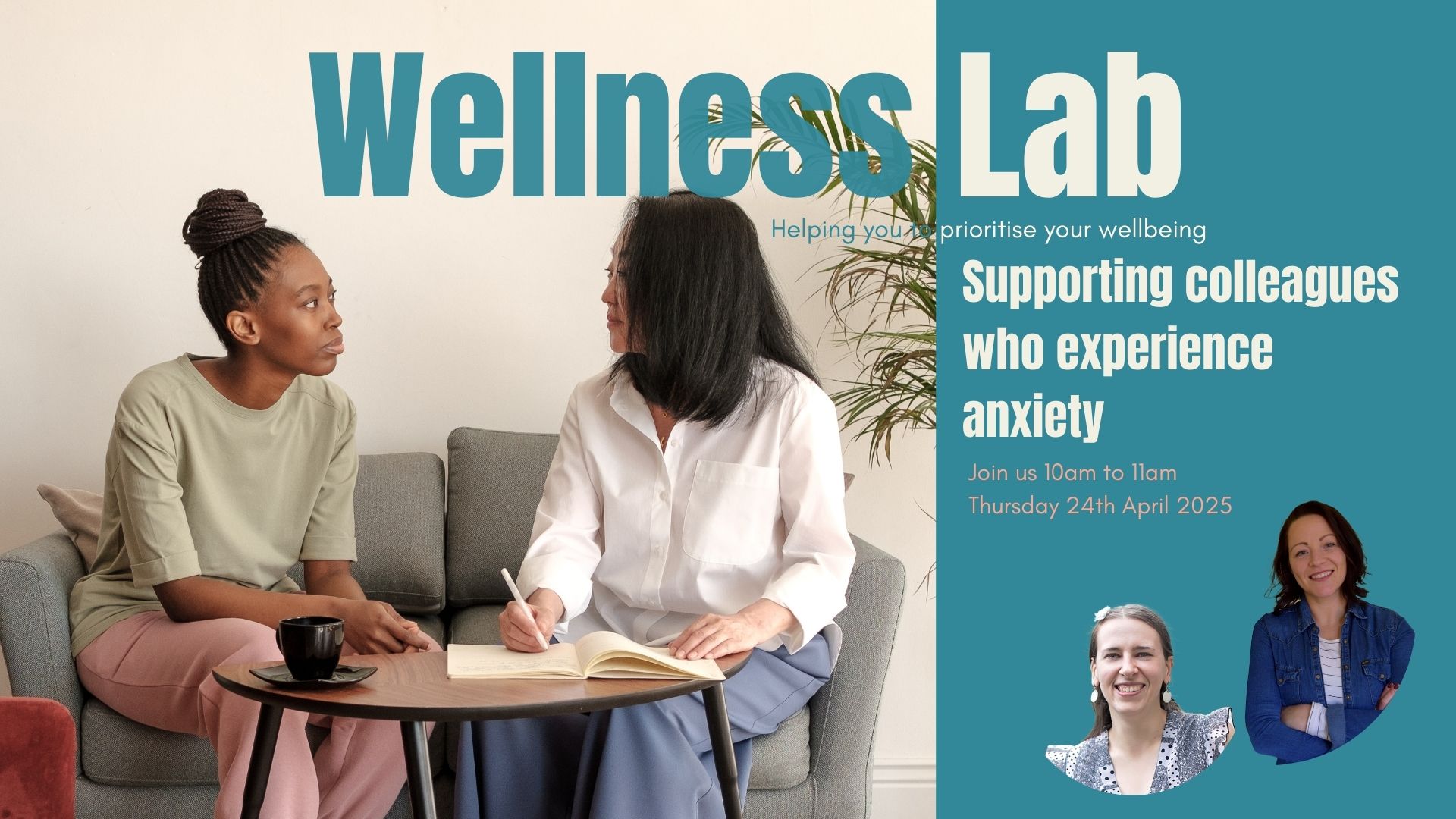
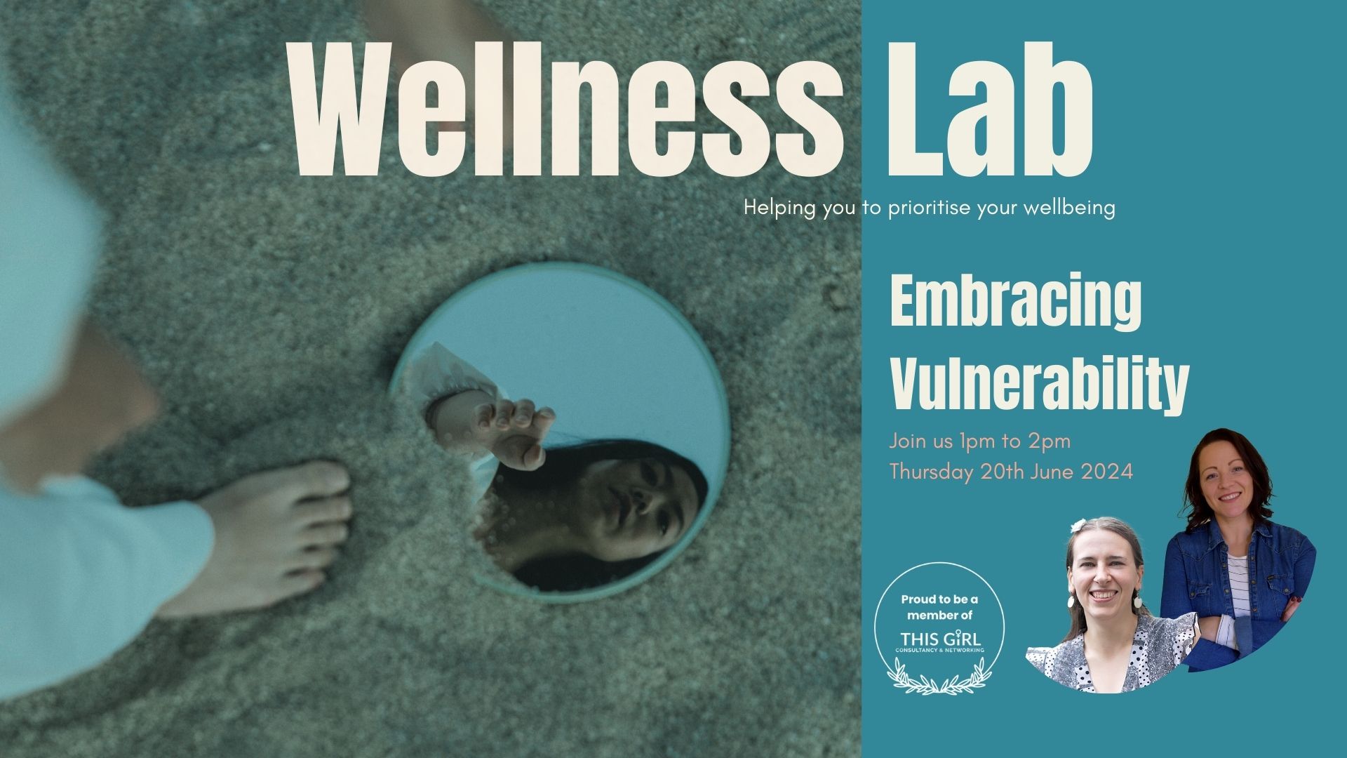
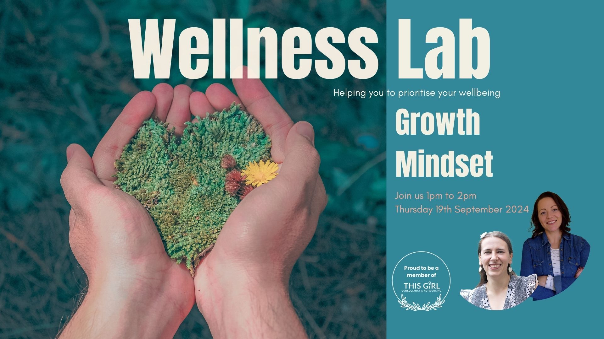
- Health & Wellbeing
- Personal Development
76 Courses in Leicester delivered Live Online
Online and phone therapy training
By Human Givens College
– essential guidance for safe and effective remote working Join our expert tutors to discover how you can make online therapy work for your practice Accredited CPD Certificate: 4 hours Length: 9am – 1.15pm (BST) LIVE ONLINE – Specialist training in delivering effective therapy online or over the phone – Join Ros Townsend live online on Tuesday 11th June 24 for this jam-packed, informative session. You will receive your Zoom link the day before the event. NB. Spaces are limited and tend to go quickly. Register your interest here if you can’t make this date, and we’ll let you know when there’s another one. BONUS RECORDING – the training is recorded, in case of technical difficulties, so you will also get a recording for 2 weeks afterwards to maximise your learning. Delivering online therapy, or counselling clients on the phone, requires a particular set of skills and brings with it specific considerations. This live online workshop will help you gain confidence in working safely and ethically, examining the advantages, potential drawbacks and adjustments you need to make to work remotely successfully. There will be plenty of time for questions, and helpful discussions with your peers and experienced tutors. Why take this course Whether you are a new practitioner wanting to develop your online practice, or an experienced therapist who has decided to start offering services online or on the phone, this course will help you gain the skills and understanding you need to do so safely and effectively. Unlike other online courses, this practical live online CPD training gives you the opportunity to ask our experienced tutors questions about any aspects that concern you, as well as learning from their case histories about what has worked – and what hasn’t – for them. Covering essential areas such as managing client expectations, setting up a therapeutic online environment, risk management, and the use and adaptation of various skills and techniques for online or telephone work, this course gives you the essential information you need to deliver therapeutic interventions remotely. Both Jo Baker and Ros Townsend, the course tutors, have extensive experience of working with clients online, with Ros now running her entire therapy practice remotely. Jo works using a blended approach (combining face-to-face counselling and online psychotherapy), and both bring a wealth of practical tips, hands on experience and real-life examples to the training. During the day, there will be ample opportunity to discuss and share ideas with both tutors and peers, and to enter into both structured and more free-ranging discussions about both the benefits and potential difficulties that one might encounter when working therapeutically through remote mediums. What the training covers: The importance of aligning client and therapist expectations for online therapy, or therapy over the phone How to set-up successfully for work on the phone or online – including template agreements to use with your clients Managing your technology and ensuring good communication – key things to ascertain, plus troubleshooting tips What to do when the call won’t connect The importance of confidentiality and privacy – and the potential problems you need be aware of when working online Agreeing safe communication methods between sessions How to successfully manage dual therapy spaces The importance of setting and maintaining professional boundaries Discussion regarding what is / is not acceptable in a home therapy space How to manage transitions before and after the session – for clients and therapists The key differences between online and face to face therapy work How to adapt and work successfully with a range of key therapeutic skills – such as Guided Imagery and The Rewind technique Assessing suitability of client presentations – including guidance on cases that are not suitable for online therapy How to manage risk effectively in an online or telephone environment How to put in place effective contingency plans for when technology fails Developing flexibility: dealing with the unexpected – including what to do if a session is interrupted When to refer a client on The additional pressures and potential stressors of online and telephone working Working in a blended way – combining remote and face-to-face sessions Key differences for the client of receiving therapy online or over the telephone The particular considerations of working with a wider client group from different geographical locations The importance of self-care and self-awareness Insurance and GDPR considerations when delivering online therapy or counselling, or working via the phone The importance of appropriate supervision Course Programme The ‘Online and phone therapy training’ course starts at 9.00am and runs until 1.15pm. (BST). 9.00am Join the Zoom meeting 9.15am First session starts 11.00am Comfort break and discussion 11.30am Second session 1.15pm Day ends Who is this course suitable for? This course is designed for both trainee and fully-qualified therapists, psychotherapists and counsellors It is recommended to all HG practitioners by the Human Givens Institute – trainee HG Therapists are expected to take this training if they are considering working online. This course has been independently accredited by the internationally recognised CPD Standards Office for 4 hours of CPD training. On completion of this training you’ll receive CPD certificates from the College and the CPD Standards Office.

Tableau Training On Tap - Fast Track
By Tableau Training Uk
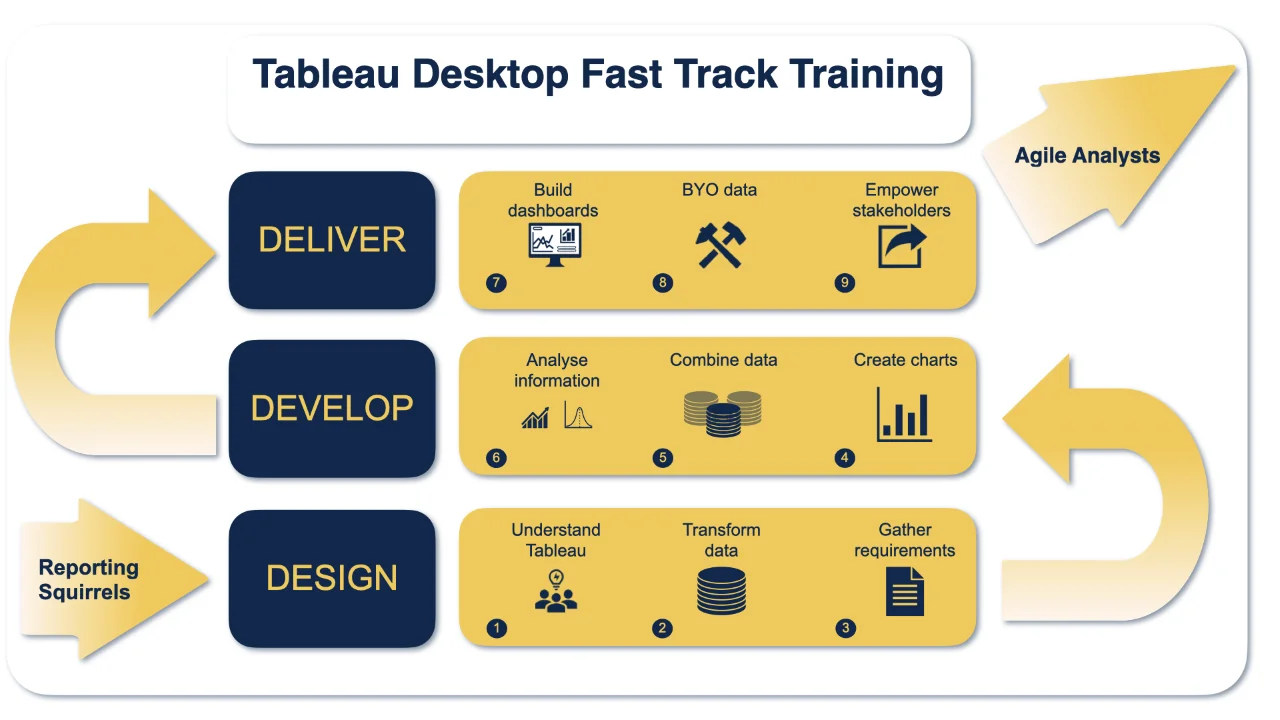
Tableau is an intuitive and simple tool to learn. This Tableau training course is a jumpstart to getting report writers and analysts who are self-taught or have no previous knowledge to being productive. It covers everything from connecting to data, through to creating interactive dashboards with a range of visualisations in three days. Having a quick turnaround from starting to use Tableau, to getting real, actionable insights means that you get a swift return on your investment. At the end of this course, you will be able to communicate insights more effectively, enabling your organisation to make better decisions, quickly. This accelerated approach is key to getting engagement from within your organisation so everyone can immediately see and feel the impact of the data and insights you create. Our Tableau Desktop Fast Track course combines all of our Foundation (Fundamentals) and Analyst (Intermediate) content into a 3 day live online course with added access to online bonus content of 3 additional modules. Gathering Requirements, Bring Your Own Data and Engaging Users. What do you get? This course is delivered live virtually and has all material provided through our online portal, together with email support and live coaching sessions. The full program includes all of the following elements: 3 days of live and interactive instructor-led sessions delivered by an expert Tableau Trainer 6 weeks access to our live coaching program delivered by expert Tableau coaches 50+ practical exercises to practice what you learn 12 months access to video’s that walk you through the theory and exercise solutions Practical advice, tools and resources for using Tableau in the real world The three additional online modules provide:Clarity on the approach to gathering dashboard requirements in a way that can be translated into dashboard designs.An agile and iterative development process that delivers products that meet user needs more quickly and effectively.An understanding of how end users will interact with dashboards to ensure that designers deliver actionable results. THE SYLLABUS PHASE 1: DESIGN MODULE 1: UNDERSTAND TABLEAU What is possible How does Tableau deal with data Know your way around Review of Type Conversions How do we format charts Dashboard basics – My first Dashboard MODULE 2: TRANSFORM DATA Connecting to and setting up data in Tableau Modifying data attributes How Do I Structure my Data – Groups & Hierarchies, Visual Groups How Tableau Deals with Dates – Using Discrete and Continuous Dates, Custom Dates How do I create calculated fields and why? – Creating Calculated Fields, Types of calculated fields, Row Level v Aggregations, Aggregating dimensions in calculations, Changing the Level of Detail (LOD) of calculations – What, Why, How MODULE 3: GATHER REQUIREMENTS(ONLINE CONTENT ONLY) Brainstorm and assess possible priorities Pitfalls to avoid Gather requirements PHASE 2: DEVELOP MODULE 4: CREATE CHARTS Charts that Compare Multiple Measures – Measure Names and Measure Values, Shared Axis Charts, Dual Axis Charts, Scatter Plots Showing progress over time Creating Tables – Creating Tables, Highlight Tables, Heat Maps Showing Relational & Proportional Data – Pie Charts, Donut Charts, Tree Maps Making things dynamic with parameters MODULE 5: COMBINE DATA Relationships Joining Tables – Join Types, Joining tables within the same database, cross database joins, join calculations Blending – How to create a blend with common fields, Custom defined Field relationships and mismatched element names, Calculated fields in blended data sources Unions – Manual Unions and mismatched columns, Wildcard unions Data Extracts – Creating & Editing Data extracts MODULE 6: ANALYSE INFORMATION Table Calculations Sets, Reference Lines, Trends and Forecasting Answering spatial questions – Mapping, Creating a choropleth (filled) map, Using your own images for spatial analysis, Mapping with spatial files Advanced charts Bar in Bar charts Bullet graphs Creating Bins and Histograms Creating a Box & Whisker plot Viz in Tooltips PHASE 3: DESIGN MODULE 7: BUILD DASHBOARDS Using the Dashboard Interface Device layouts Dashboard Actions – Set actions, Parameter actions Viz in Tooltips for Dashboards Dashboard containers – Horizontal & Vertical containers, Hidden containers Navigate between dashboards Telling data driven stories MODULE 8: BRING YOUR OWN DATA Design Best Practices & Resources Wireframe templates Questions Process Start building and testing MODULE 9: EMPOWER STAKEHOLDERS What is Tableau Server Publishing & permissions How can your users engage with content The Tableau ecosystem Review your progress Your next steps HOW MUCH OF YOUR TIME WILL THIS TAKE? Delegates are also provided 6 weeks access to our Tableau Coaching. We run Live Q&A sessions from 4pm-5pm on a Monday (Connecting to Data and Calculated Fields), 2pm-3pm Friday (Creating Charts) & 4pm-5pm Friday (Dashboard Design). The coaching helps delegates to transition from the theory of using Tableau to its practical use. We’d be expecting them to apply the exercises you’ll be doing during the course, onto your own data after the course. In our experience, this is the best way to increase both understanding and long term memory retention. The live coaching also acts as a troubleshooting platform for any practical issues that delegates need to overcome in the real world. Delegates also have 12 months access to all of the training material covered in the course in the form of an online portal (this includes theory videos, exercise solution videos, exercise materials and even quizzes). We have a growing LinkedIn community that delegates are encouraged to join and participate in. We regularly post useful blog posts and additional training that will enhance the Tableau journey and understanding. We help teams using Tableau to transform in the following ways : From a disjointed understanding of Tableau – To being familiar with Tableau terminology and capability From ad-hoc data uploads and error prone calculations – To reusable data connections and robust metrics From disjointed stakeholder questions – To clear and concise requirements that lead to decision making From being unsure how difficult Tableau will be to learn – To being able to develop standard charts and tables in Tableau with dynamic reporting capabilities From manually combining data for each analytical task – To dynamically combining data from multiple tables for analysis From being unsure how to answer analytical questions and what options there are – To being equipped with multiple actionable, dynamic, analytical use cases From not knowing Why, When and How to create Dashboards or Story’s – To being able to combine analysis to answer complex questions and tell data driven stories From using demo data theory – To Delivering value [Answering questions] on their own data From spending lots of time answering colleagues ad-hoc (data) questions – To empowering stakeholders in answering ad-hoc queries and reducing the time to analyse and steer the business
Customising your Shiny Core App - Developing Dynamic Data Tables and Plots
By Datacove
What You'll Learn Static vs dynamic displays - why interactive plots and tables are useful in shiny and how they can contribute towards the overall usability of the application Introduction to highcharter - how to create rendered, interactive plots using a similar syntax to the tidyverse (ggplot2) Developing dynamic charts within high charts - creating visualisations that respond to user-initiated actions within the application Introduction to DT - a package for creating data tables that users can interact with, e.g. by searching for specific pieces of data Developing dynamic tables within DT - developing sortable and searchable interactive tables for use in the application About The Trainer Jeremy has been using R since the very first day of his career in 2005, when it was better known as a mere letter of the alphabet! As an early adopter of the language, he’s seen it evolve – from its ugly initial versions to more elegant analytics solutions underpinned by the tidyverse, on which this course is focused. He is a regular speaker on UK R circuit and co-organises a number of R-community groups, including LondonR, ManchesterR & BrightonR, and the infamous EARL conference! About Us Datacove are a data and analytics consultancy specialising in customer analytics, marketing analytics and process automation. With over 20 years of combined experience in the industry we answer the questions that sit at the heart of every business, from who your customers are, to where and how you find more of them and how much you need to spend to do so. We also automate your most painful business processes, removing the 20+ hours you spend on them per week, forever! Extra Information Our courses are delivered during core office hours, ensuring they fit seamlessly into your work schedule. Once your booking is confirmed, we will send you a Microsoft Teams link, allowing you to join the session with ease.