- Professional Development
- Medicine & Nursing
- Arts & Crafts
- Health & Wellbeing
- Personal Development
54 Data Visualization courses in Cardiff delivered Live Online
BOX310 SAP BusinessObjects Dashboards 4.1
By Nexus Human
Duration 3 Days 18 CPD hours This course is intended for The primary audience for this course are Application Consultants, Business Analysts, and Business Process Owners/Team Leads/Power Users. In this course, students are enabled to transform Excel workbooks into captivating dashboards for executives and business users. Introduction to Dashboards Creating Interactive Dashboards Using an Embedded Excel Workbook in the Dashboard Data Visualizations with Charts Using Data in a Range Using Data in a Series Preparing Future Data by Ignoring End Blanks Dashboard Distribution Distributing a Dashboard Single Value Components Using Single Value Components Alerts Setting Up Alerts Selectors Using Selectors Setting Default Values for Selectors Selecting Multiple Items Common Components Using Images in a Dashboard Using Tables in a Dashboard Using an Interactive Calendar in a Dashboard Adding a URL to a Dashboard Components Used as Selectors Using the Chart Component as a Selector Using the Map Component as a Selector Format Options Configuring Proportional Size and Position Using Themes to Apply Formats Using Templates to Apply Formats Applying Globalization Dynamic Visability Adding Dynamic Visibility Using Formulas to Create Dynamic Visibility Creating Multi-Layer Dashboards Dashboard Design Optimization Optimizing Dashboard Design Dashboard Connection to Live Data Using Live Data Sources Setting Up an XML Connection Using Web Services to Connect to Data Using the Query Browser to Connect to Data Using the Portal Data Connection to Connect to Data Additional course details: Nexus Humans BOX310 SAP BusinessObjects Dashboards 4.1 training program is a workshop that presents an invigorating mix of sessions, lessons, and masterclasses meticulously crafted to propel your learning expedition forward. This immersive bootcamp-style experience boasts interactive lectures, hands-on labs, and collaborative hackathons, all strategically designed to fortify fundamental concepts. Guided by seasoned coaches, each session offers priceless insights and practical skills crucial for honing your expertise. Whether you're stepping into the realm of professional skills or a seasoned professional, this comprehensive course ensures you're equipped with the knowledge and prowess necessary for success. While we feel this is the best course for the BOX310 SAP BusinessObjects Dashboards 4.1 course and one of our Top 10 we encourage you to read the course outline to make sure it is the right content for you. Additionally, private sessions, closed classes or dedicated events are available both live online and at our training centres in Dublin and London, as well as at your offices anywhere in the UK, Ireland or across EMEA.

Hands-on Data Analysis with Pandas (TTPS4878)
By Nexus Human
Duration 3 Days 18 CPD hours This course is intended for This course is geared for Python-experienced attendees who wish to be equipped with the skills you need to use pandas to ensure the veracity of your data, visualize it for effective decision-making, and reliably reproduce analyses across multiple datasets. Overview Working in a hands-on learning environment, guided by our expert team, attendees will learn to: Understand how data analysts and scientists gather and analyze data Perform data analysis and data wrangling using Python Combine, group, and aggregate data from multiple sources Create data visualizations with pandas, matplotlib, and seaborn Apply machine learning (ML) algorithms to identify patterns and make predictions Use Python data science libraries to analyze real-world datasets Use pandas to solve common data representation and analysis problems Build Python scripts, modules, and packages for reusable analysis code Perform efficient data analysis and manipulation tasks using pandas Apply pandas to different real-world domains with the help of step-by-step demonstrations Get accustomed to using pandas as an effective data exploration tool. Data analysis has become a necessary skill in a variety of domains where knowing how to work with data and extract insights can generate significant value. Geared for data team members with incoming Python scripting experience, Hands-On Data Analysis with Pandas will show you how to analyze your data, get started with machine learning, and work effectively with Python libraries often used for data science, such as pandas, NumPy, matplotlib, seaborn, and scikit-learn. Using real-world datasets, you will learn how to use the powerful pandas library to perform data wrangling to reshape, clean, and aggregate your data. Then, you will be able to conduct exploratory data analysis by calculating summary statistics and visualizing the data to find patterns. In the concluding lessons, you will explore some applications of anomaly detection, regression, clustering, and classification using scikit-learn to make predictions based on past data. Students will leave the course armed with the skills required to use pandas to ensure the veracity of their data, visualize it for effective decision-making, and reliably reproduce analyses across multiple datasets. Introduction to Data Analysis Fundamentals of data analysis Statistical foundations Setting up a virtual environment Working with Pandas DataFrames Pandas data structures Bringing data into a pandas DataFrame Inspecting a DataFrame object Grabbing subsets of the data Adding and removing data Data Wrangling with Pandas What is data wrangling? Collecting temperature data Cleaning up the data Restructuring the data Handling duplicate, missing, or invalid data Aggregating Pandas DataFrames Database-style operations on DataFrames DataFrame operations Aggregations with pandas and numpy Time series Visualizing Data with Pandas and Matplotlib An introduction to matplotlib Plotting with pandas The pandas.plotting subpackage Plotting with Seaborn and Customization Techniques Utilizing seaborn for advanced plotting Formatting Customizing visualizations Financial Analysis - Bitcoin and the Stock Market Building a Python package Data extraction with pandas Exploratory data analysis Technical analysis of financial instruments Modeling performance Rule-Based Anomaly Detection Simulating login attempts Exploratory data analysis Rule-based anomaly detection Getting Started with Machine Learning in Python Learning the lingo Exploratory data analysis Preprocessing data Clustering Regression Classification Making Better Predictions - Optimizing Models Hyperparameter tuning with grid search Feature engineering Ensemble methods Inspecting classification prediction confidence Addressing class imbalance Regularization Machine Learning Anomaly Detection Exploring the data Unsupervised methods Supervised methods Online learning The Road Ahead Data resources Practicing working with data Python practice

Advanced Tableau
By Nexus Human
Duration 2.5 Days 15 CPD hours This course is intended for This course is intended for those with a basic understanding of Tableau who want to pursue mastery of the advanced features. Overview The goal of this course is to present essential Tableau concepts and its advanced functionalities to help better prepare and analyze data. This course will use Tableau Hyper, Tableau Prep and more. Getting Up to Speed ? a Review of the Basics Connecting Tableau to your data Connecting to Tableau Server Connecting to saved data sources Measure Names and Measure Values Three essential Tableau concepts Exporting data to other devices Summary All About Data ? Getting Your Data Ready Data mining and knowledge discovery process models CRISP?DM All About Data ? Joins, Blends, and Data Structures All About Data - Joins, Blends, and Data Structures Introduction to joins Introduction to complex joins Exercise: observing join culling Introduction to join calculations Introduction to spatial joins Introduction to unions Understanding data blending Order of operations No dimensions from a secondary source Introduction to scaffolding Introduction to data structures Exercise: adjusting the data structure for different questions Summary Table Calculations Table Calculations A definition and two questions Introduction to functions Directional and non-directional table calculations Application of functions Summary Level of Detail Calculations Level of Detail Calculations Building playgrounds Playground I: FIXED and EXCLUDE Playground II: INCLUDE Practical application Exercise: practical FIXED Exercise: practical INCLUDE Exercise: practical EXCLUDE Summary Beyond the Basic Chart Types Beyond the Basic Chart Types Improving popular visualizations Custom background images Tableau extensions Summary Mapping Mapping Extending Tableau's mapping capabilities without leaving Tableau Extending Tableau mapping with other technology Exercise: connecting to a WMS server Exploring the TMS file Exploring Mapbox Accessing different maps with a dashboard Creating custom polygons Converting shape files for Tableau Exercise: polygons for Texas Heatmaps Summary Tableau for Presentations Tableau for Presentations Getting the best images out of Tableau From Tableau to PowerPoint Embedding Tableau in PowerPoint Animating Tableau Story points and dashboards for Presentations Summary Visualization Best Practices and Dashboard Design Visualization Best Practices and Dashboard Design Visualization design theory Formatting rules Color rules Visualization type rules Compromises Keeping visualizations simple Dashboard design Dashboard layout Sheet selection Summary Advanced Analytics Advanced Analytics Self-service Analytics Use case ? Self-service Analytics Use case ? Geo-spatial Analytics Summary Improving Performance Improving Performance Understanding the performance-recording dashboard Exercise: exploring performance recording in Tableau desktop Performance-recording dashboard events Behind the scenes of the performance- recording dashboard Hardware and on-the-fly techniques Hardware considerations On-the-fly-techniques Single Data Source > Joining > Blending Three ways Tableau connects to data Using referential integrity when joining Advantages of blending Efficiently working with data sources Tuning data sources Working efficiently with large data sources Intelligent extracts Understanding the Tableau data extract Constructing an extract for optimal performance Exercise: summary aggregates for improved performance Optimizing extracts Exercise: materialized calculations Using filters wisely Extract filter performance Data source filter performance Context filters Dimension and measure filters Table-calculation filters Efficient calculations Boolean/Numbers > Date > String Additional performance considerations Avoid overcrowding a dashboard Fixing dashboard sizing Setting expectations Summary Additional course details: Nexus Humans Advanced Tableau training program is a workshop that presents an invigorating mix of sessions, lessons, and masterclasses meticulously crafted to propel your learning expedition forward. This immersive bootcamp-style experience boasts interactive lectures, hands-on labs, and collaborative hackathons, all strategically designed to fortify fundamental concepts. Guided by seasoned coaches, each session offers priceless insights and practical skills crucial for honing your expertise. Whether you're stepping into the realm of professional skills or a seasoned professional, this comprehensive course ensures you're equipped with the knowledge and prowess necessary for success. While we feel this is the best course for the Advanced Tableau course and one of our Top 10 we encourage you to read the course outline to make sure it is the right content for you. Additionally, private sessions, closed classes or dedicated events are available both live online and at our training centres in Dublin and London, as well as at your offices anywhere in the UK, Ireland or across EMEA.

Power BI - dashboards (1 day) (In-House)
By The In House Training Company
Power BI is a powerful data visualisation program that allows businesses to monitor data, analyse trends, and make decisions. This course is designed to provide a solid understanding of the reporting side of Power BI, the dashboards, where administrators, and end users can interact with dynamic visuals that communicates information. This course focuses entirely on the creation and design of visualisations in dashboards, including a range of chart types, engaging maps, and different types of tables. Designing dashboards with KPI's (key performance indicators), heatmaps, flowcharts, sparklines, and compare multiple variables with trendlines. This one-day programme focuses entirely on creating dashboards, by using the many visualisation tools available in Power BI. You will learn to build dynamic, user-friendly interfaces in both Power BI Desktop and Power BI Service. 1 Introduction Power BI ecosystem Things to keep in mind Selecting dashboard colours Importing visuals into Power BI Data sources for your analysis Joining tables in Power BI 2 Working with data Utilising a report theme Table visuals Matrix visuals Drilling into hierarchies Applying static filters Group numbers with lists Group numbers with bins 3 Creating visuals Heatmaps in Power BI Visualising time-intelligence trends Ranking categorical totals Comparing proportions View trends with sparklines 4 Comparing variables Insert key performance indicators (KPI) Visualising trendlines as KPI Forecasting with trendlines Visualising flows with Sankey diagrams Creating a scatter plot 5 Mapping options Map visuals Using a filled map Mapping with latitude and longitude Mapping with ArcGIS or ESRI 6 Creating dashboards High-level dashboard Migration analysis dashboard Adding slicers for filtering Promote interaction with nudge prompts Searching the dashboard with a slicer Creating dynamic labels Highlighting key points on the dashboard Customised visualisation tooltips Syncing slicers across pages 7 Sharing dashboards Setting up and formatting phone views Exporting data Creating PDF files Uploading to the cloud Share dashboards in SharePoint online

Online Options
Show all 356Data Visualization in Stata
By Packt
Learning and applying new visual techniques can often be a daunting experience. This is especially true if you need to generate and code data visualizations yourself. This course focuses specifically on how to create many different types of graphs and all their possible options and sub-options.
Python for Data Visualization - A Beginner's Guide
By Packt
This beginner-friendly course takes us on a journey into data visualization. You will learn to transform raw data into stunning visuals using Matplotlib, Seaborn, and Plotly. From charts to dynamic heatmaps, we will master the essentials. Fuel your curiosity, enhance your skills, and communicate insights effectively to become a Python data visualization pro!
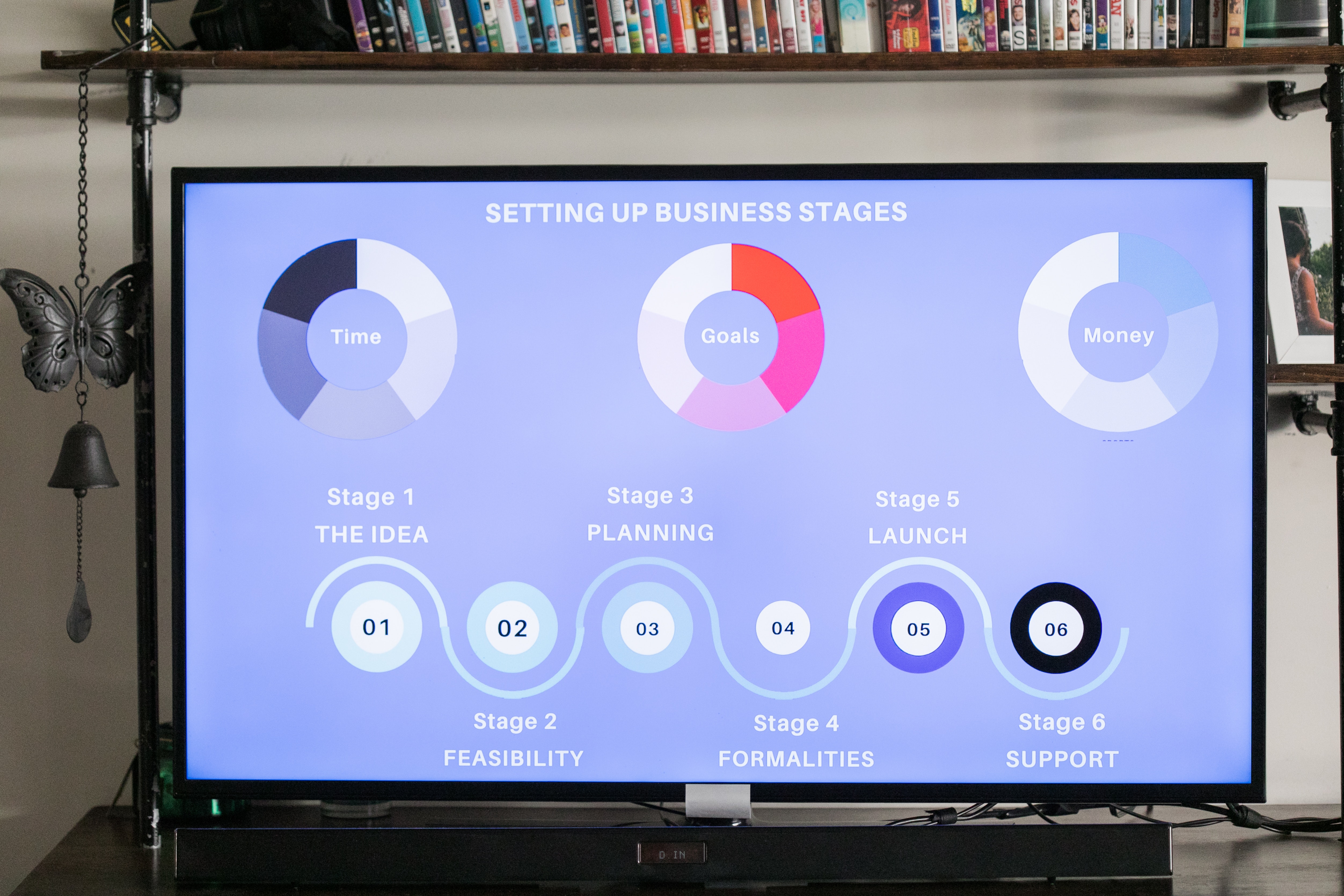
Data visualization and infographics
By Fire Plus Algebra
The insights gained from data analysis are only truly valuable when you can be clearly expressed to other people – bosses, colleagues, clients, customers, or other stakeholders. In this workshop you’ll learn how to turn raw qualitative or quantitative data into a clear visual story through infographics and data visualization. We'll discuss the key principles for planning an effective visual, look at examples of best (and worst) practice, and learn repeatable and practical design techniques for enhancing the story. We'll also give you an overview of useful tools that will help you turn your idea into a finished infographic or data visualization. You could be conjuring up eye-catching slide decks, building effective reports and dashboards, pitching to investors, or presenting persuasive data to your most important customers. This is a fully interactive online workshop, so be prepared to join discussions and get hands on with building your own visualisations. Takeaways Be able to evaluate the elements that make an infographic or visualization effective. Learn quick and repeatable visual tricks for ensuring infographics convey a clear message. Understand how to tailor your approach to different audiences and context. Discover a bunch of free tools and resources to help you build your own visualizations. Understand how online, interactive visualizations work and how to create them. Delivery We deliver our courses over Zoom, to maximise flexibility. The training can be delivered in a single day, or across multiple sessions. All of our courses are live and interactive – every session includes a mix of formal tuition and hands-on exercises. To ensure this is possible, the number of attendees is capped at 16 people. Tutor Alan Rutter is the founder of Fire Plus Algebra. He is a specialist in communicating complex subjects through data visualisation, writing and design. He teaches for General Assembly and runs in-house training for public sector clients including the Home Office, the Department of Transport, the Biotechnology and Biological Sciences Research Council, the Health Foundation, and numerous local government and emergency services teams. He previously worked with Guardian Masterclasses on curating and delivering new course strands, including developing and teaching their B2B data visualisation courses. He oversaw the iPad edition launches of Wired, GQ, Vanity Fair and Vogue in the UK, and has worked with Condé Nast International as product owner on a bespoke digital asset management system for their 11 global markets. Testimonials "Just to say what a great course this was. I have made my first report employing some of the ideas and tools you showed us – to rapturous responses! The next actions are clear for all and they all understood it! Thank you for helping me to organise my data and thoughts, showing how to present the key message up front, and how to keep it simple and focused. Gearing up for another report now!" Kay Anderson | Head of Finance | Mima "We have been using Tableau to display data for some time but knew we could do more to engage our end users. Alan’s training gave us a framework to start thinking about what we wanted to achieve with our visualisations and analysis, and some great tips on how to display information for maximum impact. Alan was an engaging trainer and we found the workshops very energising." Ellen Austin | Senior Data Analyst | London School of Economics
D3.js: Complete Developer Data Visualization Guide
By Packt
Bring data to life with the D3.js data visualization library, and get up to speed with JavaScript, HTML, and CSS to build stunning data visuals
Learn the power of coding with this Master JavaScript with Data Visualization course. With JavaScript being the focus, this program offers comprehensive insights into the heart of web development. The course begins with the basics, setting up your local development environment, and quickly moves on to exploring JavaScript fundamentals like strings, operators, and control flow statements, preparing you for a deep dive into the world of coding. Unlock your potential as we guide you through JavaScript's crucial aspects, including functions, error handling, and client-side validations. Each module is designed by industry experts, ensuring your understanding aligns with real-world scenarios. The course offers practical examples, and quizzes, fostering a rich learning environment that stimulates engagement and helps to master the topics. But what sets this course apart is its emphasis on Data Visualization using Google Chart. The integration of JavaScript with Data Visualization introduces you to new and innovative methods to present data in a more interactive and user-friendly format. By the end of the course, you should be proficient in JavaScript and able to design and implement complex data visualisations. Sign up today for a learning journey combining tech knowledge with creative visualisation skills! Learning Outcomes: After completing the JavaScript with Data Visualization course, you should be able to: Develop a comprehensive understanding of JavaScript fundamentals. Acquire the ability to write and manipulate JavaScript strings and operators. Gain mastery over JavaScript control flow and conditional statements. Learn to implement robust JavaScript functions for diverse applications. Understand JavaScript error handling and client-side validations. Learn to visualise data using Google Chart tools effectively. Gain the ability to create interactive, data-driven web applications. Who is this course for: This JavaScript with Data Visualization course is ideal for: Aspiring web developers seeking to learn JavaScript. Data analysts interested in expanding their skillset. Web designers aiming to enhance their interactivity skills. Software engineers looking to broaden their coding repertoire. Any tech enthusiast wanting to harness the power of Data Visualization. Certification After studying the course materials of the JavaScript with Data Visualization course, there will be a written assignment test which you can take either during or at the end of the course. After passing the test, you will have a range of certification options. A CPD Accredited PDF Certificate costs £4.99, while a CPD Accredited Hardcopy Certificate is £8.00. Also, a PDF Transcript costs £4.99, and a Hardcopy Transcript is £9.99. Select according to your needs, and we assure timely delivery of your chosen certificate. Requirements This professionally designed JavaScript with Data Visualization course does not require you to have any prior qualifications or experience. It is open to everyone, and you can access the course from anywhere at any time. Just enrol and start learning! Career Path: Upon completion of this JavaScript with Data Visualization course, you can gain the knowledge and skills required to pursue many career paths, such as: JavaScript Developer: £35,000 - £55,000 Per year. Front-end Developer: £40,000 - £60,000 Per year. Full-Stack Developer: £45,000 - £70,000 Per year. Data Visualization Engineer: £45,000 - £65,000 Per year. Web Application Developer: £40,000 - £60,000 Per year. Software Engineer: £50,000 - £80,000 Per year. Course Curriculum Introduction Getting Started Introduction to Getting Started 00:02:00 Course Curriculum 00:05:00 How to Get Pre-Requisites 00:02:00 Getting Started on Windows, Linux or Mac 00:01:00 How to ask a Great Questions 00:02:00 FAQ's 00:01:00 Setting up Local Development Environment What is JavaScript 00:09:00 Choosing Code Editor 00:03:00 Installing Code Editor (Sublime Text) 00:04:00 Installing Code Editor(Visual Studio Code) 00:07:00 Hello World Program 00:14:00 Getting Output 00:11:00 Summary 00:02:00 JavaScript Fundamentals Introduction 00:02:00 Internal JavaScript 00:13:00 External JavaScript 00:09:00 Inline JavaScript 00:04:00 Async and defer 00:06:00 Variables 00:13:00 Data Types 00:10:00 Numbers 00:06:00 Boolean 00:04:00 Arrays() 00:12:00 Objects 00:06:00 Comments 00:05:00 Summary 00:01:00 JavaScript Strings Introduction 00:02:00 Strings 00:06:00 String Formatting 00:05:00 String Methods 00:12:00 Summary 00:02:00 JavaScript Operators Introduction 00:02:00 Arithmetic operators 00:07:00 Assignment operators 00:03:00 Comparison operators 00:06:00 Logical operators 00:08:00 Summary 00:02:00 JavaScript Conditional Statements Introduction 00:02:00 If-else-if statement 00:04:00 If-else statement 00:05:00 If-else-if statement 00:04:00 Switch-case statement 00:09:00 Summary 00:01:00 JavaScript Control Flow Statements Introduction 00:02:00 While loop 00:09:00 Do-while loop 00:03:00 For loop 00:08:00 Break 00:02:00 Continue 00:03:00 Coding Exercise 00:02:00 Solution for Coding Exercise 00:02:00 Summary 00:02:00 JavaScript Functions Introduction 00:02:00 Creating a Function 00:07:00 Function Call() 00:07:00 Function with parameters 00:05:00 Function Bind() 00:06:00 Summary 00:01:00 Data Visualization (Google Chart) Introduction 00:01:00 How to Use Google chart script 00:04:00 Line Graph chart 00:14:00 Scatter plots chart 00:02:00 Bar chart 00:04:00 3D Pie chart 00:02:00 3D Pie chart 00:02:00 Summary 00:01:00 JavaScript Error Handling Introduction 00:01:00 Try-catch 00:05:00 Try-catch-finally 00:17:00 Summary 00:01:00 JavaScript Client-side Validations Introduction 00:01:00 On Submit Validation 00:09:00 Input Numeric Validation 00:12:00 Login Form Validation 00:05:00 Password Strength Check Validation 00:04:00 Summary 00:01:00

Effective Data Visualization with Tableau
By Nexus Human
Duration 2 Days 12 CPD hours This course is intended for This course is relevant to anyone who needs to work with and understand data including: Business Analysts, Data Analysts, Reporting and BI professionals Marketing and Digital Marketing professionals Digital, Web, e-Commerce, Social media and Mobile channel professionals Business managers who need to interpret analytical output to inform managerial decisions Overview This course will cover the basic theory of data visualization along with practical skills for creating compelling visualizations, reports and dashboards from data using Tableau. Outcome: After attending this course delegates will understand - How to move from business questions to great data visualizations and beyond How to apply the fundamentals of data visualization to create informative charts How to choose the right visualization type for the job at hand How to design and develop basic dashboards in Tableau that people will love to use by doing the following: Reading data sources into Tableau Setting up the roles and data types for your analysis Creating new data fields using a range of calculation types Creating the following types of charts - cross tabs, pie and bar charts, geographic maps, dual axis and combo charts, heat maps, highlight tables, tree maps and scatter plots Creating Dashboards that delight using the all of the features available in Tableau. The use of analytics, statistics and data science in business has grown massively in recent years. Harnessing the power of data is opening actionable insights in diverse industries from banking to tourism. From Business Questions to Data Visualisation and Beyond The first step in any data analysis project is to move from a business question to data analysis and then on to a complete solution. This section will examine this conversion emphasizing: The use of data visualization to address a business need The data analytics process ? from business questions to developed dashboards Introduction to Tableau ? Part 1 In this section, the main functionality of Tableau will be explained including: Selecting and loading your data Defining data item properties Create basic calculations including basic arithmetic calculations, custom aggregations and ratios, date math, and quick table calculations Creating basic visualizations Creating a basic dashboard Introduction to Tableau ? Part 2 In this section, the main functionality of Tableau will be explained including: Selecting and loading your data Defining data item properties Create basic calculations including basic arithmetic calculations, custom aggregations and ratios, date math, and quick table calculations Creating basic visualizations Creating a basic dashboard Key Components of Good Data Visualisation and The Visualisation Zoo In this section the following topics will be covered: Colour theory Graphical perception & communication Choosing the right chart for the right job Data Exploration with Tableau Exploring data to answer business questions is one of the key uses of applying good data visualization techniques within Tableau. In this section we will apply the data visualization theory from the previous section within Tableau to uncover trends within the data to answer specific business questions. The types of charts that will be covered are: Cross Tabs Pie and bar charts Geographic maps Dual axis and combo charts with different mark types Heat maps Highlight tables Tree maps Scatter plots Introduction to Building Dashboards with Tableau In this section, we will implement the full process from business question to final basic dashboard in Tableau: Introduction to good dashboard design Building dashboards in Tableau

Data Understanding and Data Visualization with Python
By Packt
This course first equips you with the fundamentals of Python and then progresses to teach you how to use various libraries such as NumPy, Pandas, Seaborn, Bokeh, and so on. This course contains several mini projects so that, by the end of this course, you will be equipped with the essential tools you need to become a visualization expert.
Machine Learning for Absolute Beginners - Level 3
By Packt
In this course, you will learn the fundamentals of data visualization in Python using the well-known Matplotlib and Seaborn data science libraries and perform exploratory data analysis (EDA) by visualizing a data set using a variety of charts.
Spatial Data Visualization and Machine Learning in Python Level 4
By Course Cloud
Course Overview Make the most of the plotting and AI capabilities of the world's benchmark programming language by taking this course to create Spatial Data Visualisation and Machine Learning in Python Level 4. Using the intuitive syntax available to you, you will be amazed at the results you can achieve with the power of its libraries and mapping potential for all manner of complex projects. This comprehensive Python tutorial is an excellent way to learn the important and potentially ground-breaking aspects of machine learning. With the benefit of expert guidance and step-by-step training, IT technology, you will be taken from quick installations to complex coding. You will learn how to become proficient with coding capabilities that will put you at the forefront of advanced programming techniques and the aptitude to envisage AI projects that will impress and be used for practical and useful purposes. This best selling Spatial Data Visualization and Machine Learning in Python Level 4 has been developed by industry professionals and has already been completed by hundreds of satisfied students. This in-depth Spatial Data Visualization and Machine Learning in Python Level 4 is suitable for anyone who wants to build their professional skill set and improve their expert knowledge. The Spatial Data Visualization and Machine Learning in Python Level 4 is CPD-accredited, so you can be confident you're completing a quality training course will boost your CV and enhance your career potential. The Spatial Data Visualization and Machine Learning in Python Level 4 is made up of several information-packed modules which break down each topic into bite-sized chunks to ensure you understand and retain everything you learn. After successfully completing the Spatial Data Visualization and Machine Learning in Python Level 4, you will be awarded a certificate of completion as proof of your new skills. If you are looking to pursue a new career and want to build your professional skills to excel in your chosen field, the certificate of completion from the Spatial Data Visualization and Machine Learning in Python Level 4 will help you stand out from the crowd. You can also validate your certification on our website. We know that you are busy and that time is precious, so we have designed the Spatial Data Visualization and Machine Learning in Python Level 4 to be completed at your own pace, whether that's part-time or full-time. Get full course access upon registration and access the course materials from anywhere in the world, at any time, from any internet-enabled device. Our experienced tutors are here to support you through the entire learning process and answer any queries you may have via email.

Projects in Data Science
By Packt
This video course gives you an insight into applied data science concepts using Python. With the help of interesting activities and hands-on coding exercises, you'll learn about data science, extended data analysis, linear and logistic regression, data visualization, k-means clustering, and decision trees.
