- Professional Development
- Medicine & Nursing
- Arts & Crafts
- Health & Wellbeing
- Personal Development
1 Data Storytelling courses in Coventry
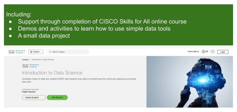
Introduction to Data Science
By futureCoders SE
Learn the basics of Data Science, combining a supported #CISCO Skills for All online course with practical learning and a project to help consolidate the learning.
Online Options
Show all 20Python for Data Visualization - A Beginner's Guide
By Packt
This beginner-friendly course takes us on a journey into data visualization. You will learn to transform raw data into stunning visuals using Matplotlib, Seaborn, and Plotly. From charts to dynamic heatmaps, we will master the essentials. Fuel your curiosity, enhance your skills, and communicate insights effectively to become a Python data visualization pro!
Data storytelling
By Fire Plus Algebra
Data has become the most important resource for every organisation – but the insights gained from data analysis will only ever be truly valuable if they can be clearly expressed to other people. This course is for anybody who works with data, and needs to communicate the meaning that's in the numbers to colleagues, customers, bosses or external stakeholders. It will give you or your team the confidence and skills to translate raw data into compelling visual stories for your key audiences. The principles and skills covered apply to the simplest PowerPoint chart, to more complex interactive visualisations. We’ll work with you before the course to ensure that we understand your organisation and what you’re hoping to achieve. Sample learning content Session 1: What makes a great data-driven story The key elements of a successful infographic or presentation. Industry best practice, and discussion of good (and bad) examples. A simple framework for identifying the Audience, Story and Action. Session 2: Data in context How to balance function and aesthetic appeal. Identifying the right graph, chart, infographic or other visual. Framing the data and providing contextual information. Session 3: Designing for the human brain Using colours to add emphasis and meaning. Design and layout principles, and creating hierarchies of information. The principle of ‘self-sufficiency’, and removing clutter. Session 4: Navigation and narrative Tailoring visualisations for different types of communications. Structuring presentations and longer reports. Thinking in layers to create interactive dashboards. Delivery We deliver our courses over Zoom, to maximise flexibility. The training can be delivered in a single day, or across multiple sessions. All of our courses are live and interactive – every session includes a mix of formal tuition and hands-on exercises. To ensure this is possible, the number of attendees is capped at 16 people. Tutor Alan Rutter is the founder of Fire Plus Algebra. He is a specialist in communicating complex subjects through data visualisation, writing and design. He teaches for General Assembly and runs in-house training for public sector clients including the Home Office, the Department of Transport, the Biotechnology and Biological Sciences Research Council, the Health Foundation, and numerous local government and emergency services teams. He previously worked with Guardian Masterclasses on curating and delivering new course strands, including developing and teaching their B2B data visualisation courses. He oversaw the iPad edition launches of Wired, GQ, Vanity Fair and Vogue in the UK, and has worked with Condé Nast International as product owner on a bespoke digital asset management system for their 11 global markets. Testimonial “I was familiar with Alan’s work as a Guardian Masterclass instructor on data visualisation and digital journalism, which made it easy for me to recommend him for onsite training at the Liverpool School of Tropical Medicine. We had a large group of people interested in honing their abilities to depict their research and stories in engaging ways. Alan’s course provided great insight about common communication pitfalls and how to avoid them, how to become better communicators by understanding the audience diversity, and it showcased some great online tools for creating infographics. This should be mandatory training for all students, academics, report writers and those involved with conveying research to the media as it will help increase the clarity and accessibility of our own research stories.” Dr Lee Haines | Liverpool School of Tropical Medicine

IT and Analytics Courses - 8 Courses Bundle
By NextGen Learning
Imagine a world where the vast realms of IT and analytics seem intricate, and the data emanating from every corner feels overwhelming. Now, reimagine a world where you have the power to interpret, analyse, and make that data sing a tune of actionable insights. Welcome to our "IT and Analytics" bundle, where complexity turns into simplicity. Dive deep into the myriad elements of IT and analytics, encompassing everything from the basics of Google Analytics and Excel Pivot Tables to the advanced nuances of Windows 10 troubleshooting. This comprehensive bundle caters to both beginners and seasoned professionals, offering in-depth theoretical knowledge that is instrumental in the real world. By immersing yourself in these carefully curated courses, you are setting the foundation for deciphering data, understanding IT basics, and recruiting the right IT talent. The purpose of this bundle is clear: to mould learners into well-rounded professionals with a keen sense for IT and analytics. Whether you're looking to streamline business processes, bolster your IT department, or simply understand the data-centric world around you, this is your golden ticket. Take the leap and embrace the future of IT and analytics today! Courses Included: Course 1: Google Analytics for Everyone Course 2: RCA: Root Cause Analysis Course 3: SQL for Data Science, Data Analytics and Data Visualization Course 4: Introduction to Data Analytics with Tableau Course 5: Excel Pivot Tables Course 6: CompTIA IT Fundamentals ITF+ (FCO-U61) Course 7: Recruitment: IT Basics for IT Recruiters Course 8: Advance Windows 10 Troubleshooting for IT HelpDesk Learning Outcomes: Understand the fundamentals and advanced features of popular IT and analytics platforms. Gain theoretical insights into root cause analysis and its applications. Enhance decision-making abilities through data visualisation techniques. Grasp the essence of IT recruitment and selection of appropriate candidates. Master troubleshooting methods and strategies for Windows 10. Build foundational knowledge in IT essentials through the CompTIA IT Fundamentals ITF+ curriculum. Google Analytics for Everyone Decode user behaviour and make informed decisions with Google Analytics. RCA: Root Cause Analysis Uncover the underlying reasons behind complex issues through structured analysis. SQL for Data Science, Data Analytics and Data Visualization Harness the power of SQL for effective data science and visualization. Introduction to Data Analytics with Tableau Dive into data storytelling and visualisation with Tableau. Excel Pivot Tables Master Excel's Pivot Tables for dynamic data analysis. CompTIA IT Fundamentals ITF+ (FCO-U61) Establish a solid IT foundation with CompTIA IT Fundamentals. Recruitment: IT Basics for IT Recruiters Learn the essentials of IT recruitment and talent selection. Advance Windows 10 Troubleshooting for IT HelpDesk Elevate your troubleshooting skills for Windows 10 environments. CPD 80 CPD hours / points Accredited by CPD Quality Standards Who is this course for? Aspiring data analysts keen on mastering theoretical aspects of IT and analytics. IT enthusiasts looking to enhance their knowledge base. Business professionals aiming to understand IT-related decisions better. HR and recruitment professionals with a focus on IT hiring. Anyone with a passion for data interpretation and the world of IT. Career path Data Analyst - £30K to £50K/year. IT Support Specialist - £25K to £45K/year. IT Recruiter - £28K to £55K/year. Database Administrator - £35K to £60K/year. Business Intelligence Analyst - £32K to £58K/year. IT Consultant - £40K to £70K/year. Systems Administrator - £30K to £55K/year. Certificates CPD Certificate Of Completion Digital certificate - Included 8 Digital Certificates Are Included With This Bundle CPD Quality Standard Hardcopy Certificate (FREE UK Delivery) Hard copy certificate - £9.99 Hardcopy Transcript - £9.99
Data Analyst Training: Microsoft Power BI at QLS Level 7 Diploma
By Imperial Academy
Bring Your Data To Life | Designed by Industry Specialist | Level 7 | QLS Endorsed Diploma | Certificate Included
Data visualization and infographics
By Fire Plus Algebra
The insights gained from data analysis are only truly valuable when you can be clearly expressed to other people – bosses, colleagues, clients, customers, or other stakeholders. In this workshop you’ll learn how to turn raw qualitative or quantitative data into a clear visual story through infographics and data visualization. We'll discuss the key principles for planning an effective visual, look at examples of best (and worst) practice, and learn repeatable and practical design techniques for enhancing the story. We'll also give you an overview of useful tools that will help you turn your idea into a finished infographic or data visualization. You could be conjuring up eye-catching slide decks, building effective reports and dashboards, pitching to investors, or presenting persuasive data to your most important customers. This is a fully interactive online workshop, so be prepared to join discussions and get hands on with building your own visualisations. Takeaways Be able to evaluate the elements that make an infographic or visualization effective. Learn quick and repeatable visual tricks for ensuring infographics convey a clear message. Understand how to tailor your approach to different audiences and context. Discover a bunch of free tools and resources to help you build your own visualizations. Understand how online, interactive visualizations work and how to create them. Delivery We deliver our courses over Zoom, to maximise flexibility. The training can be delivered in a single day, or across multiple sessions. All of our courses are live and interactive – every session includes a mix of formal tuition and hands-on exercises. To ensure this is possible, the number of attendees is capped at 16 people. Tutor Alan Rutter is the founder of Fire Plus Algebra. He is a specialist in communicating complex subjects through data visualisation, writing and design. He teaches for General Assembly and runs in-house training for public sector clients including the Home Office, the Department of Transport, the Biotechnology and Biological Sciences Research Council, the Health Foundation, and numerous local government and emergency services teams. He previously worked with Guardian Masterclasses on curating and delivering new course strands, including developing and teaching their B2B data visualisation courses. He oversaw the iPad edition launches of Wired, GQ, Vanity Fair and Vogue in the UK, and has worked with Condé Nast International as product owner on a bespoke digital asset management system for their 11 global markets. Testimonials "Just to say what a great course this was. I have made my first report employing some of the ideas and tools you showed us – to rapturous responses! The next actions are clear for all and they all understood it! Thank you for helping me to organise my data and thoughts, showing how to present the key message up front, and how to keep it simple and focused. Gearing up for another report now!" Kay Anderson | Head of Finance | Mima "We have been using Tableau to display data for some time but knew we could do more to engage our end users. Alan’s training gave us a framework to start thinking about what we wanted to achieve with our visualisations and analysis, and some great tips on how to display information for maximum impact. Alan was an engaging trainer and we found the workshops very energising." Ellen Austin | Senior Data Analyst | London School of Economics
The Complete Tableau Bootcamp for Aspiring Data Scientists
By Packt
Learn the basics and the advanced concepts of Tableau to create stunning and detailed visualizations. This course provides step-by-step guidance on how we can make data easier to understand and easier to interpret by using visualizations. We'll be working with Tableau 2020.3.
Telling Stories that Inspire: Create Engagement and Belief so People will Act
By IIL Europe Ltd
Telling Stories that Inspire: Create Engagement and Belief so People will Act In this active presentation, participants will encounter the deep and fascinating body of knowledge around organizational narrative. This isn't about performance or building your "public speaking" skills. It is a recognition that story is a strategic act: Which stories should leaders tell? It begins with selection, because when you tell the right story at the right time the results can be transformational. David Hutchens will introduce participants to storytelling through a lens of change management. They will discover the three stories they should be telling now in order to move the system and engage their team in a context of extreme uncertainty. Attendees of this session will: Explore how stories of continuity, novelty, and transition are needs that every organizational system has. Hear specific examples of how other leaders and organizations are telling these stories. Identify some of the 'narrative assets' (the value-holding stories) that they can start telling right away!

Python Mini Bundle
By Compete High
The Python Mini Bundle offers a clean, structured pathway into essential programming languages and web design basics. Whether you're wrestling with loops or wondering what exactly Go Lang does with its semicolons, this bundle provides clarity across popular technologies—without sounding like a lecture from a sleep-deprived engineer. It starts with Python’s logic, adds HTML and CSS for structure and style, sprinkles in data analysis, and rounds it out with Go Lang—because sometimes, even programmers enjoy a change of pace. It's ideal for learners who enjoy seeing code behave (most of the time) and data that tells a story without emotional outbursts. Learning Outcomes: Understand Python syntax, loops, and structured programming logic. Learn Go Lang structures and execution models for simple programmes. Explore HTML basics and webpage layout fundamentals. Study CSS styling for visual structure and site presentation. Apply Python to explore introductory data analysis techniques. Identify core programming patterns across language types. Who is this Course For: Beginners curious about Python and clean programming logic. Students exploring front-end and back-end web structure theory. Individuals interested in combining coding with data storytelling. Learners wanting to explore multiple programming language basics. Aspiring analysts looking at foundational coding for data handling. Developers transitioning to structured web and code learning. Hobbyists keen to write functional, logical, readable code. Coders who appreciate both syntax and simplicity in language. Career Path: Python Developer – £45,000/year Junior Data Analyst – £30,000/year Web Developer (HTML/CSS) – £32,000/year Go Lang Developer – £48,000/year Software Tester – £34,000/year Front-End Developer – £35,500/year

Supercharge your skills and career and learn in-demand knowledge needed to build business intelligence dashboards. This beginner to intermediate level course will introduce you to all the Power BI technologies i.e. Power Query, DAX, Data Modelling (Power Pivot), M, types of visualizations, etc.
Thinking about learning more understanding the role of data within an organisation? As data becomes an important currency in the world and an enabler for the future, it is imperative that all organisations have a firm understanding of the data available to them and the power it can hold. The BCS Foundation Award in Understanding Data in your Organisation teaches the the terminology, principles, concepts and approaches used within data management, and the overall value of data to an organisation.
Search By Location
- Data Storytelling Courses in London
- Data Storytelling Courses in Birmingham
- Data Storytelling Courses in Glasgow
- Data Storytelling Courses in Liverpool
- Data Storytelling Courses in Bristol
- Data Storytelling Courses in Manchester
- Data Storytelling Courses in Sheffield
- Data Storytelling Courses in Leeds
- Data Storytelling Courses in Edinburgh
- Data Storytelling Courses in Leicester
- Data Storytelling Courses in Coventry
- Data Storytelling Courses in Bradford
- Data Storytelling Courses in Cardiff
- Data Storytelling Courses in Belfast
- Data Storytelling Courses in Nottingham