- Professional Development
- Medicine & Nursing
- Arts & Crafts
- Health & Wellbeing
- Personal Development
6 Data Storytelling courses in Cardiff delivered Live Online
Data storytelling
By Fire Plus Algebra
Data has become the most important resource for every organisation – but the insights gained from data analysis will only ever be truly valuable if they can be clearly expressed to other people. This course is for anybody who works with data, and needs to communicate the meaning that's in the numbers to colleagues, customers, bosses or external stakeholders. It will give you or your team the confidence and skills to translate raw data into compelling visual stories for your key audiences. The principles and skills covered apply to the simplest PowerPoint chart, to more complex interactive visualisations. We’ll work with you before the course to ensure that we understand your organisation and what you’re hoping to achieve. Sample learning content Session 1: What makes a great data-driven story The key elements of a successful infographic or presentation. Industry best practice, and discussion of good (and bad) examples. A simple framework for identifying the Audience, Story and Action. Session 2: Data in context How to balance function and aesthetic appeal. Identifying the right graph, chart, infographic or other visual. Framing the data and providing contextual information. Session 3: Designing for the human brain Using colours to add emphasis and meaning. Design and layout principles, and creating hierarchies of information. The principle of ‘self-sufficiency’, and removing clutter. Session 4: Navigation and narrative Tailoring visualisations for different types of communications. Structuring presentations and longer reports. Thinking in layers to create interactive dashboards. Delivery We deliver our courses over Zoom, to maximise flexibility. The training can be delivered in a single day, or across multiple sessions. All of our courses are live and interactive – every session includes a mix of formal tuition and hands-on exercises. To ensure this is possible, the number of attendees is capped at 16 people. Tutor Alan Rutter is the founder of Fire Plus Algebra. He is a specialist in communicating complex subjects through data visualisation, writing and design. He teaches for General Assembly and runs in-house training for public sector clients including the Home Office, the Department of Transport, the Biotechnology and Biological Sciences Research Council, the Health Foundation, and numerous local government and emergency services teams. He previously worked with Guardian Masterclasses on curating and delivering new course strands, including developing and teaching their B2B data visualisation courses. He oversaw the iPad edition launches of Wired, GQ, Vanity Fair and Vogue in the UK, and has worked with Condé Nast International as product owner on a bespoke digital asset management system for their 11 global markets. Testimonial “I was familiar with Alan’s work as a Guardian Masterclass instructor on data visualisation and digital journalism, which made it easy for me to recommend him for onsite training at the Liverpool School of Tropical Medicine. We had a large group of people interested in honing their abilities to depict their research and stories in engaging ways. Alan’s course provided great insight about common communication pitfalls and how to avoid them, how to become better communicators by understanding the audience diversity, and it showcased some great online tools for creating infographics. This should be mandatory training for all students, academics, report writers and those involved with conveying research to the media as it will help increase the clarity and accessibility of our own research stories.” Dr Lee Haines | Liverpool School of Tropical Medicine

Data visualization and infographics
By Fire Plus Algebra
The insights gained from data analysis are only truly valuable when you can be clearly expressed to other people – bosses, colleagues, clients, customers, or other stakeholders. In this workshop you’ll learn how to turn raw qualitative or quantitative data into a clear visual story through infographics and data visualization. We'll discuss the key principles for planning an effective visual, look at examples of best (and worst) practice, and learn repeatable and practical design techniques for enhancing the story. We'll also give you an overview of useful tools that will help you turn your idea into a finished infographic or data visualization. You could be conjuring up eye-catching slide decks, building effective reports and dashboards, pitching to investors, or presenting persuasive data to your most important customers. This is a fully interactive online workshop, so be prepared to join discussions and get hands on with building your own visualisations. Takeaways Be able to evaluate the elements that make an infographic or visualization effective. Learn quick and repeatable visual tricks for ensuring infographics convey a clear message. Understand how to tailor your approach to different audiences and context. Discover a bunch of free tools and resources to help you build your own visualizations. Understand how online, interactive visualizations work and how to create them. Delivery We deliver our courses over Zoom, to maximise flexibility. The training can be delivered in a single day, or across multiple sessions. All of our courses are live and interactive – every session includes a mix of formal tuition and hands-on exercises. To ensure this is possible, the number of attendees is capped at 16 people. Tutor Alan Rutter is the founder of Fire Plus Algebra. He is a specialist in communicating complex subjects through data visualisation, writing and design. He teaches for General Assembly and runs in-house training for public sector clients including the Home Office, the Department of Transport, the Biotechnology and Biological Sciences Research Council, the Health Foundation, and numerous local government and emergency services teams. He previously worked with Guardian Masterclasses on curating and delivering new course strands, including developing and teaching their B2B data visualisation courses. He oversaw the iPad edition launches of Wired, GQ, Vanity Fair and Vogue in the UK, and has worked with Condé Nast International as product owner on a bespoke digital asset management system for their 11 global markets. Testimonials "Just to say what a great course this was. I have made my first report employing some of the ideas and tools you showed us – to rapturous responses! The next actions are clear for all and they all understood it! Thank you for helping me to organise my data and thoughts, showing how to present the key message up front, and how to keep it simple and focused. Gearing up for another report now!" Kay Anderson | Head of Finance | Mima "We have been using Tableau to display data for some time but knew we could do more to engage our end users. Alan’s training gave us a framework to start thinking about what we wanted to achieve with our visualisations and analysis, and some great tips on how to display information for maximum impact. Alan was an engaging trainer and we found the workshops very energising." Ellen Austin | Senior Data Analyst | London School of Economics
Microsoft Power BI Masterclass 2021
By NextGen Learning
Microsoft Power BI Masterclass 2021 Course Overview: The "Microsoft Power BI Masterclass 2021" provides learners with the skills to become proficient in data analysis and visualization using Power BI. This comprehensive course covers the core functionalities of Power BI, from data preparation and transformation to creating impactful reports and dashboards. Learners will gain valuable insights into data modelling, visualisation, and the use of DAX for advanced calculations. By the end of the course, participants will be able to apply their knowledge to real-world projects, improving their ability to communicate data-driven insights effectively. This course is ideal for professionals and beginners who want to leverage Power BI to unlock the potential of their data. Course Description: This masterclass delves into the essential features of Microsoft Power BI, guiding learners through every stage of data analysis. Starting with project setup and data transformation in the Query Editor, the course progresses to advanced topics such as DAX functions and data storytelling. Learners will explore how to build data models, create dashboards, and employ Python in Power BI to enhance their reports. The course also covers Power BI Service for cloud-based analytics, row-level security for data protection, and integrating additional data sources. With a focus on empowering users to communicate insights clearly, the course ensures learners gain the expertise to manage data efficiently, make informed decisions, and stay up to date with evolving tools and features. Microsoft Power BI Masterclass 2021 Curriculum: Module 01: Introduction Module 02: Preparing our Project Module 03: Data Transformation - The Query Editor Module 04: Data Transformation - Advanced Module 05: Creating a Data Model Module 06: Data Visualization Module 07: Power BI & Python Module 08: Storytelling with Data Module 09: DAX - The Essentials Module 10: DAX - The CALCULATE function Module 11: Power BI Service - Power BI Cloud Module 12: Row-Level Security Module 13: More data sources Module 14: Next steps to improve & stay up to date (See full curriculum) Who is this course for? Individuals seeking to enhance their data analysis skills. Professionals aiming to advance their data visualization expertise. Beginners with an interest in data science or business analytics. Business analysts or data professionals looking to upskill in Power BI. Career Path: Data Analyst Business Intelligence Analyst Data Scientist Power BI Developer Reporting Analyst Data Visualisation Expert

Dashboard design
By Fire Plus Algebra
Data dashboards provide key information to stakeholders so that they can make informed decisions. While there are plenty of software solutions for building these essential data products, there is much less guidance on how to design dashboards to meet the diverse needs of users. This course is for anyone who is building or implementing dashboards, and wants to know more about design principles and best practice. You could be using business intelligence software (such as Power BI or Tableau), or implementing bespoke solutions. The course will give your team the ability to evaluate user needs and levels of understanding, make informed decisions about chart selections, and make effective use of interactivity dynamic data. We’ll work with you before the course to ensure that we understand your organisation and what you’re hoping to achieve. Sample learning content Session 1: Data with a purpose Understanding the different types of dashboard. Information overload and other common dashboard pitfalls. Assessing user needs and levels of data fluency. Session 2: Planning a dashboard Assessing diverse user needs and levels of data fluency. Taking a User Experience (UX) approach to design and navigation. Applying an interative and collaborative approach to onboarding. Session 3: Graphs, charts and dials Understanding how graphical perception informs chart choices. Making intelligent design choices to help users explore. Design principles for layout and navigation. Session 4: Using interactivity Making effective use of filters to slice and dice data sets. Using layers of information to enable drilldown data exploration. Complenting dashboards with automated alerts and queries. Delivery We deliver our courses over Zoom, to maximise flexibility. The training can be delivered in a single day, or across multiple sessions. All of our courses are live and interactive – every session includes a mix of formal tuition and hands-on exercises. To ensure this is possible, the number of attendees is capped at 16 people. Tutor Alan Rutter is the founder of Fire Plus Algebra. He is a specialist in communicating complex subjects through data visualisation, writing and design. He teaches for General Assembly and runs in-house training for public sector clients including the Home Office, the Department of Transport, the Biotechnology and Biological Sciences Research Council, the Health Foundation, and numerous local government and emergency services teams. He previously worked with Guardian Masterclasses on curating and delivering new course strands, including developing and teaching their B2B data visualisation courses. He oversaw the iPad edition launches of Wired, GQ, Vanity Fair and Vogue in the UK, and has worked with Condé Nast International as product owner on a bespoke digital asset management system for their 11 global markets. Testimonial “Alan was great to work with, he took us through the concepts behind data visualisation which means our team is now equipped for the future. He has a wide range of experience across the topic that is delivered in a clear, concise and friendly manner. We look forward to working with Alan again in the future.” John Masterson | Chief Product Officer | ImproveWell

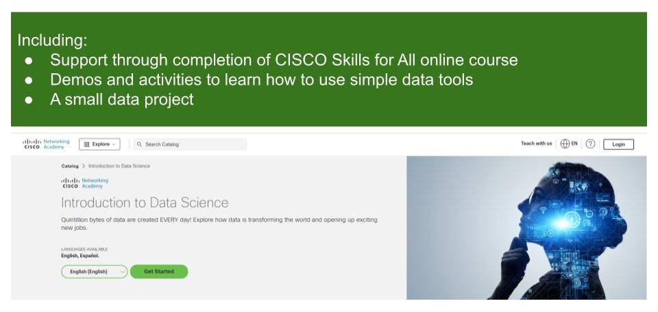
Introduction to Data Science
By futureCoders SE
Learn the basics of Data Science, combining a supported #CISCO Skills for All online course with practical learning and a project to help consolidate the learning.