- Professional Development
- Medicine & Nursing
- Arts & Crafts
- Health & Wellbeing
- Personal Development
212 Dash courses delivered Live Online
Introduction to WordPress Online
By Platform Training
Live online course with study materials and certificate of completion included This beginner's WordPress course will enable you to create your own website using the world's favourite content management system. The user friendly web based software enables you to quickly and easily get your website up and running. This one day course will teach you how to write, edit and manage your WordPress site and also to use image, audio and video content. Whether you are seeking to learn WordPress for your own personal posts or for business and marketing purposes this course will get you up and running right away. Resources Introduction to WordPress Description Completing this course will enable you to do the following and more: Become familiar with the WordPress CMS Install and configure WordPress Manage WordPress themes Understand the WP interface and the dashboard Add users and assigning different user roles Set-up reading options Create, add, update and assign menus Understand Posts and Pages Edit and format content Use the Gutenberg block editor Create and manage your homepage Carry out customisations Understand SEO optimisation For the full course content please download the course information pdf listed above. Who is this course for? This workshop is suitable for anyone with basic PC or Mac skills who wishes to learn how to create and manage websites with WordPress. No previous knowledge or experience of WordPress is necessary. Requirements Attendees should have basic PC or Mac skills. You will need a broadband internet connection to participate in this live online course. Certificates Certificate of completion Digital certificate - Included

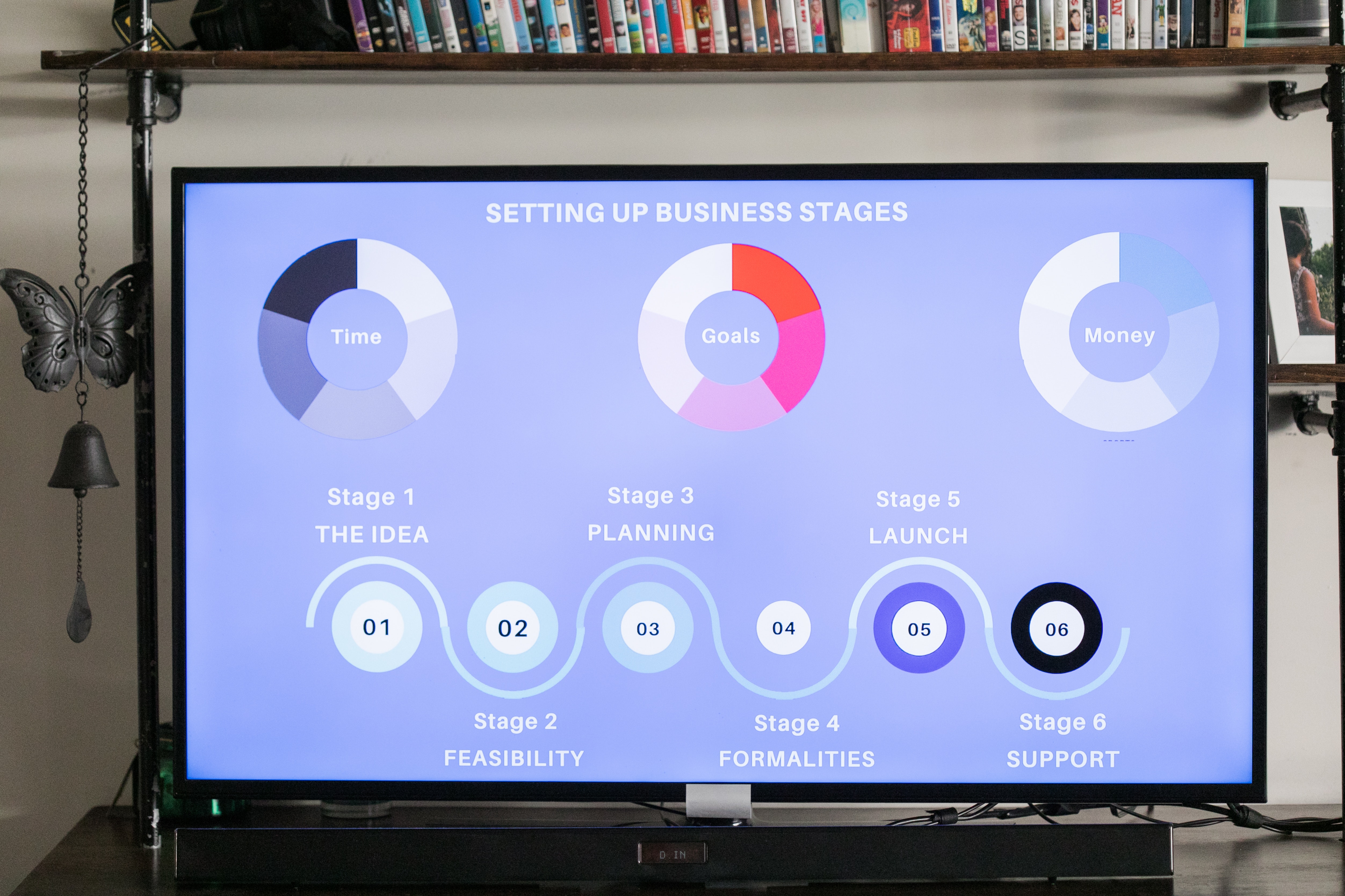
Data visualization and infographics
By Fire Plus Algebra
The insights gained from data analysis are only truly valuable when you can be clearly expressed to other people – bosses, colleagues, clients, customers, or other stakeholders. In this workshop you’ll learn how to turn raw qualitative or quantitative data into a clear visual story through infographics and data visualization. We'll discuss the key principles for planning an effective visual, look at examples of best (and worst) practice, and learn repeatable and practical design techniques for enhancing the story. We'll also give you an overview of useful tools that will help you turn your idea into a finished infographic or data visualization. You could be conjuring up eye-catching slide decks, building effective reports and dashboards, pitching to investors, or presenting persuasive data to your most important customers. This is a fully interactive online workshop, so be prepared to join discussions and get hands on with building your own visualisations. Takeaways Be able to evaluate the elements that make an infographic or visualization effective. Learn quick and repeatable visual tricks for ensuring infographics convey a clear message. Understand how to tailor your approach to different audiences and context. Discover a bunch of free tools and resources to help you build your own visualizations. Understand how online, interactive visualizations work and how to create them. Delivery We deliver our courses over Zoom, to maximise flexibility. The training can be delivered in a single day, or across multiple sessions. All of our courses are live and interactive – every session includes a mix of formal tuition and hands-on exercises. To ensure this is possible, the number of attendees is capped at 16 people. Tutor Alan Rutter is the founder of Fire Plus Algebra. He is a specialist in communicating complex subjects through data visualisation, writing and design. He teaches for General Assembly and runs in-house training for public sector clients including the Home Office, the Department of Transport, the Biotechnology and Biological Sciences Research Council, the Health Foundation, and numerous local government and emergency services teams. He previously worked with Guardian Masterclasses on curating and delivering new course strands, including developing and teaching their B2B data visualisation courses. He oversaw the iPad edition launches of Wired, GQ, Vanity Fair and Vogue in the UK, and has worked with Condé Nast International as product owner on a bespoke digital asset management system for their 11 global markets. Testimonials "Just to say what a great course this was. I have made my first report employing some of the ideas and tools you showed us – to rapturous responses! The next actions are clear for all and they all understood it! Thank you for helping me to organise my data and thoughts, showing how to present the key message up front, and how to keep it simple and focused. Gearing up for another report now!" Kay Anderson | Head of Finance | Mima "We have been using Tableau to display data for some time but knew we could do more to engage our end users. Alan’s training gave us a framework to start thinking about what we wanted to achieve with our visualisations and analysis, and some great tips on how to display information for maximum impact. Alan was an engaging trainer and we found the workshops very energising." Ellen Austin | Senior Data Analyst | London School of Economics
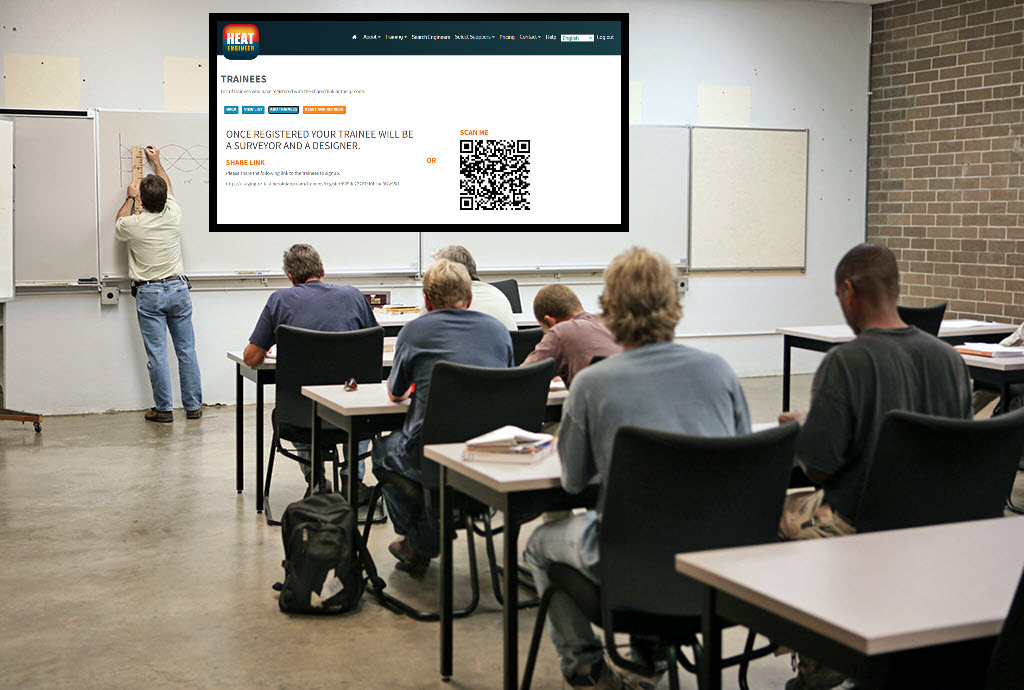
For new users and the curious. Hello, For new users and the curious. IMPORTANT: Firstly, once you are signed up, send us your requests on what you would like to see within the demonstration and learn on the course. We will then cater for your needs and answer them during the session. This is designed to be an introduction into how to start a room by room survey using the Heat Engineer app, then sending this survey to the online dashboard. We will then go through the different steps to complete this heat loss report. Optional pages will also be worked through and shown. Examples of how to select the flow temperature and the heat source (heat pumps and boilers) will be presented once the heat loss result is completed.

Introduction to Shiny R Core - Observers and Reactivity
By Datacove
What You'll Learn An introduction to reactive expressions - how they differ from base R functionality and why they are needed within Shiny. Simple reactive expressions - creating dynamic data expressions Reacting to user-initiated actions - how to get your dashboard to adapt dynamically to user inputs Nested reactions - more complex relationships where multiple actions need to bee accounted for About The Trainer Jeremy has been using R since the very first day of his career in 2005, when it was better known as a mere letter of the alphabet! As an early adopter of the language, he’s seen it evolve – from its ugly initial versions to more elegant analytics solutions underpinned by the tidyverse, on which this course is focused. He is a regular speaker on UK R circuit and co-organises a number of R-community groups, including LondonR, ManchesterR & BrightonR, and the infamous EARL conference! About Us Datacove are a data and analytics consultancy specialising in customer analytics, marketing analytics and process automation. With over 20 years of combined experience in the industry we answer the questions that sit at the heart of every business, from who your customers are, to where and how you find more of them and how much you need to spend to do so. We also automate your most painful business processes, removing the 20+ hours you spend on them per week, forever! Extra Information Our courses are delivered during core office hours, ensuring they fit seamlessly into your work schedule. Once your booking is confirmed, we will send you a Microsoft Teams link, allowing you to join the session with ease.

Salesforce Building Lenses, Dashboards, and Apps in Tableau CRM (ANC201)
By Nexus Human
Duration 1 Days 6 CPD hours This course is intended for This course is aimed at users with the Tableau CRM license who need to build effective lenses and dashboards for their business users to explore their data. It may also be of interest to users who are connecting and integrating this data, to understand how it is used in the lens and dashboard building process. Overview Build and manage apps in Tableau CRM Design a dashboard based on requirements, and create a dashboard template Create and add lenses to build a dashboard Optimize a dashboard for mobile use Ready to start building in Tableau CRM? In this course, you?ll find out how to design and create an effective dashboard layout to help viewers quickly find their way around. You?ll learn how to build lenses and add them into your dashboards using the Tableau CRM Dashboard Designer. Once you?ve created a dashboard, you?ll also learn how to optimize the dashboard for mobile. Finally you?ll also learn how to organize your lenses and dashboards using apps and ensure that only the right users have access to them.Looking for Tableau classes? Check out the Tableau catalog here. Managing Apps, Lenses, Dashboards, and Datasets Overview of building and managing apps Building an app Manage apps, lenses, dashboards, and datasets Designing a Dashboard and Creating a Template Dashboard Building Overview Designing a Dashboard Create a dashboard template Building a Dashboard Building a Dashboard Adding Charts, Tables, and KPIs to a Dashboard Adding Filters to a Dashboard Modify a Dashboard for Mobile Translating Desktop Dashboards to a Mobile Device Creating/Updating Mobile Dashboard Layouts

Microsoft Power BI Reports and Dashboards for Business Users
By Nexus Human
Duration 1 Days 6 CPD hours This course is intended for Anyone whose role requires them to use existing Power BI Reports or Dashboards to consume the contents. Roles can include management at all levels, team leaders or anyone who needs to commission the production of reports or dashboards. It is assumed that attendees on the course are familiar with charts. Please note that this course is not suitable for new Excel users, delegates need Ability to create charts Ability to use filters in data Overview This course covers the use of Power BI Desktop and the Power BI service hosted in Office 365 to identify core features, terminology and processes applicable when using reports or dashboards.Delegates will learn how to: Power BI Concepts and Main Features How a report is created Navigating reports and dashboards How to apply filters and slicers To use Insights, Analytics and Natural Language Queries Power BI provides a variety of methods for using reports and dashboards within which data can be viewed and analyzed visually. Getting Started with Power BI Power BI Concepts and Versions Introduction to Main Features: Jargon buster From Data to Reports and Dashboards Visualizations Overview Visualizations Available Visualizations as Filter Reports and Dashboards Similarities and differences Understanding what you are looking at Understanding what you are looking at Using a Report in Power BI Filters, sorting and using slicers See the actual data See Data and See Records Drill visualizations Off the shelf data analysis Quick Conditional Formatting Analytics lines Use Insight for Increases and Decrease Forecast Analytics Changing calculations and Show As Working with Dashboards Dashboards in Power BI Defined How is a dashboard different from a report? Working in the Dashboard window
Teachers will become familiar with the software, aiding each learner access to their college dashboard as a designer, so they can complete a heat loss report and other heating design elements. Furthermore each learner will have access to send surveys from the heat engineer app (Apple or Android) which once sent will be received within the college dashboard. Where teachers can assess the survey.
BOX310 SAP BusinessObjects Dashboards 4.1
By Nexus Human
Duration 3 Days 18 CPD hours This course is intended for The primary audience for this course are Application Consultants, Business Analysts, and Business Process Owners/Team Leads/Power Users. In this course, students are enabled to transform Excel workbooks into captivating dashboards for executives and business users. Introduction to Dashboards Creating Interactive Dashboards Using an Embedded Excel Workbook in the Dashboard Data Visualizations with Charts Using Data in a Range Using Data in a Series Preparing Future Data by Ignoring End Blanks Dashboard Distribution Distributing a Dashboard Single Value Components Using Single Value Components Alerts Setting Up Alerts Selectors Using Selectors Setting Default Values for Selectors Selecting Multiple Items Common Components Using Images in a Dashboard Using Tables in a Dashboard Using an Interactive Calendar in a Dashboard Adding a URL to a Dashboard Components Used as Selectors Using the Chart Component as a Selector Using the Map Component as a Selector Format Options Configuring Proportional Size and Position Using Themes to Apply Formats Using Templates to Apply Formats Applying Globalization Dynamic Visability Adding Dynamic Visibility Using Formulas to Create Dynamic Visibility Creating Multi-Layer Dashboards Dashboard Design Optimization Optimizing Dashboard Design Dashboard Connection to Live Data Using Live Data Sources Setting Up an XML Connection Using Web Services to Connect to Data Using the Query Browser to Connect to Data Using the Portal Data Connection to Connect to Data Additional course details: Nexus Humans BOX310 SAP BusinessObjects Dashboards 4.1 training program is a workshop that presents an invigorating mix of sessions, lessons, and masterclasses meticulously crafted to propel your learning expedition forward. This immersive bootcamp-style experience boasts interactive lectures, hands-on labs, and collaborative hackathons, all strategically designed to fortify fundamental concepts. Guided by seasoned coaches, each session offers priceless insights and practical skills crucial for honing your expertise. Whether you're stepping into the realm of professional skills or a seasoned professional, this comprehensive course ensures you're equipped with the knowledge and prowess necessary for success. While we feel this is the best course for the BOX310 SAP BusinessObjects Dashboards 4.1 course and one of our Top 10 we encourage you to read the course outline to make sure it is the right content for you. Additionally, private sessions, closed classes or dedicated events are available both live online and at our training centres in Dublin and London, as well as at your offices anywhere in the UK, Ireland or across EMEA.
Power BI - dashboards (1 day) (In-House)
By The In House Training Company
Power BI is a powerful data visualisation program that allows businesses to monitor data, analyse trends, and make decisions. This course is designed to provide a solid understanding of the reporting side of Power BI, the dashboards, where administrators, and end users can interact with dynamic visuals that communicates information. This course focuses entirely on the creation and design of visualisations in dashboards, including a range of chart types, engaging maps, and different types of tables. Designing dashboards with KPI's (key performance indicators), heatmaps, flowcharts, sparklines, and compare multiple variables with trendlines. This one-day programme focuses entirely on creating dashboards, by using the many visualisation tools available in Power BI. You will learn to build dynamic, user-friendly interfaces in both Power BI Desktop and Power BI Service. 1 Introduction Power BI ecosystem Things to keep in mind Selecting dashboard colours Importing visuals into Power BI Data sources for your analysis Joining tables in Power BI 2 Working with data Utilising a report theme Table visuals Matrix visuals Drilling into hierarchies Applying static filters Group numbers with lists Group numbers with bins 3 Creating visuals Heatmaps in Power BI Visualising time-intelligence trends Ranking categorical totals Comparing proportions View trends with sparklines 4 Comparing variables Insert key performance indicators (KPI) Visualising trendlines as KPI Forecasting with trendlines Visualising flows with Sankey diagrams Creating a scatter plot 5 Mapping options Map visuals Using a filled map Mapping with latitude and longitude Mapping with ArcGIS or ESRI 6 Creating dashboards High-level dashboard Migration analysis dashboard Adding slicers for filtering Promote interaction with nudge prompts Searching the dashboard with a slicer Creating dynamic labels Highlighting key points on the dashboard Customised visualisation tooltips Syncing slicers across pages 7 Sharing dashboards Setting up and formatting phone views Exporting data Creating PDF files Uploading to the cloud Share dashboards in SharePoint online

Microsoft Power BI - Master Power BI in 90 Minutes!
By NextGen Learning
Course Overview This "Microsoft Power BI - Master Power BI in 90 Minutes!" course offers a concise yet comprehensive introduction to Power BI, empowering learners to quickly create and manage data dashboards. The course is designed for both newcomers and those looking to enhance their skills, covering essential topics to help users understand and utilise Power BI for data analysis and reporting. Upon completion, learners will gain the ability to design dynamic dashboards, manipulate data, and visualise trends, providing valuable insights for decision-making in various business environments. Course Description This course takes learners through Power BI’s core functionalities, starting with an introduction to the platform before advancing to building basic and sophisticated dashboards. Learners will explore key aspects such as data import, filtering, and the creation of interactive visuals. By working with live data, participants will develop an understanding of how to generate real-time reports, enhancing their ability to analyse data and derive insights. The course offers both beginner and advanced concepts, ensuring that all participants can apply what they’ve learned to real-world data scenarios. Upon completing the course, learners will feel confident in their ability to utilise Power BI to its full potential in any business context. Course Modules Module 01: Power BI - Introduction Module 02: Your First Power BI Dashboard Module 03: Your Advanced Power BI Dashboard with Real Live Data Module 04: Course Bonuses (See full curriculum) Who is this course for? Individuals seeking to enhance their data analysis skills. Professionals aiming to improve data visualisation and reporting capabilities. Beginners with an interest in business intelligence or data management. Anyone looking to gain insights into data-driven decision-making. Career Path Business Intelligence Analyst Data Analyst Data Visualisation Specialist Marketing Data Analyst Financial Analyst