- Professional Development
- Medicine & Nursing
- Arts & Crafts
- Health & Wellbeing
- Personal Development
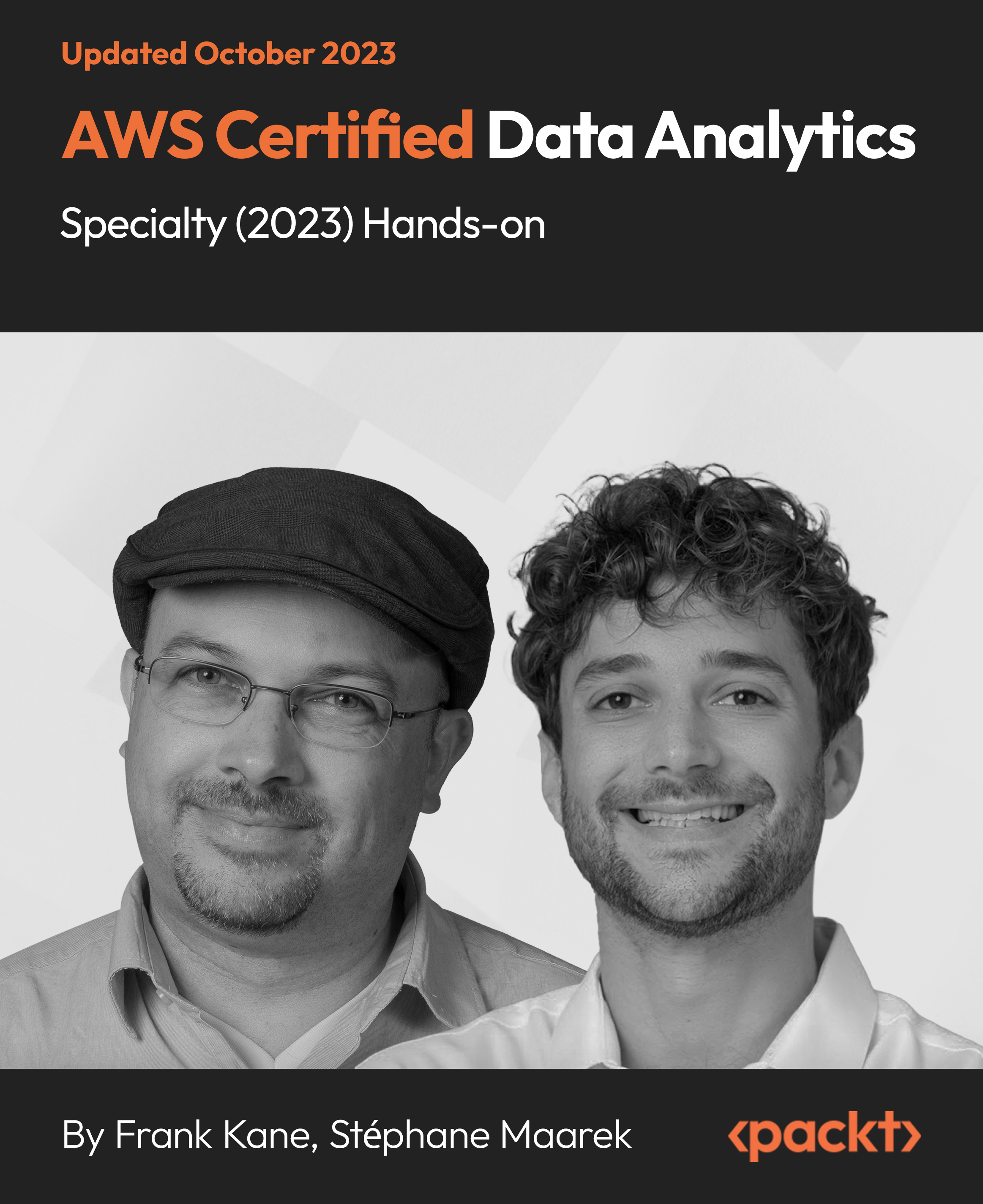
AWS Certified Data Analytics Specialty (2023) Hands-on
By Packt
This course covers the important topics needed to pass the AWS Certified Data Analytics-Specialty exam (AWS DAS-C01). You will learn about Kinesis, EMR, DynamoDB, and Redshift, and get ready for the exam by working through quizzes, exercises, and practice exams, along with exploring essential tips and techniques.
Overview This comprehensive course on Interactive Dashboards with Data Studio will deepen your understanding on this topic. After successful completion of this course you can acquire the required skills in this sector. This Interactive Dashboards with Data Studio comes with accredited certification, which will enhance your CV and make you worthy in the job market. So enrol in this course today to fast track your career ladder. How will I get my certificate? You may have to take a quiz or a written test online during or after the course. After successfully completing the course, you will be eligible for the certificate. Who is This course for? There is no experience or previous qualifications required for enrolment on this Interactive Dashboards with Data Studio. It is available to all students, of all academic backgrounds. Requirements Our Interactive Dashboards with Data Studio is fully compatible with PC's, Mac's, Laptop, Tablet and Smartphone devices. This course has been designed to be fully compatible with tablets and smartphones so you can access your course on Wi-Fi, 3G or 4G. There is no time limit for completing this course, it can be studied in your own time at your own pace. Career Path Having these various qualifications will increase the value in your CV and open you up to multiple sectors such as Business & Management, Admin, Accountancy & Finance, Secretarial & PA, Teaching & Mentoring etc. Course Curriculum 2 sections • 5 lectures • 02:41:00 total length •Module 01: Introduction to GDS: 00:36:00 •Module 02: Data Visualization: 01:29:00 •Module 03: Geo-visualization: 00:16:00 •Module 04: A Socio-Economic Case Study: 00:20:00 •Assignment - Interactive Dashboards with Data Studio: 00:00:00

Power BI: Dashboard in a Day
By Nexus Human
Duration 1 Days 6 CPD hours This course is intended for The Power BI in a Day course is designed for beginners and intermediate users of Power BI. Overview #NAME? Students will discover the full capabilities of Power BI in a one-day, hands-on workshop. Please Note: This workshop is primarily self-directed and students will work at their own pace while having access to an instructor for questions. 1 - Accessing & Preparing data Data Set Power BI Desktop Power BI Desktop ? Accessing Data Power BI Desktop ? Data Preparation 2 - Data Modeling and Exploration Power BI Desktop ? Data Modeling and Exploration Power BI Desktop ? Data Exploration Continued References 3 - Data Visualization Power BI Desktop Power BI Desktop ? Data Visualization References 4 - Publishing & Accessing Reports Power BI Desktop ? Creating Mobile View Power BI Service Power BI Service ? Publishing Report Power BI Mobile ? Accessing Report on Mobile Device Power BI Service ? Collaboration and Distribution References 5 - Dashboard and Collaboration Power BI Service Building Dashboard References Additional course details: Nexus Humans Power BI: Dashboard in a Day training program is a workshop that presents an invigorating mix of sessions, lessons, and masterclasses meticulously crafted to propel your learning expedition forward. This immersive bootcamp-style experience boasts interactive lectures, hands-on labs, and collaborative hackathons, all strategically designed to fortify fundamental concepts. Guided by seasoned coaches, each session offers priceless insights and practical skills crucial for honing your expertise. Whether you're stepping into the realm of professional skills or a seasoned professional, this comprehensive course ensures you're equipped with the knowledge and prowess necessary for success. While we feel this is the best course for the Power BI: Dashboard in a Day course and one of our Top 10 we encourage you to read the course outline to make sure it is the right content for you. Additionally, private sessions, closed classes or dedicated events are available both live online and at our training centres in Dublin and London, as well as at your offices anywhere in the UK, Ireland or across EMEA.

Looker Bootcamp: Analyzing and Visualizing Data with Looker (TTDVLK02)
By Nexus Human
Duration 2 Days 12 CPD hours This course is intended for The audience for this course includes professionals who are new to Looker who are interested in leveraging Looker for data analysis, visualization, and reporting. The course is designed for individuals seeking to gain a comprehensive understanding of Looker's functionalities and apply these skills in their organizations to drive data-driven decision-making. Overview This course combines expert lecture, real-world demonstrations and group discussions with machine-based practical labs and exercises. Working in a hands-on learning environment led by our expert facilitator, you'll explore and gain: Comprehensive understanding of Looker's platform: Gain a solid foundation in Looker's key features, functionality, and interface, enabling you to navigate and utilize the platform effectively for your data analysis and visualization needs. Mastery of LookML and data modeling: Develop proficiency in Looker's unique data modeling language, LookML, to create customized and efficient data models that cater to your organization's specific requirements. Expertise in creating insightful Explores: Learn to build, customize, and save Explores with dimensions, measures, filters, and calculated fields, empowering you to analyze your data and uncover valuable insights. Proficiency in dashboard design and sharing: Acquire the skills to design visually appealing and informative dashboards, share them with different user roles, and schedule exports to keep stakeholders informed and up-to-date. Enhanced content organization with folders and boards: Understand how to effectively use folders and boards to organize, manage, and discover content within Looker, making it easily accessible for you and your team. Optional: Advanced visualization techniques for impactful storytelling: Master advanced visualization techniques, including customizations with HTML, CSS, and JavaScript, and interactive visualizations using Looker's API, to create compelling data stories that resonate with your audience. Discover the power of data analytics and visualization with our hands-on, two-day introductory course Looker Bootcamp: Analyzing and Visualizing Data with Looker. Designed for professionals who want to unlock valuable insights from their data, this immersive training experience will guide you through Looker's cutting-edge features and provide you with the essential skills to create engaging, interactive, and insightful reports and dashboards. Our experienced trainers will take you on a journey from the fundamentals of Looker and its unique data modeling language, LookML, to advanced visualization techniques and content organization strategies, ensuring you leave the course equipped to make data-driven decisions with confidence. Throughout the course, you will have the opportunity to participate in practical exercises and workshops that will help you apply the concepts and techniques learned in real-world scenarios. You will explore the potential of Looker's Explores, dive into LookML's capabilities, and master the art of dashboard design and sharing. Learn how to organize and manage your content with folders and boards and harness the power of advanced visualization techniques to make your data come alive. Getting Started with Looker Overview of Looker and its key features Navigating the Looker interface Looker terminology and basic concepts Connecting to Data Sources Setting up and managing data connections Exploring database schemas Understanding LookML: Looker's data modeling language Creating and Customizing Explores Building and customizing Explores Adding dimensions, measures, and filters Creating calculated fields Saving and organizing Explores Data Visualization Creating visualizations using Looker's visualization library Customizing chart types, colors, and labels Displaying visualizations in dashboards Introduction to Looker's API for custom visualizations Advanced Explores and LookML LookML refresher and best practices Creating derived tables and data transformations Managing access controls and data permissions Organizing and Sharing Content with Folders and Boards Introduction to folders and boards in Looker Creating and managing folders for organizing content Setting up boards for easy content discovery Sharing folders and boards with different user roles and permissions Dashboard Design and Sharing Best practices for dashboard design Adding, arranging, and resizing visualizations Scheduling and exporting dashboard data Advanced Visualization Techniques Customizing visualizations with HTML, CSS, and JavaScript Creating interactive visualizations using Looker's API Integrating Looker visualizations with other tools Hands-on Workshop and Project Participants work on a guided project to apply the skills learned Trainer provides individual support and guidance Project Presentations, Q&A, and Training Wrap-up Additional course details: Nexus Humans Looker Bootcamp: Analyzing and Visualizing Data with Looker (TTDVLK02) training program is a workshop that presents an invigorating mix of sessions, lessons, and masterclasses meticulously crafted to propel your learning expedition forward. This immersive bootcamp-style experience boasts interactive lectures, hands-on labs, and collaborative hackathons, all strategically designed to fortify fundamental concepts. Guided by seasoned coaches, each session offers priceless insights and practical skills crucial for honing your expertise. Whether you're stepping into the realm of professional skills or a seasoned professional, this comprehensive course ensures you're equipped with the knowledge and prowess necessary for success. While we feel this is the best course for the Looker Bootcamp: Analyzing and Visualizing Data with Looker (TTDVLK02) course and one of our Top 10 we encourage you to read the course outline to make sure it is the right content for you. Additionally, private sessions, closed classes or dedicated events are available both live online and at our training centres in Dublin and London, as well as at your offices anywhere in the UK, Ireland or across EMEA.

Next-Level PowerBI for Experienced Users (TTDPB02)
By Nexus Human
Duration 2 Days 12 CPD hours This course is intended for This is an Intermediate PowerBI course geared for experienced users who wish to leverage the tool's more advanced capabilities Overview This course is about 50% hands-on lab and 50% lecture, designed to train attendees in essential PowerBI data handling functions and reporting skills, coupling the most current, effective techniques with the soundest practices. Attendees of this course will gain practical examples from the experienced instructor who has deployed and configured Power BI reporting in a wide variety of businesses. Working in a hands-on learning environment led by our expert facilitator, students will learn how to: Create Advanced Power BI Reports Advanced understanding of the data schemas and extracting data Perform advanced transformations of data or any data schema Utilize time-phased data in the creation of complex analyses Create new measures using DAX Filter data using row-level security Create and deploy content packs Use Power BI to integrate with line-of-business applications Next Level Power BI for Experienced Users is a two day, course that provides attendees already experienced with Microsoft Power BI basics with a hands-on exploration of intermediate and beyond level features. This course is geared for attendees ready to learn the advanced techniques that you, your business analysts, and your stakeholders need to create complex information from projects, program, and portfolio reporting to utilizing time-phased data and, potentially, data from your enterprise?s other line-of-business tools. Get Project Online Data Select and mine relevant tables with ODATA Advanced ODATA data mining Importing other data formats Advanced Editing of data queries Advanced Data Transformations Managing table relationships Creating & using data hierarchies Creating custom columns and measures and metrics for filtering and reporting Creating Power BI Reports Using advanced visualizations Configuring drill-down Modifying visual interactions Importing and creating custom visuals Configure Power BI Security Creating Dashboard and row-level security Utilizing Filtering using row-level security Publishing Reports and Dashboards Building Mobile Reporting Creating and deploying content packs Configuring natural language query

Power BI - dashboards (1 day) (In-House)
By The In House Training Company
Power BI is a powerful data visualisation program that allows businesses to monitor data, analyse trends, and make decisions. This course is designed to provide a solid understanding of the reporting side of Power BI, the dashboards, where administrators, and end users can interact with dynamic visuals that communicates information. This course focuses entirely on the creation and design of visualisations in dashboards, including a range of chart types, engaging maps, and different types of tables. Designing dashboards with KPI's (key performance indicators), heatmaps, flowcharts, sparklines, and compare multiple variables with trendlines. This one-day programme focuses entirely on creating dashboards, by using the many visualisation tools available in Power BI. You will learn to build dynamic, user-friendly interfaces in both Power BI Desktop and Power BI Service. 1 Introduction Power BI ecosystem Things to keep in mind Selecting dashboard colours Importing visuals into Power BI Data sources for your analysis Joining tables in Power BI 2 Working with data Utilising a report theme Table visuals Matrix visuals Drilling into hierarchies Applying static filters Group numbers with lists Group numbers with bins 3 Creating visuals Heatmaps in Power BI Visualising time-intelligence trends Ranking categorical totals Comparing proportions View trends with sparklines 4 Comparing variables Insert key performance indicators (KPI) Visualising trendlines as KPI Forecasting with trendlines Visualising flows with Sankey diagrams Creating a scatter plot 5 Mapping options Map visuals Using a filled map Mapping with latitude and longitude Mapping with ArcGIS or ESRI 6 Creating dashboards High-level dashboard Migration analysis dashboard Adding slicers for filtering Promote interaction with nudge prompts Searching the dashboard with a slicer Creating dynamic labels Highlighting key points on the dashboard Customised visualisation tooltips Syncing slicers across pages 7 Sharing dashboards Setting up and formatting phone views Exporting data Creating PDF files Uploading to the cloud Share dashboards in SharePoint online
