- Professional Development
- Medicine & Nursing
- Arts & Crafts
- Health & Wellbeing
- Personal Development
709 Microsoft courses in Cardiff delivered Live Online
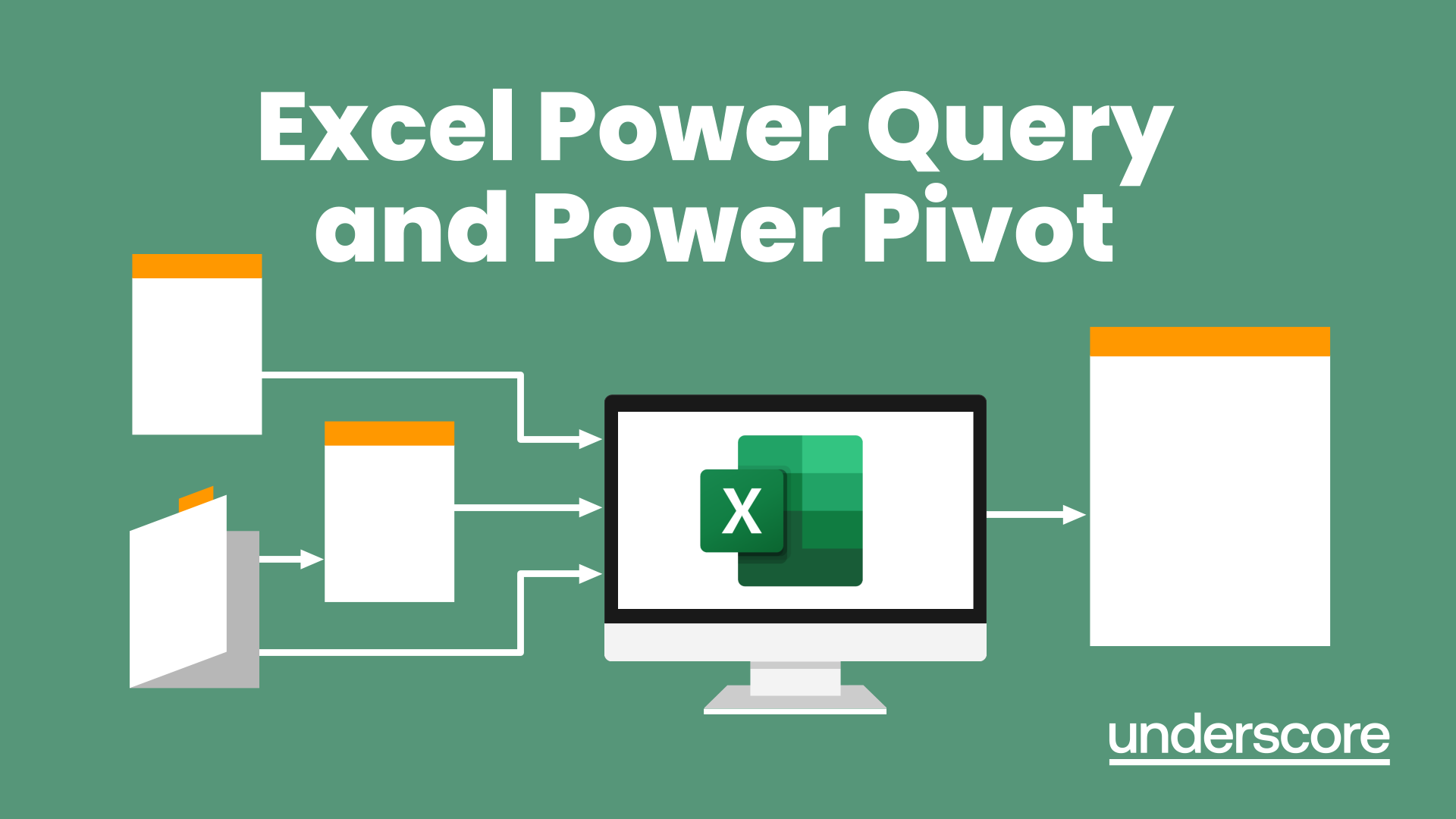
Excel Power Query and Power Pivot
By Underscore Group
Learn how to work with and connect multiple data sets to effectively analyse and report on data. Course overview Duration: 1 day (6.5 hours) Within Excel you have some powerful features to enable you to connect and analyse multiple data sources. Power Query enables you to import and manipulate your data, Power Pivot enables you to connect multiple data sources and create pivot tables and pivot charts from them. This course is an introduction to Power Query and Power Pivot in Excel to get you started on creating a powerful reporting capability. Knowledge of working with Excel workbooks and relational databases would be an advantage. Objectives By the end of the course you will be able to: Import data from multiple data sources Edit and transform data before importing Add extra columns of data Append data Merge data from other tables Create data models Build data relationships Build Pivot Tables Build Pivot Charts Use Slicers and Timeline Filters Content Importing data Data sources Importing data Transforming data Editing your data Setting data types Removing columns/rows Choosing columns to keep Setting header rows Splitting columns Appending queries Appending data from other tables Adding text Columns from example Custom columns Conditional columns Merge queries Setting up and using merge queries Merging in columns of data Creating a data model The data model Multiple data tables Connecting tables Building relationships Relationship types Building visuals from multiple tables Analysing information using pivot tables Creating and modifying a Pivot Table Recalculating the Pivot Table Filtering the Pivot Table Searching the Pivot Table Drilling down to underlying data Customising field names Changing field formatting Pivot charts, slices and timelines Creating Pivot Charts Adding and using Slicers
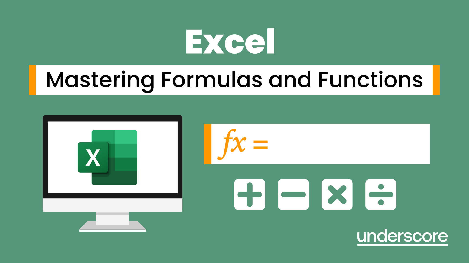
Excel - Mastering Formulas and Functions
By Underscore Group
Ideal for those already using Excel but who really want to get to grips with formulas and functions. Course overview Duration: 1 day (6.5 hours) Our Excel Mastering Formulas and Functions course looks at how to confidently use formulas and functions within Excel. It looks at how to correctly construct formulas and explains how to build common formulas such as working with percentages. It investigates a range of built in Excel functions and shows you how to use the formula auditing tools to help when things go wrong. This course is aimed at existing users of Excel who want to further their skills. Participants should be able to confidently create and amend worksheets. Objectives By the end of the course you will be able to: Construct Formulas Use a range of common Functions Work with absolute and relative references in formulas Create percentage calculations Use named ranges in formulas Use the XLOOKUP command Create formulas with date and use date functions Use formulas in conditional formatting Use a range of Count functions Use the formula auditing tools Content Formulas vs Functions Constructing formulas Using functions Common Excel functions Using the function wizard vs the formula bar Formulas in tables Absolute vs relative references in formulas Using absolute references in formulas Using partial absolute referencing Range Naming Naming ranges Using range names in formulas Single and multi-cell ranges Working with percentages Creating formulas with percentages Percentage breakdowns Percentage increases Formatting as a percentage Using Lookups Using XLOOKUP to insert information from other spreadsheets Calculating with dates Calculating with dates Using date functions Using formulas in conditional formatting Using conditional formulas Using functions in conditional formatting Count functions COUNT COUNTA COUNTBLANK Formula auditing Using the auditing facility Tracing how formulas are made up Tracing precedents and dependants Evaluating formulas Error checking Showing formulas on a sheet
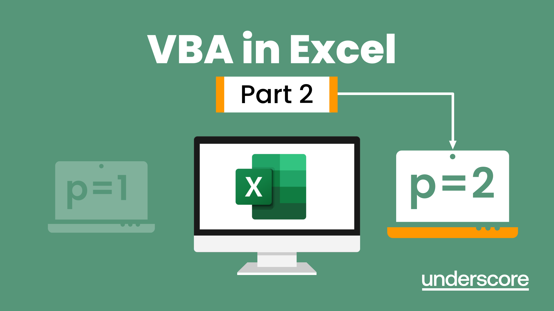
VBA in Excel - Part 2
By Underscore Group
Expand your VBA knowledge further and learn some of the more advanced coding features. Course overview Duration: 2 days (13 hours) This course is aimed at experienced VBA users or those who have attended our Part 1 course and have started to use the language. Part 2 expands on the huge array of commands and elements of the data model that can be used and looks at building more complex VBA models Objectives By the end of the course you will be able to: Use comparison operators and system functions Use Arrays Work with ranges Work with the worksheets and workbooks collections and objects Use application objects Use the FileSystemObject Create function procedures Import and save text files Connect to other applications Content Comparison operators Using Comparison operators and functions The LIKE function Wildcards Using SELECT Case System functions The VAL function Case functions Trim functions Text functions Date functions Excel worksheet functions Using Excel functions in VBA Arrays Creating arrays Using arrays Ubound and Lbound Single and multi dimensional arrays Static vs dynamic arrays Working with ranges Creating range objects Passing data between range objects and arrays Using Transpose The Excel object model The object browser Working with collections Collections Creating object variables Setting object variables The For Each . . . Next Loo Sheet collections The worksheets collection The worksheet object The sheets collection Using object Grouping worksheets Using Typename The Workbook collection The workbooks collection Setting workbook variables Application objects Excel default information Display/alerts Screen updating Status bar On Time Using Wait Systems dialog boxes Showing dialog boxes Using dialog boxes Working with files Searching for files and folders The DIR function The FileSystemObject Function procedures Creating functions Adding arguments Calling functions Working with text files Searching for files and folders The DIR function The FileSystemObject Using the FILE and FOLDER collections Sharing data with other applications Early vs Late Binding Setting references to other applications Creating application variables Setting application variables
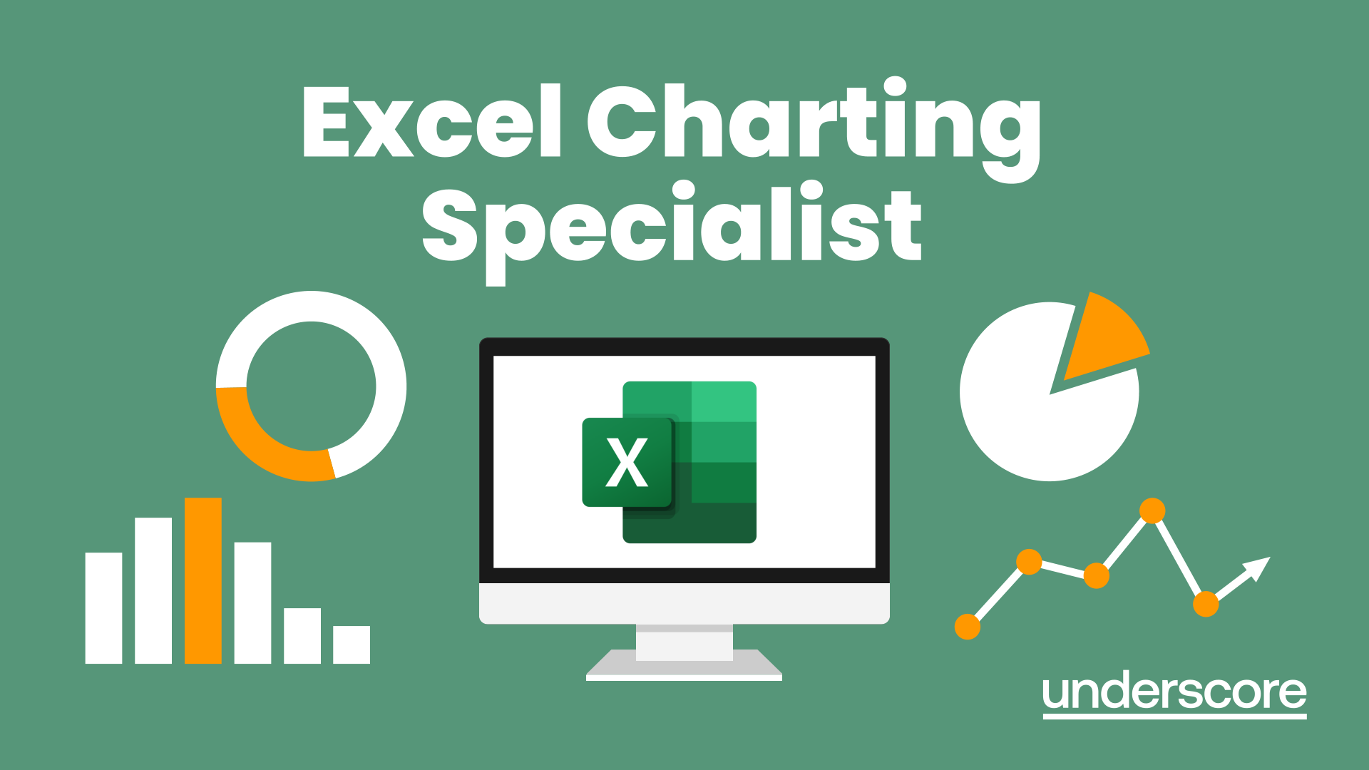
Excel Charting Specialist
By Underscore Group
Look at the in depth features of charts and some specialist tools to make your charts come to life. Course overview Duration: 1 day (6.5 hours) Our Excel Charting Specialist course examines how to unlock the full potential of Charts in Excel. It investigates the useful tools needed for creating bespoke Charts, allowing you to creatively present data more visually. By the end of the course, you will have an awareness of the tools used for creating more advanced Charts and will be able to create your own Dynamic Charts. The course is designed for existing users of Excel who are looking at more advanced ways to visualise data in Excel using Charts. Objectives By the end of the course you will be able to: Create and Amend Charts Format multiple areas of a Chart Use a Combo Chart Apply Conditional Formatting to a Chart Create Dynamic Charts Work with Custom Formatting Create an Advanced Dynamic Chart Content Creating and amending charts Creating Simple Charts Using the Chart Design tab Adding Chart Elements Changing the type of Chart Formatting charts Format Chart Area Format Data Series Format Data Point Format Axis Working with combo charts Adding additional data to a Chart Customising Chart types Creating Clustered Column/line Charts Applying conditional formatting on charts Using IF Statements Highlighting Max/Min Data points in Charts Using Series Overlap Dynamic charts Creating dynamic Target vs Actual Charts Introducing the NA function Hiding data used for Charts Custom formatting charts Formatting Data Labels Customising number formats Using Trend Arrows to show changes Editing Format Code Advanced dynamic charts Pivot Chart rules Creating a Pivot Chart Working with your Pivot Chart Creating calculations Combining all elements to create an Advanced Chart Using Error Bars to create a line Adding a scroll bar and linking with data
DP-060T00 Migrate NoSQL workloads to Azure Cosmos DB
By Nexus Human
Duration 1 Days 6 CPD hours This course is intended for The primary audience for this course is database developers who plan to migrate their MongoDB or Cassandra DB workloads to Azure using Cosmos DB. Overview Building Globally Distributed Applications with Cosmos DB Migrate MongoDB Workloads to Cosmos DB Migrate Cassandra DB Workloads to Cosmos DB This course will teach the students what is Cosmos DB and how you can migrate MongoDB and Cassandra workloads to Cosmos DB. Building Globally Distributed Applications with Cosmos DB Cosmos DB overview Cosmos DB APIs Provisioning Throughput Partitioning/Sharding Best Practices Migrate MongoDB Workloads to Cosmos DB Understand Migration Benefits Migration Planning Data Migration Application Migration Post-migration considerations Migrate Cassandra DB Workloads to Cosmos DB Understand Migration Benefits Migration Planning Data Migration Application Migration Post-migration considerations Additional course details: Nexus Humans DP-060T00 Migrate NoSQL workloads to Azure Cosmos DB training program is a workshop that presents an invigorating mix of sessions, lessons, and masterclasses meticulously crafted to propel your learning expedition forward. This immersive bootcamp-style experience boasts interactive lectures, hands-on labs, and collaborative hackathons, all strategically designed to fortify fundamental concepts. Guided by seasoned coaches, each session offers priceless insights and practical skills crucial for honing your expertise. Whether you're stepping into the realm of professional skills or a seasoned professional, this comprehensive course ensures you're equipped with the knowledge and prowess necessary for success. While we feel this is the best course for the DP-060T00 Migrate NoSQL workloads to Azure Cosmos DB course and one of our Top 10 we encourage you to read the course outline to make sure it is the right content for you. Additionally, private sessions, closed classes or dedicated events are available both live online and at our training centres in Dublin and London, as well as at your offices anywhere in the UK, Ireland or across EMEA.

Power BI - dashboards (1 day) (In-House)
By The In House Training Company
Power BI is a powerful data visualisation program that allows businesses to monitor data, analyse trends, and make decisions. This course is designed to provide a solid understanding of the reporting side of Power BI, the dashboards, where administrators, and end users can interact with dynamic visuals that communicates information. This course focuses entirely on the creation and design of visualisations in dashboards, including a range of chart types, engaging maps, and different types of tables. Designing dashboards with KPI's (key performance indicators), heatmaps, flowcharts, sparklines, and compare multiple variables with trendlines. This one-day programme focuses entirely on creating dashboards, by using the many visualisation tools available in Power BI. You will learn to build dynamic, user-friendly interfaces in both Power BI Desktop and Power BI Service. 1 Introduction Power BI ecosystem Things to keep in mind Selecting dashboard colours Importing visuals into Power BI Data sources for your analysis Joining tables in Power BI 2 Working with data Utilising a report theme Table visuals Matrix visuals Drilling into hierarchies Applying static filters Group numbers with lists Group numbers with bins 3 Creating visuals Heatmaps in Power BI Visualising time-intelligence trends Ranking categorical totals Comparing proportions View trends with sparklines 4 Comparing variables Insert key performance indicators (KPI) Visualising trendlines as KPI Forecasting with trendlines Visualising flows with Sankey diagrams Creating a scatter plot 5 Mapping options Map visuals Using a filled map Mapping with latitude and longitude Mapping with ArcGIS or ESRI 6 Creating dashboards High-level dashboard Migration analysis dashboard Adding slicers for filtering Promote interaction with nudge prompts Searching the dashboard with a slicer Creating dynamic labels Highlighting key points on the dashboard Customised visualisation tooltips Syncing slicers across pages 7 Sharing dashboards Setting up and formatting phone views Exporting data Creating PDF files Uploading to the cloud Share dashboards in SharePoint online

Power BI - introduction (2 day) (In-House)
By The In House Training Company
There is a lot to learn in Power BI, this course takes a comprehensive look at the fundamentals of analysing data and includes a balanced look at the four main components that make up Power BI Desktop: Report view, Data view, Model view, and the Power Query Editor. It also demonstrates how to utilise the online Power BI service. It looks at authoring tools that enable you to connect to and transform data from a variety of sources, allowing you to produce detailed reports through a range of visualisations, in an interactive and dynamic way. It also includes a detailed look at formulas by writing both M functions in Power Query, and DAX functions in Desktop view. This knowledge will allow you to take your reports to the next level. The aim of this course is to provide a complete introduction to understanding the Power BI analysis process, by working hands-on with examples that will equip you with the necessary skills to start applying your learning straight away. 1 Getting Started The Power BI ecosystem Opening Power BI Desktop Power BI's four views Introduction to Dashboards 2 Importing Files Importing data sources Importing an Excel file Importing a CSV file Importing a database Connect to an SQL Server Database Import vs. Direct Query Importing from the web Importing a folder of files Managing file connections 3 Shape Data in the Query Editor The process of shaping data Managing data types Keeping and removing rows Add a custom column Appending tables together Hiding queries in reports Fixing error issues Basic maths operations 4 The Data Model Table relationships Relationship properties 5 Merge Queries Table join kinds Merging tables 6 Inserting Dashboard Visuals Things to keep in mind Inserting maps Formatting Maps Inserting charts Formatting Charts Inserting a tree map Inserting a table, matrix, and card Controlling number formats About report themes Highlighting key points Filter reports with slicers Sync slicers across dashboards Custom web visuals 7 Publish and share Reports Publishing to Power BI service Editing online reports Pinning visuals to a dashboard What is Q&A? Sharing dashboards Exporting reports to PowerPoint Exporting reports as PDF files 8 The Power Query Editor Fill data up and down Split column by delimiter Add a conditional column More custom columns Merging columns 9 The M Functions Inserting text functions Insert an IF function Create a query group 10 Pivoting Tables Pivot a table Pivot and append tables Pivot but don't aggregate Unpivot tables Append mismatched headers 11 Data Modelling Expanded Understanding relationships Mark a date table 12 DAX New Columns New columns and measures New column calculations Insert a SWITCH function 13 Introduction to DAX Measures Common measure functions Insert a SUM function Insert a COUNTROWS function Insert a DISTINCTCOUNT function Insert a DIVIDE function DAX rules 14 The CALCULATE Measure The syntax of CALCULATE Insert a CALCULATE function Control field summarisation Things of note 15 The SUMX measure X iterator functions Anatomy of SUMX Insert a SUMX function When to use X functions 16 Time Intelligence Measures Importance of a calendar table Insert a TOTALYTD function Change financial year end date Comparing historical data Insert a DATEADD function 17 Hierarchies and Groups Mine data using hierarchies Compare data in groups
Power BI - intermediate (2 day) (In-House)
By The In House Training Company
This course is designed for those already using Power BI Desktop and are ready to work with more comprehensive elements of analysing and reporting in Power BI. The course maintains a balanced look at data analysis including the Power Query Editor, with a deep dive into writing DAX formulas, and enhanced dashboard visualisations. The aim of this course is to provide a more complete understanding of the whole Power BI analytics process, by working with business examples that will equip you with the necessary skills to output comprehensive reports and explore Power BI's analytical capabilities in more depth. 1 The Query Editor Grouping rows in a table Split row by delimiter Add days to determine deadlines The query editor 2 Fuzzy Matching Joins Matching inconsistencies by percentage Matching with transformation table 3 The Query Editor M Functions Adding custom columns Creating an IF function Nested AND logics in an IF function 4 DAX New Columns Functions Including TRUE with SWITCH Using multiple conditions The FIND DAX function The IF DAX function Logical functions IF, AND, OR 5 Editing DAX Measures Making DAX easier to read Add comments to a measure Using quick measures 6 The Anatomy of CALCULATE Understanding CALCULATE filters Add context to CALCULATE with FILTER Using CALCULATE with a threshold 7 The ALL Measure Anatomy of ALL Create an ALL measure Using ALL as a filter Use ALL for percentages 8 DAX Iterators Anatomy of iterators A closer look at SUMX Using RELATED with SUMX Create a RANKX RANKX with ALL 9 Date and Time Functions Overview of functions Create a DATEDIFF function 10 Time Intelligent Measures Compare historical monthly data Create a DATEADD measure Creating cumulative totals Creating cumulative measures Visualising cumulative totals 11 Visualisations In-Depth Utilising report themes Applying static filters Group data using lists Group numbers using bins Creating heatmaps Comparing proportions View trends with sparklines 12 Comparing Variables Visualising trendlines as KPI Forecasting with trendlines Creating a scatter plot Creating dynamic labels Customised visualisation tooltips Export reports to SharePoint
Power BI - advanced (1 day) (In-House)
By The In House Training Company
This course starts with data transformation strategies, exploring capabilities in the Power Query Editor, and data-cleansing practices. It looks at the Advanced Query Editor to view the M language code. This course focuses on advanced DAX measures that include filtering conditions, with a deep dive into time intelligence measures. Like the M query language, DAX is a rich functional language that supports variables and expression references. This course also looks at the creation of dynamic dashboards and incorporates a range of visualisations available in Power BI Desktop and online in the AppSource. The course finishes with a look at setting up end user level security in tables. 1 The query editor Split by row delimiter AddDays to determine deadlines Advanced query editor 2 Fuzzy matching joins Matching inconsistencies by percentage Matching with transformation table 3 Logical column functions Logical functions IF, AND, OR Using multiple conditions Including FIND in functions 4 Editing DAX measures Make DAX easier to read Add comments to a measure Using quick measures 5 The anatomy of CALCULATE Understanding CALCULATE context filters Adding context to CALCULATE with FILTER Using CALCULATE with a threshold 6 The ALL measure Anatomy of ALL Create an ALL measure Using ALL as a filter Use ALL for percentage 7 DAX iterators Anatomy of iterators A closer look at SUMX Using RELATED in SUMX Create a RANKX RANKX with ALL 8 Date and time functions Overview of functions Create a DATEDIFF function 9 Time intelligent measures Compare historical monthly data Create a DATEADD measure Creating cumulative totals Creating cumulative measures Visualising cumulative totals 10 Visualisations in-depth Utilising report themes Create a heatmap Comparing proportions View trends with sparklines Group numbers using bins Setting up a histogram 11 Comparing variables Visualising trendlines as KPI Forecasting with trendlines Creating a scatter plot Creating dynamic labels Customised visualisation tooltips Export reports to SharePoint 12 User level security Setting up row level security Testing user security
Power BI - introduction to intermediate (2 days) (In-House)
By The In House Training Company
This course starts with the basics then moves seamlessly to an intermediate level. It includes a comprehensive yet balanced look at the four main components that make up Power BI Desktop: Report view, Data view, Model view, and the Power Query Editor. It also demonstrates how to use the online Power BI service. It looks at authoring tools that enables you to connect to and transform data from a variety of sources, allowing you to produce dynamic reports using a library of visualisations. Once you have those reports, the course looks at the seamless process of sharing those with your colleagues by publishing to the online Power BI service. The aim of this course is to provide a strong understanding of the Power BI analysis process, by working with real-world examples that will equip you with the necessary skills to start applying your knowledge straight away. 1 Getting started The Power BI process Launching Power BI Desktop The four views of Power BI Dashboard visuals 2 Connecting to files Connect to data sources Connect to an Excel file Connect to a CSV file Connect to a database Import vs. DirectQuery Connect to a web source Create a data table 3 Transforming data The process of cleaning data Column data types Remove rows with filters Add a custom column Append data to a table Fix error issues Basic maths operations 4 Build a data model Table relationships Manage table relationships 5 Merge queries Table join kinds Merging tables 6 Create report visualisations Creating map visuals Formatting maps Creating chart visuals Formatting chart Tables, matrixes, and cards Control formatting with themes Filter reports with slicers Reports for mobile devices Custom online visuals Export report data to Excel 7 The power query editor Fill data up and down Split columns by delimiter Add conditional columns Merging columns 8 The M formula Creating M functions Create an IF function Create a query group 9 Pivot and unpivot tables Pivot tables in the query editor Pivot and append tables Pivot but don't summarise Unpivot tables Append mismatched headers 10 Data modelling revisited Data model relationships Mark a calendar as a date table 11 Introduction to calculated columns New columns vs. measures Creating a new column calculation The SWITCH function 12 Introduction to DAX measures Common measure categories The SUM measure Adding measures to visuals COUNTROWS and DISINCTCOUNT functions DAX rules 13 The CALCULATE measure The syntax of CALCULATE Things of note about CALCULATE 14 The SUMX measure The SUMX measure X iterator functions Anatomy of SUMX 15 Introduction to time intelligence Importance of a calendar table A special lookup table The TOTALYTD measure Change year end in TOTALYTD 16 Hierarchy, groups and formatting Create a hierarchy to drill data Compare data in groups Add conditional formatting 17 Share reports on the web Publish to the BI online service Get quick insights Upload reports from BI service Exporting report data What is Q&A? Sharing your reports 18 Apply your learning Post training recap lesson