- Professional Development
- Medicine & Nursing
- Arts & Crafts
- Health & Wellbeing
- Personal Development
77 Courses in Nottingham delivered Live Online
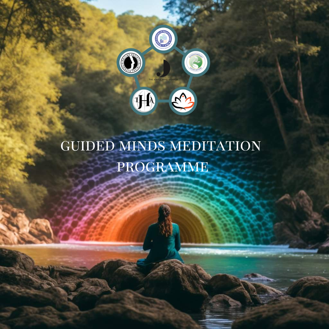
🌿 Guided Minds: A 12-Month Meditation Journey Create calm, clarity & connection—one month at a time. Guided Minds is a year-long meditation programme designed to help you build a sustainable, enriching practice through monthly themes, supportive sessions, and practical tools for real life. Whether you're new to meditation or looking to deepen your experience, this programme will guide you with compassion and clarity. 🔁 Programme Format Weekly Live Sessions (Online & In-Person) Monthly Themes & Challenges Guided Meditations & Practices Supportive Community Access to Session Recordings Join monthly or commit to the full journey—the choice is yours. 🌟 Monthly Themes Overview July: Making Meditation a Healthy Habit Learn how to create a sustainable daily practice using breath, posture and science-backed techniques. ✔️ Relaxation response ✔️ Meditation for clarity & calm ✔️ Core practices: breath, posture, stillness ✔️ In-person Session 5: “Pulling It All Together” August: Meditation & Mindfulness Focus on the profound benefits of meditation: ✔️ Stress relief, heart health, immunity ✔️ Slowing ageing, boosting self-compassion ✔️ 3 Principles: Habituation, Wisdom, Openheartedness ✔️ Diamond Dedication Meditation September: Calming a Wandering Mind Tame your busy mind through simple, powerful practices. ✔️ Focused attention vs. mind-wandering ✔️ Thought loops & rumination ✔️ Colour, mantra & visualisation meditations ✔️ Mindfulness of thought October: Creating a Mindful Life Bring mindfulness into everyday moments. ✔️ Living in the now ✔️ Radical acceptance & surrender ✔️ Senses as anchors: sound, touch, breath ✔️ Showing up fully for life November: Meditation for Stress Relief Practical methods to manage stress & emotional overload. ✔️ Good vs. bad stress ✔️ The ego, fight/flight, and impermanence ✔️ Gratitude & visualisation ✔️ Overcoming obstacles to meditation December: Rest & Reflection Warm the heart and calm the mind before the holidays. ✔️ Body-based awareness ✔️ Reviewing your progress ✔️ Meditations for resilience ✔️ Peaceful practices for winter January: Meditation for Positive Emotions Start the year with joy, love, and purpose. ✔️ Heart-opening meditations ✔️ Gratitude & happiness ✔️ Intention-setting with optional cacao ceremony ✔️ Emotional healing & connection February: Meditation for Well-Being A holistic approach to health from the inside out. ✔️ Four foundations of mindfulness ✔️ Forgiveness (including Huna meditations) ✔️ Body-mind connection ✔️ Compassion and curiosity March: Deeper into Meditation Explore advanced techniques with renewed clarity. ✔️ Insight, wisdom, open-heartedness ✔️ Posture & Nine-Cycle Breathing ✔️ Concentration & mental clarity ✔️ Appreciation for life April: Meditation for Relaxation Recharge your nervous system with rest-focused meditations. ✔️ Body scan & breath awareness ✔️ Guided deep relaxation ✔️ Calming anxiety & overactivity ✔️ Rest as a radical act May: The Art of Living Live with intention and reverence. ✔️ Meditation on impermanence & emptiness ✔️ Self-love & emotional nourishment ✔️ Present moment awareness ✔️ Breath as a life companion June: Meditation on Inner Peace End the year rooted, spacious, and unshakable. ✔️ Letting go of resistance ✔️ Unflappability & mental resilience ✔️ Responsibility & self-awareness ✔️ Lasting inner calm and clarity 💷 Pricing Options Online sessions: £10 each In-person sessions: £15 each Join the Guided Minds Meditation Community for £28/month ✓ Includes all sessions (online & in-person) ✓ Unlimited access to recordings ✓ Bonus practices & group support 🌱 Ready to begin? Each month offers a new opportunity to reset, reflect and grow. Join any time, or commit to the full year and transform your relationship with your mind, body and life.
Effective Data Visualisation
By Nexus Human
Duration 2 Days 12 CPD hours This course is intended for This course is aimed at anyone currently working with data who is interested in using data visualisation to more effectively communicate their results. Overview At completion, delegates will understand how data visualisations can be best used to communicate actionable insights from data and be competent with the tools required to do it. Visualising data, and analytics results, is one of the most effective ways to achieve this. This course will cover the theory of data visualisation along with practical skills for creating compelling visualisations from data. Course Outline The use of analytics, statistics and data science in business has grown massively in recent years. Harnessing the power of data is opening actionable insights in diverse industries from banking to horse breeding. The companies doing this most successfully understand that using sophisticated analytics approaches to unlock insights from data is only half the job. Communicating these insights to all of the different parts of an organisation is just as important as doing the actual analysis. Visualising data, and analytics results, is one of the most effective ways to achieve this. This course will cover the theory of data visualisation along with practical skills for creating compelling visualisations from data. To attend this course delegates should be competent in the use of data analysis tools such as reporting tools, spreadsheet software or business intelligence tools. The course will explore the following topics through a series of interactive workshop sessions: Fundamentals of data visualisation Data characteristics & dimensions Mapping visual encodings to data dimensions Colour theory Graphical perception & communication Interaction design Visualisation different characteristics of data: trends, comparisons, correlations, maps, networks, hierarchies, text Designing effective dashboards
Advanced Kibana training course description This training course is aimed at users who already have some experience with Kibana, who are looking to further their knowledge. What will you learn Lens Timelion Maps Custom Visualisations with Vega Canvas Filters and Controls Drilldown and Dashboards KQSL and ElasticQueries Scripted and RunTime Fields Alerts and Alarms Advanced Kibana training course details Who will benefit: Users who already have some experience with Kibana, who are looking to further their knowledge. Prerequisites: None Duration 1 day Advanced Kibana training course contents Topics Lens Visualisation types (tables,bars,charts) Category breakdown Adding multiple metrics Using formulas in metrics Labels Adding reference layer Limitations Visualise Library Timeseries, Metrics Different types of aggregations Maps GeoMapping Heat Maps Using ES index as data source Visualisation, tool tips Custom Visualisations with Vega Introduction to vega scripting Canvas Widgets and Texts Elasticsearch SQL Canvas Expressions Filters and Controls Dropdown filters Ad-hoc filters Searchbar filters Drilldown Dashboards Linking one dashboard to another KQSL and ElasticQueries Bool Query AND/OR Phrase Part match vs keyword search Wildcard search Scripted and RunTime Fields Creating ad-hoc calculated fields using scripts Performance issues Alerts and Alarms Query Based Formatting output Connector types(email,index,teams etc)
Dashboard design
By Fire Plus Algebra
Data dashboards provide key information to stakeholders so that they can make informed decisions. While there are plenty of software solutions for building these essential data products, there is much less guidance on how to design dashboards to meet the diverse needs of users. This course is for anyone who is building or implementing dashboards, and wants to know more about design principles and best practice. You could be using business intelligence software (such as Power BI or Tableau), or implementing bespoke solutions. The course will give your team the ability to evaluate user needs and levels of understanding, make informed decisions about chart selections, and make effective use of interactivity dynamic data. We’ll work with you before the course to ensure that we understand your organisation and what you’re hoping to achieve. Sample learning content Session 1: Data with a purpose Understanding the different types of dashboard. Information overload and other common dashboard pitfalls. Assessing user needs and levels of data fluency. Session 2: Planning a dashboard Assessing diverse user needs and levels of data fluency. Taking a User Experience (UX) approach to design and navigation. Applying an interative and collaborative approach to onboarding. Session 3: Graphs, charts and dials Understanding how graphical perception informs chart choices. Making intelligent design choices to help users explore. Design principles for layout and navigation. Session 4: Using interactivity Making effective use of filters to slice and dice data sets. Using layers of information to enable drilldown data exploration. Complenting dashboards with automated alerts and queries. Delivery We deliver our courses over Zoom, to maximise flexibility. The training can be delivered in a single day, or across multiple sessions. All of our courses are live and interactive – every session includes a mix of formal tuition and hands-on exercises. To ensure this is possible, the number of attendees is capped at 16 people. Tutor Alan Rutter is the founder of Fire Plus Algebra. He is a specialist in communicating complex subjects through data visualisation, writing and design. He teaches for General Assembly and runs in-house training for public sector clients including the Home Office, the Department of Transport, the Biotechnology and Biological Sciences Research Council, the Health Foundation, and numerous local government and emergency services teams. He previously worked with Guardian Masterclasses on curating and delivering new course strands, including developing and teaching their B2B data visualisation courses. He oversaw the iPad edition launches of Wired, GQ, Vanity Fair and Vogue in the UK, and has worked with Condé Nast International as product owner on a bespoke digital asset management system for their 11 global markets. Testimonial “Alan was great to work with, he took us through the concepts behind data visualisation which means our team is now equipped for the future. He has a wide range of experience across the topic that is delivered in a clear, concise and friendly manner. We look forward to working with Alan again in the future.” John Masterson | Chief Product Officer | ImproveWell

Data storytelling
By Fire Plus Algebra
Data has become the most important resource for every organisation – but the insights gained from data analysis will only ever be truly valuable if they can be clearly expressed to other people. This course is for anybody who works with data, and needs to communicate the meaning that's in the numbers to colleagues, customers, bosses or external stakeholders. It will give you or your team the confidence and skills to translate raw data into compelling visual stories for your key audiences. The principles and skills covered apply to the simplest PowerPoint chart, to more complex interactive visualisations. We’ll work with you before the course to ensure that we understand your organisation and what you’re hoping to achieve. Sample learning content Session 1: What makes a great data-driven story The key elements of a successful infographic or presentation. Industry best practice, and discussion of good (and bad) examples. A simple framework for identifying the Audience, Story and Action. Session 2: Data in context How to balance function and aesthetic appeal. Identifying the right graph, chart, infographic or other visual. Framing the data and providing contextual information. Session 3: Designing for the human brain Using colours to add emphasis and meaning. Design and layout principles, and creating hierarchies of information. The principle of ‘self-sufficiency’, and removing clutter. Session 4: Navigation and narrative Tailoring visualisations for different types of communications. Structuring presentations and longer reports. Thinking in layers to create interactive dashboards. Delivery We deliver our courses over Zoom, to maximise flexibility. The training can be delivered in a single day, or across multiple sessions. All of our courses are live and interactive – every session includes a mix of formal tuition and hands-on exercises. To ensure this is possible, the number of attendees is capped at 16 people. Tutor Alan Rutter is the founder of Fire Plus Algebra. He is a specialist in communicating complex subjects through data visualisation, writing and design. He teaches for General Assembly and runs in-house training for public sector clients including the Home Office, the Department of Transport, the Biotechnology and Biological Sciences Research Council, the Health Foundation, and numerous local government and emergency services teams. He previously worked with Guardian Masterclasses on curating and delivering new course strands, including developing and teaching their B2B data visualisation courses. He oversaw the iPad edition launches of Wired, GQ, Vanity Fair and Vogue in the UK, and has worked with Condé Nast International as product owner on a bespoke digital asset management system for their 11 global markets. Testimonial “I was familiar with Alan’s work as a Guardian Masterclass instructor on data visualisation and digital journalism, which made it easy for me to recommend him for onsite training at the Liverpool School of Tropical Medicine. We had a large group of people interested in honing their abilities to depict their research and stories in engaging ways. Alan’s course provided great insight about common communication pitfalls and how to avoid them, how to become better communicators by understanding the audience diversity, and it showcased some great online tools for creating infographics. This should be mandatory training for all students, academics, report writers and those involved with conveying research to the media as it will help increase the clarity and accessibility of our own research stories.” Dr Lee Haines | Liverpool School of Tropical Medicine


Communicating complexity
By Fire Plus Algebra
Successful communications are all about making the message as simple as possible – but this can be difficult when the subjects we're talking about are inherently complicated. Academic institutions, tech companies, health organisations, charities and many others have complex ideas, processes and systems at the heart of what they do. This course is for anybody who needs to distill information down into key messages for important stakeholders, funders and investors, decision makers and members of the public. You’ll learn proven techniques for grabbing attention and changing minds through presentations and public speaking, infographics and data visualisations, and written reports and online posts. We’ll work with you before the course to ensure that we understand your organisation and what you’re hoping to achieve. Sample learning content Session 1: Understanding your audience Matching your objectives to your audience's motivations. Identifying the right tone and language. Understanding how, where and when your audience wants to be spoken to. Session 2: Refining your objectives Breaking down strategic aims into tactical steps Metrics and milestones: defining and measuring progress and success. Rapidly building a brief for your communications. Session 3: Telling the story Using metaphors, visuals, comparisons to frame your narrative. From slide decks to online campaigns - choosing the right formats for delivering your message. Selecting communications channels to maximise reach and impact. Session 4: Keeping it going Processes and systems for launching and maintaining communications campaigns. Building social proof – creating and curating content. Troubleshooting and preparing for common challenges. Delivery We deliver our courses over Zoom, to maximise flexibility. The training can be delivered in a single day, or across multiple sessions. All of our courses are live and interactive – every session includes a mix of formal tuition and hands-on exercises. To ensure this is possible, the number of attendees is capped at 16 people. Tutor Alan Rutter is the founder of Fire Plus Algebra. He is a specialist in communicating complex subjects through data visualisation, writing and design. He teaches for General Assembly and runs in-house training for public sector clients including the Home Office, the Department of Transport, the Biotechnology and Biological Sciences Research Council, the Health Foundation, and numerous local government and emergency services teams. He previously worked with Guardian Masterclasses on curating and delivering new course strands, including developing and teaching their B2B data visualisation courses. He oversaw the iPad edition launches of Wired, GQ, Vanity Fair and Vogue in the UK, and has worked with Condé Nast International as product owner on a bespoke digital asset management system for their 11 global markets. Testimonial “We’ve now worked with Alan for almost 3 years, and during that time he has continued to deliver the highest quality training for our clients and delegates. Alan’s passionate delivery style has continued to deliver innovative training solutions to over 1500 delegates across the public, private and voluntary sector. Each of our courses with him has always delivered exceptional feedback and satisfaction levels.” Joe Barlow | Head of Programme, Understanding ModernGov

Presenting with Impact
By Fire Plus Algebra
To drive actions and get decisions made, you need to be able to present effectively to customers, clients, senior managers or colleagues. The perfect presentation is a potent combination of content, design and delivery You need to distill down complex concepts, large data sets, intricate processes and innovative ideas. You need to make the right design choices to ensure your slide decks communicate quickly (as well as looking great). And you need the confidence and storytelling techniques to lead your audience through the content. This course is for anyone who regularly needs to create and deliver presentations for different stakeholders. It will cover how to plan, design and deliver brilliant presentations. Sample learning content Session 1: Planning a presentation Assessing the needs and level of understanding of your audience. Frameworks for building a logical and compelling narrative. Emphasising key messages, while allowing for deep dives and questions. Session 2: Presenting data and processes Understand graphical perception and how people absorb visual information. Effective charts for different types of data stories. How to display processes, timelines and organisational structures. Session 3: Design tricks Using colours to add emphasis and meaning. Creating hierarchies of information to help your audience. Building templates and style guides. Session 4: Delivery techniques Perfecting your performance in-person or online. Dealing with difficult questions and hostile audiences. Refining the beginning, middle and end of your narrative. Delivery We deliver our courses over Zoom, to maximise flexibility. The training can be delivered in a single day, or across multiple sessions. All of our courses are live and interactive – every session includes a mix of formal tuition and hands-on exercises. To ensure this is possible, the number of attendees is capped at 16 people. Tutor Alan Rutter is the founder of Fire Plus Algebra. He is a specialist in communicating complex subjects through data visualisation, writing and design. He teaches for General Assembly and runs in-house training for public sector clients including the Home Office, the Department of Transport, the Biotechnology and Biological Sciences Research Council, the Health Foundation, and numerous local government and emergency services teams. He previously worked with Guardian Masterclasses on curating and delivering new course strands, including developing and teaching their B2B data visualisation courses. He oversaw the iPad edition launches of Wired, GQ, Vanity Fair and Vogue in the UK, and has worked with Condé Nast International as product owner on a bespoke digital asset management system for their 11 global markets. Testimonial "We’ve now worked with Alan for almost 3 years, and during that time he has continued to deliver the highest quality training for our clients and delegates. Alan’s passionate delivery style has continued to deliver innovative training solutions to over 1500 delegates across the public, private and voluntary sector. Each of our courses with him has always delivered exceptional feedback and satisfaction levels." Joe Barlow | Head of Programme, Understanding ModernGov
Content strategy
By Fire Plus Algebra
Today, every individual and organisation is a publisher. You want everyone in your organisation to be a potential ambassador. And every employee has something to gain from raising their profile and showcasing their expertise. An effective content strategy allows you to deliver compelling stories to your audience in the most seamless way possible to make an emotional connection. This requires a mix of passion for the subject matter, a deep relationship with your audience, robust production processes, and the right tools. With a background in journalism and technology, we’ve worked on many projects that combine the two – including overseeing the iPad edition launches for Condé Nast in the UK, product ownership of a Digital Asset Manager for Condé Nast International, and developing and delivering content training for telco VEON. Publishers and brands we’ve worked with include WIRED, Time Out, GQ, Vanity Fair and Vogue – as well as solo entrepreneurs and startups who are trying to cut through the noise and get their message heard. In this course we'll cover the key elements of an effective content strategy: how to plan across multiple platforms, and how to implement your blueprint without exhausting yourself or your team. Sample learning content Session 1: Planning a content strategy Mapping and understanding your audiences. Defining your content objectives, for you or your organisation. Common pitfalls with poorly targeted content. Session 2: A content creation framework Finding ideas to generate a consistent stream of content. Idenitfying angles that will help you stand out from the crowd. Using different formats across multiple channels. Session 3: Keeping it going Simple processes to help hit deadlines and publish regularly. Balancing content creation and content creation. Creating a mix of evergreen and timely content. Session 4: Measurement and iteration Useful (and useless) metrics for content producers. Handling comments and joining the conversation. Iterating your content strategy based on feedback. Delivery We deliver our courses over Zoom, to maximise flexibility. The training can be delivered in a single day, or across multiple sessions. All of our courses are live and interactive – every session includes a mix of formal tuition and hands-on exercises. To ensure this is possible, the number of attendees is capped at 16 people. Tutor Alan Rutter is the founder of Fire Plus Algebra. He is a specialist in communicating complex subjects through data visualisation, writing and design. He teaches for General Assembly and runs in-house training for public sector clients including the Home Office, the Department of Transport, the Biotechnology and Biological Sciences Research Council, the Health Foundation, and numerous local government and emergency services teams. He previously worked with Guardian Masterclasses on curating and delivering new course strands, including developing and teaching their B2B data visualisation courses. He oversaw the iPad edition launches of Wired, GQ, Vanity Fair and Vogue in the UK, and has worked with Condé Nast International as product owner on a bespoke digital asset management system for their 11 global markets. Testimonial “The EMpower Network commissioned the content creation workshop to understand how to communicate effectively with a wide range of stakeholders. In light of covid-19, it’s more important than ever to communicate clearly especially as we’ve moved to remote meetings. The workshop was very insightful and Alan was a very engaging speaker making sure all attendees contributed and worked through real-life examples. Attendees praised the usefulness of the workshop and especially liked the content generation framework with one saying 'It has changed the way I think about communicating and given me a toolkit that I will use in both my work and personal projects'.” Shade Nathaniel-Ayodele | EMpower Network, Southwark Council