- Professional Development
- Medicine & Nursing
- Arts & Crafts
- Health & Wellbeing
- Personal Development
144 Courses in Coventry delivered Live Online
Data Science Projects with Python
By Nexus Human
Duration 2 Days 12 CPD hours This course is intended for If you are a data analyst, data scientist, or a business analyst who wants to get started with using Python and machine learning techniques to analyze data and predict outcomes, this book is for you. Basic knowledge of computer programming and data analytics is a must. Familiarity with mathematical concepts such as algebra and basic statistics will be useful. Overview By the end of this course, you will have the skills you need to confidently use various machine learning algorithms to perform detailed data analysis and extract meaningful insights from data. This course is designed to give you practical guidance on industry-standard data analysis and machine learning tools in Python, with the help of realistic data. The course will help you understand how you can use pandas and Matplotlib to critically examine a dataset with summary statistics and graphs, and extract the insights you seek to derive. You will continue to build on your knowledge as you learn how to prepare data and feed it to machine learning algorithms, such as regularized logistic regression and random forest, using the scikit-learn package. You?ll discover how to tune the algorithms to provide the best predictions on new and unseen data. As you delve into later sections, you?ll be able to understand the working and output of these algorithms and gain insight into not only the predictive capabilities of the models but also their reasons for making these predictions. Data Exploration and Cleaning Python and the Anaconda Package Management System Different Types of Data Science Problems Loading the Case Study Data with Jupyter and pandas Data Quality Assurance and Exploration Exploring the Financial History Features in the Dataset Activity 1: Exploring Remaining Financial Features in the Dataset Introduction to Scikit-Learn and Model Evaluation Introduction Model Performance Metrics for Binary Classification Activity 2: Performing Logistic Regression with a New Feature and Creating a Precision-Recall Curve Details of Logistic Regression and Feature Exploration Introduction Examining the Relationships between Features and the Response Univariate Feature Selection: What It Does and Doesn't Do Building Cloud-Native Applications Activity 3: Fitting a Logistic Regression Model and Directly Using the Coefficients The Bias-Variance Trade-off Introduction Estimating the Coefficients and Intercepts of Logistic Regression Cross Validation: Choosing the Regularization Parameter and Other Hyperparameters Activity 4: Cross-Validation and Feature Engineering with the Case Study Data Decision Trees and Random Forests Introduction Decision trees Random Forests: Ensembles of Decision Trees Activity 5: Cross-Validation Grid Search with Random Forest Imputation of Missing Data, Financial Analysis, and Delivery to Client Introduction Review of Modeling Results Dealing with Missing Data: Imputation Strategies Activity 6: Deriving Financial Insights Final Thoughts on Delivering the Predictive Model to the Client


Cloudera Data Analyst Training - Using Pig, Hive, and Impala with Hadoop
By Nexus Human
Duration 4 Days 24 CPD hours This course is intended for This course is designed for data analysts, business intelligence specialists, developers, system architects, and database administrators. Overview Skills gained in this training include:The features that Pig, Hive, and Impala offer for data acquisition, storage, and analysisThe fundamentals of Apache Hadoop and data ETL (extract, transform, load), ingestion, and processing with HadoopHow Pig, Hive, and Impala improve productivity for typical analysis tasksJoining diverse datasets to gain valuable business insightPerforming real-time, complex queries on datasets Cloudera University?s four-day data analyst training course focusing on Apache Pig and Hive and Cloudera Impala will teach you to apply traditional data analytics and business intelligence skills to big data. Hadoop Fundamentals The Motivation for Hadoop Hadoop Overview Data Storage: HDFS Distributed Data Processing: YARN, MapReduce, and Spark Data Processing and Analysis: Pig, Hive, and Impala Data Integration: Sqoop Other Hadoop Data Tools Exercise Scenarios Explanation Introduction to Pig What Is Pig? Pig?s Features Pig Use Cases Interacting with Pig Basic Data Analysis with Pig Pig Latin Syntax Loading Data Simple Data Types Field Definitions Data Output Viewing the Schema Filtering and Sorting Data Commonly-Used Functions Processing Complex Data with Pig Storage Formats Complex/Nested Data Types Grouping Built-In Functions for Complex Data Iterating Grouped Data Multi-Dataset Operations with Pig Techniques for Combining Data Sets Joining Data Sets in Pig Set Operations Splitting Data Sets Pig Troubleshoot & Optimization Troubleshooting Pig Logging Using Hadoop?s Web UI Data Sampling and Debugging Performance Overview Understanding the Execution Plan Tips for Improving the Performance of Your Pig Jobs Introduction to Hive & Impala What Is Hive? What Is Impala? Schema and Data Storage Comparing Hive to Traditional Databases Hive Use Cases Querying with Hive & Impala Databases and Tables Basic Hive and Impala Query Language Syntax Data Types Differences Between Hive and Impala Query Syntax Using Hue to Execute Queries Using the Impala Shell Data Management Data Storage Creating Databases and Tables Loading Data Altering Databases and Tables Simplifying Queries with Views Storing Query Results Data Storage & Performance Partitioning Tables Choosing a File Format Managing Metadata Controlling Access to Data Relational Data Analysis with Hive & Impala Joining Datasets Common Built-In Functions Aggregation and Windowing Working with Impala How Impala Executes Queries Extending Impala with User-Defined Functions Improving Impala Performance Analyzing Text and Complex Data with Hive Complex Values in Hive Using Regular Expressions in Hive Sentiment Analysis and N-Grams Conclusion Hive Optimization Understanding Query Performance Controlling Job Execution Plan Bucketing Indexing Data Extending Hive SerDes Data Transformation with Custom Scripts User-Defined Functions Parameterized Queries Choosing the Best Tool for the Job Comparing MapReduce, Pig, Hive, Impala, and Relational Databases Which to Choose?
GLA Tutors is your trusted partner in preparing children for the SATs and Eleven Plus exams. We understand the importance of these exams in shaping a child's academic future, and we are here to provide comprehensive and effective tutoring to ensure their success. Our dedicated team of tutors is well-versed in the style and content of both the SATs and Eleven Plus exams. We are committed to equipping children with the knowledge, skills, and confidence they need to excel in these challenging assessments. For SATs preparation, we offer targeted instruction in key subjects such as English (including Grammar, Reading and Writing), Mathematics, and Science. Our tutors are experienced in teaching the specific curriculum and concepts covered in the SATs, ensuring that children are thoroughly prepared for each section of the exam. From comprehension and grammar in English, to problem-solving and data analysis in Mathematics, our tutors provide tailored guidance to help children tackle every aspect of the SATs with confidence. For the Eleven Plus, we assess a child's aptitude in key areas such as English, Mathematics, Verbal Reasoning, and Non-Verbal Reasoning. Our tutors have in-depth knowledge of the exam format and content, and they employ effective strategies to help children succeed in each section. From improving comprehension and vocabulary skills in English, to developing logical reasoning and problem-solving abilities in Mathematics and Reasoning, we provide comprehensive support to ensure children are well-prepared for the Eleven Plus exams. Successfully passing the SATs or Eleven Plus exams Success in these exams opens up a world of opportunities for children. After achieving these milestones, children will have various options available to them. They may gain entry into selective secondary schools, including grammar schools, which can provide an academically challenging environment and a strong foundation for future success. Additionally, achieving high scores in these exams can enhance a child's confidence and self-esteem, paving the way for a positive attitude towards learning and academic achievement in the future. There is a direct correlation between success in these exams and the GCSEs. Individual Styles AtGLA Tutors, we understand that every child is unique, and we tailor our tutoring approach to meet their individual needs. Our tutors provide personalised instruction, focusing on areas where each child requires additional support, while also nurturing their strengths and building their overall academic abilities. We are dedicated to fostering a positive and engaging learning environment, where children feel motivated and empowered to reach their full potential. Our tutors not only impart knowledge but also instill important study skills, critical thinking abilities, and effective exam techniques that will serve children well beyond the SATs and Eleven Plus exams. Choose GLA Tutorsas your partner in preparing your child for the SATs and Eleven Plus exams. With our experienced tutors, comprehensive resources, and personalised approach, we are committed to helping children achieve their academic goals and unlock a brighter future. Invest in your child's success and join us at GLA Tutors today.

Effective Data Visualization with Tableau
By Nexus Human
Duration 2 Days 12 CPD hours This course is intended for This course is relevant to anyone who needs to work with and understand data including: Business Analysts, Data Analysts, Reporting and BI professionals Marketing and Digital Marketing professionals Digital, Web, e-Commerce, Social media and Mobile channel professionals Business managers who need to interpret analytical output to inform managerial decisions Overview This course will cover the basic theory of data visualization along with practical skills for creating compelling visualizations, reports and dashboards from data using Tableau. Outcome: After attending this course delegates will understand - How to move from business questions to great data visualizations and beyond How to apply the fundamentals of data visualization to create informative charts How to choose the right visualization type for the job at hand How to design and develop basic dashboards in Tableau that people will love to use by doing the following: Reading data sources into Tableau Setting up the roles and data types for your analysis Creating new data fields using a range of calculation types Creating the following types of charts - cross tabs, pie and bar charts, geographic maps, dual axis and combo charts, heat maps, highlight tables, tree maps and scatter plots Creating Dashboards that delight using the all of the features available in Tableau. The use of analytics, statistics and data science in business has grown massively in recent years. Harnessing the power of data is opening actionable insights in diverse industries from banking to tourism. From Business Questions to Data Visualisation and Beyond The first step in any data analysis project is to move from a business question to data analysis and then on to a complete solution. This section will examine this conversion emphasizing: The use of data visualization to address a business need The data analytics process ? from business questions to developed dashboards Introduction to Tableau ? Part 1 In this section, the main functionality of Tableau will be explained including: Selecting and loading your data Defining data item properties Create basic calculations including basic arithmetic calculations, custom aggregations and ratios, date math, and quick table calculations Creating basic visualizations Creating a basic dashboard Introduction to Tableau ? Part 2 In this section, the main functionality of Tableau will be explained including: Selecting and loading your data Defining data item properties Create basic calculations including basic arithmetic calculations, custom aggregations and ratios, date math, and quick table calculations Creating basic visualizations Creating a basic dashboard Key Components of Good Data Visualisation and The Visualisation Zoo In this section the following topics will be covered: Colour theory Graphical perception & communication Choosing the right chart for the right job Data Exploration with Tableau Exploring data to answer business questions is one of the key uses of applying good data visualization techniques within Tableau. In this section we will apply the data visualization theory from the previous section within Tableau to uncover trends within the data to answer specific business questions. The types of charts that will be covered are: Cross Tabs Pie and bar charts Geographic maps Dual axis and combo charts with different mark types Heat maps Highlight tables Tree maps Scatter plots Introduction to Building Dashboards with Tableau In this section, we will implement the full process from business question to final basic dashboard in Tableau: Introduction to good dashboard design Building dashboards in Tableau
Instructor Rental for Virtual Private Group
By Nexus Human
Duration 3.5 Days 21 CPD hours This course is intended for Intermediate Users of Office 365 and Excel Overview Creating Advanced Formulas Analyzing Data with Logical and Lookup Functions Organizing Worksheet Data with Tables Visualizing Data with Charts Analyzing Data with PivotTables, Slicers, and PivotCharts Inserting Graphics Enhancing Workbooks This course builds upon the foundational Microsoft Office Excel 2016, you create advanced workbooks and worksheets using advanced formulas and organizing your data into tables. Excel Intermediate Learn how to navigate Pivot Tables, (for example, Create a Pivot Table/ add data/ Add calculations); Formulas, Data organization (for example, multiple worksheets) Excel Advanced Data Analysis (for example, sparklines) , Macros (making changes to macros) and Building A Fast Dashboard (PivotCharts, slicers, etc.) Office 365 Training Getting More with OneDrive Office 365 Training When is a Team a Team? Includes Using Video with Audio, Exploring Teams/Navigating among Teams etc.
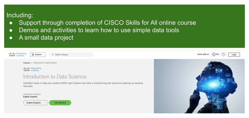
Introduction to Data Science
By futureCoders SE
Learn the basics of Data Science, combining a supported #CISCO Skills for All online course with practical learning and a project to help consolidate the learning.
Effective Data Visualisation
By Nexus Human
Duration 2 Days 12 CPD hours This course is intended for This course is aimed at anyone currently working with data who is interested in using data visualisation to more effectively communicate their results. Overview At completion, delegates will understand how data visualisations can be best used to communicate actionable insights from data and be competent with the tools required to do it. Visualising data, and analytics results, is one of the most effective ways to achieve this. This course will cover the theory of data visualisation along with practical skills for creating compelling visualisations from data. Course Outline The use of analytics, statistics and data science in business has grown massively in recent years. Harnessing the power of data is opening actionable insights in diverse industries from banking to horse breeding. The companies doing this most successfully understand that using sophisticated analytics approaches to unlock insights from data is only half the job. Communicating these insights to all of the different parts of an organisation is just as important as doing the actual analysis. Visualising data, and analytics results, is one of the most effective ways to achieve this. This course will cover the theory of data visualisation along with practical skills for creating compelling visualisations from data. To attend this course delegates should be competent in the use of data analysis tools such as reporting tools, spreadsheet software or business intelligence tools. The course will explore the following topics through a series of interactive workshop sessions: Fundamentals of data visualisation Data characteristics & dimensions Mapping visual encodings to data dimensions Colour theory Graphical perception & communication Interaction design Visualisation different characteristics of data: trends, comparisons, correlations, maps, networks, hierarchies, text Designing effective dashboards
Working with Data
By futureCoders SE
Learn how to work with data using Python (the coding language) as a tool. Learn how data is structured and how to manipulate it into a usable, clean form ready for analysis. Work on a small real-life project from conception to solution, in a team or on your own.

Microsoft Power BI Reports and Dashboards for Business Users
By Nexus Human
Duration 1 Days 6 CPD hours This course is intended for Anyone whose role requires them to use existing Power BI Reports or Dashboards to consume the contents. Roles can include management at all levels, team leaders or anyone who needs to commission the production of reports or dashboards. It is assumed that attendees on the course are familiar with charts. Please note that this course is not suitable for new Excel users, delegates need Ability to create charts Ability to use filters in data Overview This course covers the use of Power BI Desktop and the Power BI service hosted in Office 365 to identify core features, terminology and processes applicable when using reports or dashboards.Delegates will learn how to: Power BI Concepts and Main Features How a report is created Navigating reports and dashboards How to apply filters and slicers To use Insights, Analytics and Natural Language Queries Power BI provides a variety of methods for using reports and dashboards within which data can be viewed and analyzed visually. Getting Started with Power BI Power BI Concepts and Versions Introduction to Main Features: Jargon buster From Data to Reports and Dashboards Visualizations Overview Visualizations Available Visualizations as Filter Reports and Dashboards Similarities and differences Understanding what you are looking at Understanding what you are looking at Using a Report in Power BI Filters, sorting and using slicers See the actual data See Data and See Records Drill visualizations Off the shelf data analysis Quick Conditional Formatting Analytics lines Use Insight for Increases and Decrease Forecast Analytics Changing calculations and Show As Working with Dashboards Dashboards in Power BI Defined How is a dashboard different from a report? Working in the Dashboard window