- Professional Development
- Medicine & Nursing
- Arts & Crafts
- Health & Wellbeing
- Personal Development
30 Courses in Bristol delivered Live Online
Effective Data Visualisation
By Nexus Human
Duration 2 Days 12 CPD hours This course is intended for This course is aimed at anyone currently working with data who is interested in using data visualisation to more effectively communicate their results. Overview At completion, delegates will understand how data visualisations can be best used to communicate actionable insights from data and be competent with the tools required to do it. Visualising data, and analytics results, is one of the most effective ways to achieve this. This course will cover the theory of data visualisation along with practical skills for creating compelling visualisations from data. Course Outline The use of analytics, statistics and data science in business has grown massively in recent years. Harnessing the power of data is opening actionable insights in diverse industries from banking to horse breeding. The companies doing this most successfully understand that using sophisticated analytics approaches to unlock insights from data is only half the job. Communicating these insights to all of the different parts of an organisation is just as important as doing the actual analysis. Visualising data, and analytics results, is one of the most effective ways to achieve this. This course will cover the theory of data visualisation along with practical skills for creating compelling visualisations from data. To attend this course delegates should be competent in the use of data analysis tools such as reporting tools, spreadsheet software or business intelligence tools. The course will explore the following topics through a series of interactive workshop sessions: Fundamentals of data visualisation Data characteristics & dimensions Mapping visual encodings to data dimensions Colour theory Graphical perception & communication Interaction design Visualisation different characteristics of data: trends, comparisons, correlations, maps, networks, hierarchies, text Designing effective dashboards

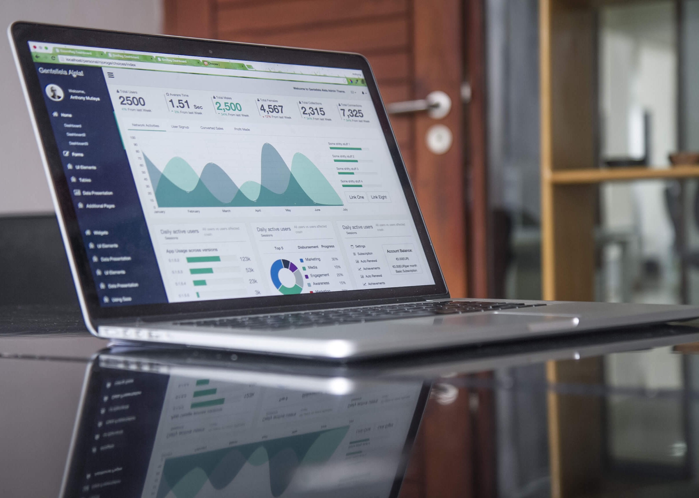
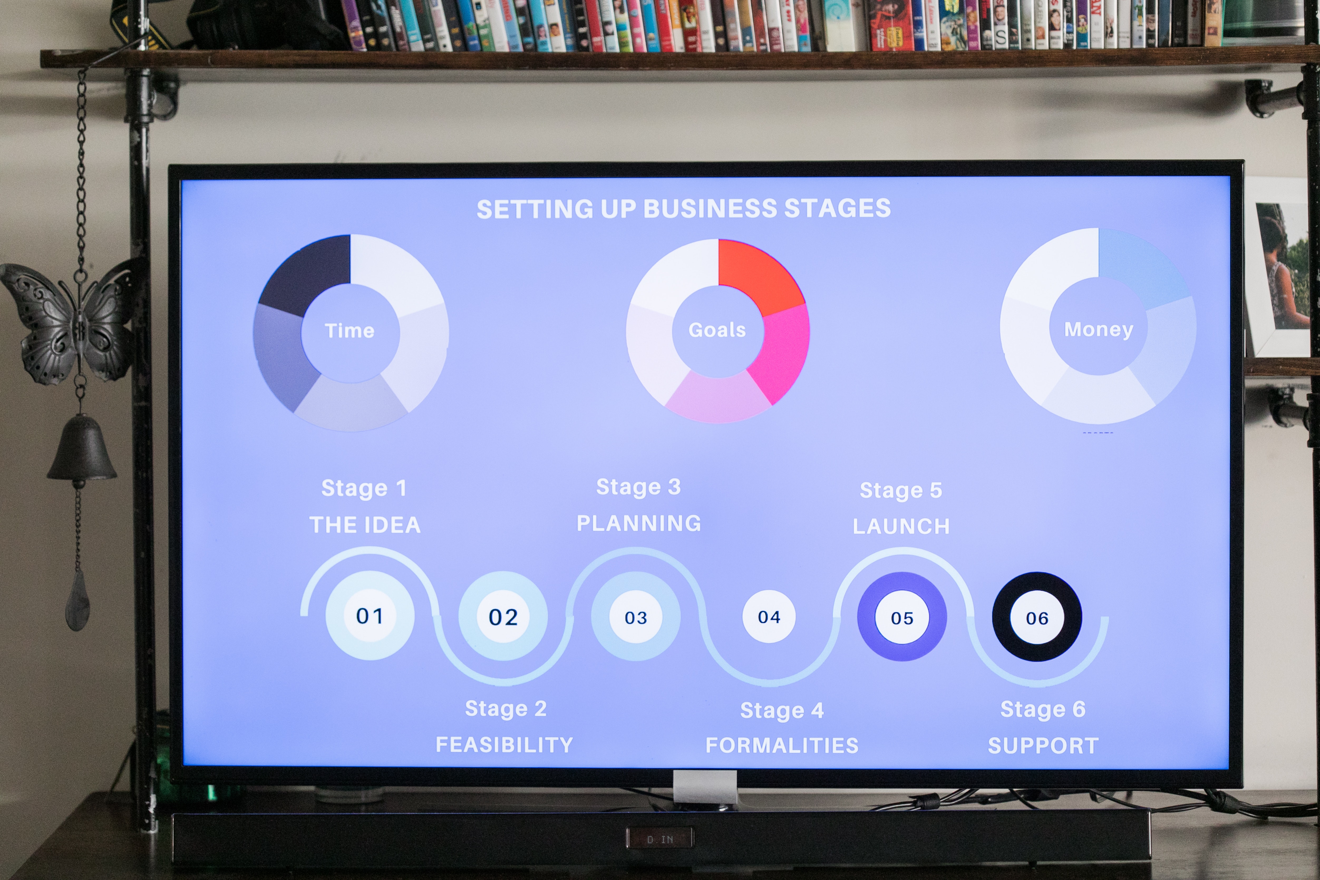
Dashboard design
By Fire Plus Algebra
Data dashboards provide key information to stakeholders so that they can make informed decisions. While there are plenty of software solutions for building these essential data products, there is much less guidance on how to design dashboards to meet the diverse needs of users. This course is for anyone who is building or implementing dashboards, and wants to know more about design principles and best practice. You could be using business intelligence software (such as Power BI or Tableau), or implementing bespoke solutions. The course will give your team the ability to evaluate user needs and levels of understanding, make informed decisions about chart selections, and make effective use of interactivity dynamic data. We’ll work with you before the course to ensure that we understand your organisation and what you’re hoping to achieve. Sample learning content Session 1: Data with a purpose Understanding the different types of dashboard. Information overload and other common dashboard pitfalls. Assessing user needs and levels of data fluency. Session 2: Planning a dashboard Assessing diverse user needs and levels of data fluency. Taking a User Experience (UX) approach to design and navigation. Applying an interative and collaborative approach to onboarding. Session 3: Graphs, charts and dials Understanding how graphical perception informs chart choices. Making intelligent design choices to help users explore. Design principles for layout and navigation. Session 4: Using interactivity Making effective use of filters to slice and dice data sets. Using layers of information to enable drilldown data exploration. Complenting dashboards with automated alerts and queries. Delivery We deliver our courses over Zoom, to maximise flexibility. The training can be delivered in a single day, or across multiple sessions. All of our courses are live and interactive – every session includes a mix of formal tuition and hands-on exercises. To ensure this is possible, the number of attendees is capped at 16 people. Tutor Alan Rutter is the founder of Fire Plus Algebra. He is a specialist in communicating complex subjects through data visualisation, writing and design. He teaches for General Assembly and runs in-house training for public sector clients including the Home Office, the Department of Transport, the Biotechnology and Biological Sciences Research Council, the Health Foundation, and numerous local government and emergency services teams. He previously worked with Guardian Masterclasses on curating and delivering new course strands, including developing and teaching their B2B data visualisation courses. He oversaw the iPad edition launches of Wired, GQ, Vanity Fair and Vogue in the UK, and has worked with Condé Nast International as product owner on a bespoke digital asset management system for their 11 global markets. Testimonial “Alan was great to work with, he took us through the concepts behind data visualisation which means our team is now equipped for the future. He has a wide range of experience across the topic that is delivered in a clear, concise and friendly manner. We look forward to working with Alan again in the future.” John Masterson | Chief Product Officer | ImproveWell
Data storytelling
By Fire Plus Algebra
Data has become the most important resource for every organisation – but the insights gained from data analysis will only ever be truly valuable if they can be clearly expressed to other people. This course is for anybody who works with data, and needs to communicate the meaning that's in the numbers to colleagues, customers, bosses or external stakeholders. It will give you or your team the confidence and skills to translate raw data into compelling visual stories for your key audiences. The principles and skills covered apply to the simplest PowerPoint chart, to more complex interactive visualisations. We’ll work with you before the course to ensure that we understand your organisation and what you’re hoping to achieve. Sample learning content Session 1: What makes a great data-driven story The key elements of a successful infographic or presentation. Industry best practice, and discussion of good (and bad) examples. A simple framework for identifying the Audience, Story and Action. Session 2: Data in context How to balance function and aesthetic appeal. Identifying the right graph, chart, infographic or other visual. Framing the data and providing contextual information. Session 3: Designing for the human brain Using colours to add emphasis and meaning. Design and layout principles, and creating hierarchies of information. The principle of ‘self-sufficiency’, and removing clutter. Session 4: Navigation and narrative Tailoring visualisations for different types of communications. Structuring presentations and longer reports. Thinking in layers to create interactive dashboards. Delivery We deliver our courses over Zoom, to maximise flexibility. The training can be delivered in a single day, or across multiple sessions. All of our courses are live and interactive – every session includes a mix of formal tuition and hands-on exercises. To ensure this is possible, the number of attendees is capped at 16 people. Tutor Alan Rutter is the founder of Fire Plus Algebra. He is a specialist in communicating complex subjects through data visualisation, writing and design. He teaches for General Assembly and runs in-house training for public sector clients including the Home Office, the Department of Transport, the Biotechnology and Biological Sciences Research Council, the Health Foundation, and numerous local government and emergency services teams. He previously worked with Guardian Masterclasses on curating and delivering new course strands, including developing and teaching their B2B data visualisation courses. He oversaw the iPad edition launches of Wired, GQ, Vanity Fair and Vogue in the UK, and has worked with Condé Nast International as product owner on a bespoke digital asset management system for their 11 global markets. Testimonial “I was familiar with Alan’s work as a Guardian Masterclass instructor on data visualisation and digital journalism, which made it easy for me to recommend him for onsite training at the Liverpool School of Tropical Medicine. We had a large group of people interested in honing their abilities to depict their research and stories in engaging ways. Alan’s course provided great insight about common communication pitfalls and how to avoid them, how to become better communicators by understanding the audience diversity, and it showcased some great online tools for creating infographics. This should be mandatory training for all students, academics, report writers and those involved with conveying research to the media as it will help increase the clarity and accessibility of our own research stories.” Dr Lee Haines | Liverpool School of Tropical Medicine

Communicating complexity
By Fire Plus Algebra
Successful communications are all about making the message as simple as possible – but this can be difficult when the subjects we're talking about are inherently complicated. Academic institutions, tech companies, health organisations, charities and many others have complex ideas, processes and systems at the heart of what they do. This course is for anybody who needs to distill information down into key messages for important stakeholders, funders and investors, decision makers and members of the public. You’ll learn proven techniques for grabbing attention and changing minds through presentations and public speaking, infographics and data visualisations, and written reports and online posts. We’ll work with you before the course to ensure that we understand your organisation and what you’re hoping to achieve. Sample learning content Session 1: Understanding your audience Matching your objectives to your audience's motivations. Identifying the right tone and language. Understanding how, where and when your audience wants to be spoken to. Session 2: Refining your objectives Breaking down strategic aims into tactical steps Metrics and milestones: defining and measuring progress and success. Rapidly building a brief for your communications. Session 3: Telling the story Using metaphors, visuals, comparisons to frame your narrative. From slide decks to online campaigns - choosing the right formats for delivering your message. Selecting communications channels to maximise reach and impact. Session 4: Keeping it going Processes and systems for launching and maintaining communications campaigns. Building social proof – creating and curating content. Troubleshooting and preparing for common challenges. Delivery We deliver our courses over Zoom, to maximise flexibility. The training can be delivered in a single day, or across multiple sessions. All of our courses are live and interactive – every session includes a mix of formal tuition and hands-on exercises. To ensure this is possible, the number of attendees is capped at 16 people. Tutor Alan Rutter is the founder of Fire Plus Algebra. He is a specialist in communicating complex subjects through data visualisation, writing and design. He teaches for General Assembly and runs in-house training for public sector clients including the Home Office, the Department of Transport, the Biotechnology and Biological Sciences Research Council, the Health Foundation, and numerous local government and emergency services teams. He previously worked with Guardian Masterclasses on curating and delivering new course strands, including developing and teaching their B2B data visualisation courses. He oversaw the iPad edition launches of Wired, GQ, Vanity Fair and Vogue in the UK, and has worked with Condé Nast International as product owner on a bespoke digital asset management system for their 11 global markets. Testimonial “We’ve now worked with Alan for almost 3 years, and during that time he has continued to deliver the highest quality training for our clients and delegates. Alan’s passionate delivery style has continued to deliver innovative training solutions to over 1500 delegates across the public, private and voluntary sector. Each of our courses with him has always delivered exceptional feedback and satisfaction levels.” Joe Barlow | Head of Programme, Understanding ModernGov

Presenting with Impact
By Fire Plus Algebra
To drive actions and get decisions made, you need to be able to present effectively to customers, clients, senior managers or colleagues. The perfect presentation is a potent combination of content, design and delivery You need to distill down complex concepts, large data sets, intricate processes and innovative ideas. You need to make the right design choices to ensure your slide decks communicate quickly (as well as looking great). And you need the confidence and storytelling techniques to lead your audience through the content. This course is for anyone who regularly needs to create and deliver presentations for different stakeholders. It will cover how to plan, design and deliver brilliant presentations. Sample learning content Session 1: Planning a presentation Assessing the needs and level of understanding of your audience. Frameworks for building a logical and compelling narrative. Emphasising key messages, while allowing for deep dives and questions. Session 2: Presenting data and processes Understand graphical perception and how people absorb visual information. Effective charts for different types of data stories. How to display processes, timelines and organisational structures. Session 3: Design tricks Using colours to add emphasis and meaning. Creating hierarchies of information to help your audience. Building templates and style guides. Session 4: Delivery techniques Perfecting your performance in-person or online. Dealing with difficult questions and hostile audiences. Refining the beginning, middle and end of your narrative. Delivery We deliver our courses over Zoom, to maximise flexibility. The training can be delivered in a single day, or across multiple sessions. All of our courses are live and interactive – every session includes a mix of formal tuition and hands-on exercises. To ensure this is possible, the number of attendees is capped at 16 people. Tutor Alan Rutter is the founder of Fire Plus Algebra. He is a specialist in communicating complex subjects through data visualisation, writing and design. He teaches for General Assembly and runs in-house training for public sector clients including the Home Office, the Department of Transport, the Biotechnology and Biological Sciences Research Council, the Health Foundation, and numerous local government and emergency services teams. He previously worked with Guardian Masterclasses on curating and delivering new course strands, including developing and teaching their B2B data visualisation courses. He oversaw the iPad edition launches of Wired, GQ, Vanity Fair and Vogue in the UK, and has worked with Condé Nast International as product owner on a bespoke digital asset management system for their 11 global markets. Testimonial "We’ve now worked with Alan for almost 3 years, and during that time he has continued to deliver the highest quality training for our clients and delegates. Alan’s passionate delivery style has continued to deliver innovative training solutions to over 1500 delegates across the public, private and voluntary sector. Each of our courses with him has always delivered exceptional feedback and satisfaction levels." Joe Barlow | Head of Programme, Understanding ModernGov

Content strategy
By Fire Plus Algebra
Today, every individual and organisation is a publisher. You want everyone in your organisation to be a potential ambassador. And every employee has something to gain from raising their profile and showcasing their expertise. An effective content strategy allows you to deliver compelling stories to your audience in the most seamless way possible to make an emotional connection. This requires a mix of passion for the subject matter, a deep relationship with your audience, robust production processes, and the right tools. With a background in journalism and technology, we’ve worked on many projects that combine the two – including overseeing the iPad edition launches for Condé Nast in the UK, product ownership of a Digital Asset Manager for Condé Nast International, and developing and delivering content training for telco VEON. Publishers and brands we’ve worked with include WIRED, Time Out, GQ, Vanity Fair and Vogue – as well as solo entrepreneurs and startups who are trying to cut through the noise and get their message heard. In this course we'll cover the key elements of an effective content strategy: how to plan across multiple platforms, and how to implement your blueprint without exhausting yourself or your team. Sample learning content Session 1: Planning a content strategy Mapping and understanding your audiences. Defining your content objectives, for you or your organisation. Common pitfalls with poorly targeted content. Session 2: A content creation framework Finding ideas to generate a consistent stream of content. Idenitfying angles that will help you stand out from the crowd. Using different formats across multiple channels. Session 3: Keeping it going Simple processes to help hit deadlines and publish regularly. Balancing content creation and content creation. Creating a mix of evergreen and timely content. Session 4: Measurement and iteration Useful (and useless) metrics for content producers. Handling comments and joining the conversation. Iterating your content strategy based on feedback. Delivery We deliver our courses over Zoom, to maximise flexibility. The training can be delivered in a single day, or across multiple sessions. All of our courses are live and interactive – every session includes a mix of formal tuition and hands-on exercises. To ensure this is possible, the number of attendees is capped at 16 people. Tutor Alan Rutter is the founder of Fire Plus Algebra. He is a specialist in communicating complex subjects through data visualisation, writing and design. He teaches for General Assembly and runs in-house training for public sector clients including the Home Office, the Department of Transport, the Biotechnology and Biological Sciences Research Council, the Health Foundation, and numerous local government and emergency services teams. He previously worked with Guardian Masterclasses on curating and delivering new course strands, including developing and teaching their B2B data visualisation courses. He oversaw the iPad edition launches of Wired, GQ, Vanity Fair and Vogue in the UK, and has worked with Condé Nast International as product owner on a bespoke digital asset management system for their 11 global markets. Testimonial “The EMpower Network commissioned the content creation workshop to understand how to communicate effectively with a wide range of stakeholders. In light of covid-19, it’s more important than ever to communicate clearly especially as we’ve moved to remote meetings. The workshop was very insightful and Alan was a very engaging speaker making sure all attendees contributed and worked through real-life examples. Attendees praised the usefulness of the workshop and especially liked the content generation framework with one saying 'It has changed the way I think about communicating and given me a toolkit that I will use in both my work and personal projects'.” Shade Nathaniel-Ayodele | EMpower Network, Southwark Council

Beginning Data Analytics With R
By Nexus Human
Duration 3 Days 18 CPD hours This course is intended for This course is aimed at anyone who wants to harness the power of data analytics in their organization. Overview After completing this course delegates will be capable of writing effective R code to manipulate, analyse and visualise data to enable their organisations make better, data-driven decisions. This course teaches delegates with no prior programming or data analytics experience how to perform data manipulation, data analysis and data visualisation in R. Course Outline Becoming a world class data analytics practitioner requires mastery of the most sophisticated data analytics tools. The R programming language is one of the most powerful and flexible tools in the data analytics toolkit. This course teaches delegates with no prior programming or data analytics experience how to perform data manipulation, data analysis and data visualisation in R. Mastery of these techniques will allow delegates to immediately add value in their work place by extracting valuable insight from company data to allow better, data-driven decisions. The course will explore the following topics through a series of interactive workshop sessions: What is R? Basic R programming conventions Data structures in R Accessing data in R Descriptive statistics in R Statistical analysis in R Data manipulation in R Data visualisation in R Additional course details: Nexus Humans Beginning Data Analytics With R training program is a workshop that presents an invigorating mix of sessions, lessons, and masterclasses meticulously crafted to propel your learning expedition forward. This immersive bootcamp-style experience boasts interactive lectures, hands-on labs, and collaborative hackathons, all strategically designed to fortify fundamental concepts. Guided by seasoned coaches, each session offers priceless insights and practical skills crucial for honing your expertise. Whether you're stepping into the realm of professional skills or a seasoned professional, this comprehensive course ensures you're equipped with the knowledge and prowess necessary for success. While we feel this is the best course for the Beginning Data Analytics With R course and one of our Top 10 we encourage you to read the course outline to make sure it is the right content for you. Additionally, private sessions, closed classes or dedicated events are available both live online and at our training centres in Dublin and London, as well as at your offices anywhere in the UK, Ireland or across EMEA.
Creating brilliant business content
By Fire Plus Algebra
Today, everyone is a publisher. Whether you're filling your company blog with compelling ideas, producing newsletters to engage your customers, packing your social media feeds with engagin content, or crafting insightful posts to push your personal professional profile – you need to use storytelling to engage your audience. In this workshop we'll break down the key ingredients that make content engaging. We'll go through a proven framework for taking ideas from initial spark, through developing a unique angle, to idenitfying the ideal format for execution. We'll discuss the purpose of the content you have in mind, and look at how your can plan a strategy to publish regularly and measure the results. This is a fully interactive online workshop, so be prepared to join discussions and develop your own content ideas. Takeaways Understanding the needs of your target audience. Identifying the Subject, Angle and Format. Cheap (or free!) tools to create professional content. Useful systmes for publishing regularly, and keeping the work manageable. Knowing where to publish on the web, social media and other platforms. Promoting your content, and getting feedback. Delivery We deliver our courses over Zoom, to maximise flexibility. The training can be delivered in a single day, or across multiple sessions. All of our courses are live and interactive – every session includes a mix of formal tuition and hands-on exercises. To ensure this is possible, the number of attendees is capped at 16 people. Tutor Alan Rutter is the founder of Fire Plus Algebra. He is a specialist in communicating complex subjects through data visualisation, writing and design. He teaches for General Assembly and runs in-house training for public sector clients including the Home Office, the Department of Transport, the Biotechnology and Biological Sciences Research Council, the Health Foundation, and numerous local government and emergency services teams. He previously worked with Guardian Masterclasses on curating and delivering new course strands, including developing and teaching their B2B data visualisation courses. He oversaw the iPad edition launches of Wired, GQ, Vanity Fair and Vogue in the UK, and has worked with Condé Nast International as product owner on a bespoke digital asset management system for their 11 global markets. Testimonial “The EMpower Network commissioned the content creation workshop to understand how to communicate effectively with a wide range of stakeholders. In light of covid-19, it’s more important than ever to communicate clearly especially as we’ve moved to remote meetings. The workshop was very insightful and Alan was a very engaging speaker making sure all attendees contributed and worked through real-life examples. Attendees praised the usefulness of the workshop and especially liked the content generation framework with one saying 'It has changed the way I think about communicating and given me a toolkit that I will use in both my work and personal projects'.” Shade Nathaniel-Ayodele | EMpower Network, Southwark Council

Data visualization and infographics
By Fire Plus Algebra
The insights gained from data analysis are only truly valuable when you can be clearly expressed to other people – bosses, colleagues, clients, customers, or other stakeholders. In this workshop you’ll learn how to turn raw qualitative or quantitative data into a clear visual story through infographics and data visualization. We'll discuss the key principles for planning an effective visual, look at examples of best (and worst) practice, and learn repeatable and practical design techniques for enhancing the story. We'll also give you an overview of useful tools that will help you turn your idea into a finished infographic or data visualization. You could be conjuring up eye-catching slide decks, building effective reports and dashboards, pitching to investors, or presenting persuasive data to your most important customers. This is a fully interactive online workshop, so be prepared to join discussions and get hands on with building your own visualisations. Takeaways Be able to evaluate the elements that make an infographic or visualization effective. Learn quick and repeatable visual tricks for ensuring infographics convey a clear message. Understand how to tailor your approach to different audiences and context. Discover a bunch of free tools and resources to help you build your own visualizations. Understand how online, interactive visualizations work and how to create them. Delivery We deliver our courses over Zoom, to maximise flexibility. The training can be delivered in a single day, or across multiple sessions. All of our courses are live and interactive – every session includes a mix of formal tuition and hands-on exercises. To ensure this is possible, the number of attendees is capped at 16 people. Tutor Alan Rutter is the founder of Fire Plus Algebra. He is a specialist in communicating complex subjects through data visualisation, writing and design. He teaches for General Assembly and runs in-house training for public sector clients including the Home Office, the Department of Transport, the Biotechnology and Biological Sciences Research Council, the Health Foundation, and numerous local government and emergency services teams. He previously worked with Guardian Masterclasses on curating and delivering new course strands, including developing and teaching their B2B data visualisation courses. He oversaw the iPad edition launches of Wired, GQ, Vanity Fair and Vogue in the UK, and has worked with Condé Nast International as product owner on a bespoke digital asset management system for their 11 global markets. Testimonials "Just to say what a great course this was. I have made my first report employing some of the ideas and tools you showed us – to rapturous responses! The next actions are clear for all and they all understood it! Thank you for helping me to organise my data and thoughts, showing how to present the key message up front, and how to keep it simple and focused. Gearing up for another report now!" Kay Anderson | Head of Finance | Mima "We have been using Tableau to display data for some time but knew we could do more to engage our end users. Alan’s training gave us a framework to start thinking about what we wanted to achieve with our visualisations and analysis, and some great tips on how to display information for maximum impact. Alan was an engaging trainer and we found the workshops very energising." Ellen Austin | Senior Data Analyst | London School of Economics
Effective Data Visualization with Tableau
By Nexus Human
Duration 2 Days 12 CPD hours This course is intended for This course is relevant to anyone who needs to work with and understand data including: Business Analysts, Data Analysts, Reporting and BI professionals Marketing and Digital Marketing professionals Digital, Web, e-Commerce, Social media and Mobile channel professionals Business managers who need to interpret analytical output to inform managerial decisions Overview This course will cover the basic theory of data visualization along with practical skills for creating compelling visualizations, reports and dashboards from data using Tableau. Outcome: After attending this course delegates will understand - How to move from business questions to great data visualizations and beyond How to apply the fundamentals of data visualization to create informative charts How to choose the right visualization type for the job at hand How to design and develop basic dashboards in Tableau that people will love to use by doing the following: Reading data sources into Tableau Setting up the roles and data types for your analysis Creating new data fields using a range of calculation types Creating the following types of charts - cross tabs, pie and bar charts, geographic maps, dual axis and combo charts, heat maps, highlight tables, tree maps and scatter plots Creating Dashboards that delight using the all of the features available in Tableau. The use of analytics, statistics and data science in business has grown massively in recent years. Harnessing the power of data is opening actionable insights in diverse industries from banking to tourism. From Business Questions to Data Visualisation and Beyond The first step in any data analysis project is to move from a business question to data analysis and then on to a complete solution. This section will examine this conversion emphasizing: The use of data visualization to address a business need The data analytics process ? from business questions to developed dashboards Introduction to Tableau ? Part 1 In this section, the main functionality of Tableau will be explained including: Selecting and loading your data Defining data item properties Create basic calculations including basic arithmetic calculations, custom aggregations and ratios, date math, and quick table calculations Creating basic visualizations Creating a basic dashboard Introduction to Tableau ? Part 2 In this section, the main functionality of Tableau will be explained including: Selecting and loading your data Defining data item properties Create basic calculations including basic arithmetic calculations, custom aggregations and ratios, date math, and quick table calculations Creating basic visualizations Creating a basic dashboard Key Components of Good Data Visualisation and The Visualisation Zoo In this section the following topics will be covered: Colour theory Graphical perception & communication Choosing the right chart for the right job Data Exploration with Tableau Exploring data to answer business questions is one of the key uses of applying good data visualization techniques within Tableau. In this section we will apply the data visualization theory from the previous section within Tableau to uncover trends within the data to answer specific business questions. The types of charts that will be covered are: Cross Tabs Pie and bar charts Geographic maps Dual axis and combo charts with different mark types Heat maps Highlight tables Tree maps Scatter plots Introduction to Building Dashboards with Tableau In this section, we will implement the full process from business question to final basic dashboard in Tableau: Introduction to good dashboard design Building dashboards in Tableau