- Professional Development
- Medicine & Nursing
- Arts & Crafts
- Health & Wellbeing
- Personal Development
128 Data Analysis courses in Aldridge delivered Live Online
Microsoft Power BI: Data Analysis Practitioner (Second Edition) (v1.3)
By Nexus Human
Duration 2 Days 12 CPD hours This course is intended for This course is designed for professionals in a variety of job roles who are currently using desktop or web-based data management tools such as Microsoft Excel or SQL Server reporting services to perform numerical or general data analysis. They are responsible for connecting to cloud-based data sources, as well as shaping and combining data for the purpose of analysis. They are also looking for alternative ways to analyze business data, visualize insights, and share those insights with peers across the enterprise. This includes capturing and reporting on data to peers, executives, and clients. Overview In this course, you will analyze data with Microsoft Power BI. You will: Analyze data with self-service BI. Connect to data sources. Perform data cleaning, profiling, and shaping. Visualize data with Power BI. Enhance data analysis by adding and customizing visual elements. Model data with calculations. Create interactive visualizations. As technology progresses and becomes more interwoven with our businesses and lives, more data is collected about business and personal activities. This era of 'big data' is a direct result of the popularity and growth of cloud computing, which provides an abundance of computational power and storage, allowing organizations of all sorts to capture and store data. Leveraging that data effectively can provide timely insights and competitive advantages. Creating data-backed visualizations is key for data scientists, or any professional, to explore, analyze, and report insights and trends from data. Microsoft© Power BI© software is designed for this purpose. Power BI was built to connect to a wide range of data sources, and it enables users to quickly create visualizations of connected data to gain insights, show trends, and create reports. Power BI's data connection capabilities and visualization features go far beyond those that can be found in spreadsheets, enabling users to create compelling and interactive worksheets, dashboards, and stories that bring data to life and turn data into thoughtful action. Analyzing Data with Self-Service BI Topic A: Data Analysis and Visualization for Business Intelligence Topic B: Self-Service BI with Microsoft Power BI Connecting to Data Sources Topic A: Create Data Connections Topic B: Configure and Manage Data Relationships Topic C: Save Files in Power BI Performing Data Cleaning, Profiling, and Shaping Topic A: Clean, Transform, and Load Data with the Query Editor Topic B: Profile Data with the Query Editor Topic C: Shape Data with the Query Editor Topic D: Combine and Manage Data Rows Visualizing Data with Power BI Topic A: Create Visualizations in Power BI Topic B: Chart Data in Power BI Enhancing Data Analysis Topic A: Customize Visuals and Pages Topic B: Incorporate Tooltips Modeling Data with Calculations Topic A: Create Calculations with Data Analysis Expressions (DAX) Topic B: Create Calculated Measures and Conditional Columns Creating Interactive Visualizations Topic A: Create and Manage Data Hierarchies Topic B: Filter and Slice Reports Topic C: Create Dashboards Additional course details: Nexus Humans Microsoft Power BI: Data Analysis Practitioner (Second Edition) (v1.3) training program is a workshop that presents an invigorating mix of sessions, lessons, and masterclasses meticulously crafted to propel your learning expedition forward. This immersive bootcamp-style experience boasts interactive lectures, hands-on labs, and collaborative hackathons, all strategically designed to fortify fundamental concepts. Guided by seasoned coaches, each session offers priceless insights and practical skills crucial for honing your expertise. Whether you're stepping into the realm of professional skills or a seasoned professional, this comprehensive course ensures you're equipped with the knowledge and prowess necessary for success. While we feel this is the best course for the Microsoft Power BI: Data Analysis Practitioner (Second Edition) (v1.3) course and one of our Top 10 we encourage you to read the course outline to make sure it is the right content for you. Additionally, private sessions, closed classes or dedicated events are available both live online and at our training centres in Dublin and London, as well as at your offices anywhere in the UK, Ireland or across EMEA.

[Data Bites for Comms Pros] AI for data crunching in comms: how far can we trust it?
By Alex Waddington
Whetstone Communications and comms2point0 are pleased to bring you the Data Bites series of free webinars. Our aim is to boost interest and levels of data literacy among not-for-profit communicators.
![[Data Bites for Comms Pros] AI for data crunching in comms: how far can we trust it?](https://cademy-images-io.b-cdn.net/96a2bc7f-1dad-4e9d-8836-561e90b80cb1/20b2a5d4-21ec-491b-be57-48af03d95825/original.webp?width=3840)

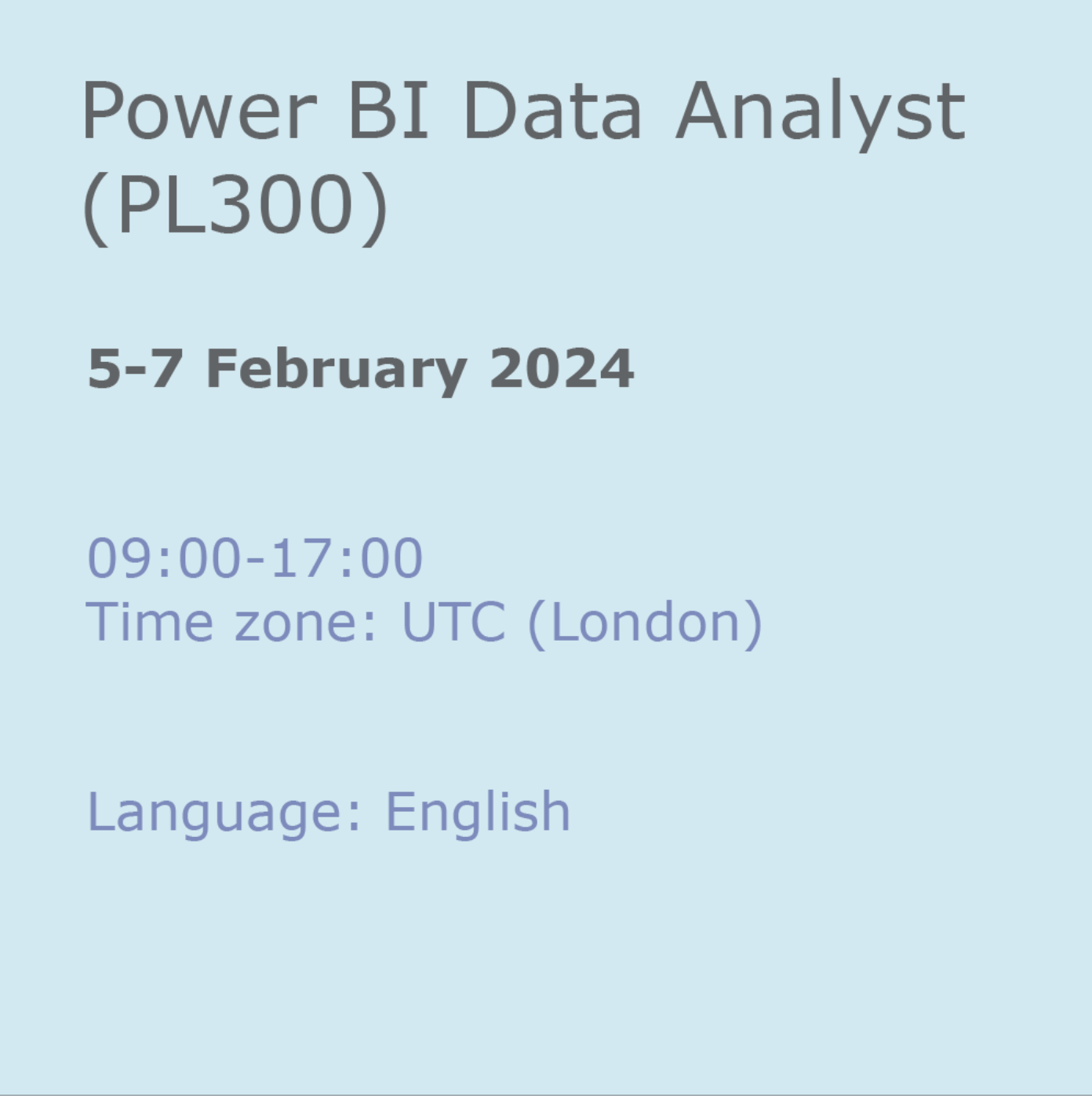
Power BI Data Analyst (PL300)
By Online Productivity Training
OVERVIEW This official Microsoft Power BI training course will teach you how to connect to data from many sources, clean and transform it using Power Query, create a data model consisting of multiple tables connected with relationships and build visualisations and reports to show the patterns in the data. The course will explore formulas created using the DAX language, including the use of advanced date intelligence calculations. Additional visualisation features including interactivity between the elements of a report page are covered as well as parameters and row-level security, which allows a report to be tailored according to who is viewing it. The course will also show how to publish reports and dashboards to a workspace on the Power BI Service. COURSE BENEFITS: Learn how to clean, transform, and load data from many sources Use database queries in Power Query to combine tables using append and merge Create and manage a data model in Power BI consisting of multiple tables connected with relationships Build Measures and other calculations in the DAX language to plot in reports Manage advanced time calculations using date tables Optimise report calculations using the Performance Analyzer Manage and share report assets to the Power BI Service Prepare for the official Microsoft PL-300 exam using Microsoft Official Courseware WHO IS THE COURSE FOR? Data Analysts with little or no experience of Power BI who wish to upgrade their knowledge to include Business Intelligence Management Consultants who need to conduct rapid analysis of their clients’ data to answer specific business questions Analysts who need to upgrade their organisation from a simple Excel or SQL-based management reporting system to a dynamic BI system Data Analysts who wish to develop organisation-wide reporting in the form of web reports or phone apps Marketers in data-intensive organisations who wish to build visually appealing, dynamic charts for their stakeholders to use COURSE OUTLINE Module 1 Getting Started With Microsoft Data Analytics Data analytics and Microsoft Getting Started with Power BI Module 2 Get Data In Power BI Get data from various data sources Optimize performance Resolve data errors Lab: Prepare Data in Power BI Desktop Module 3 Clean, Transform And Load Data In Power BI Data shaping Data profiling Enhance the data structure Lab: Load Data in Power BI Desktop Module 4 Design A Data Model In Power BI Introduction to data modelling Working with Tables Dimensions and Hierarchies Lab: Model Data in Power BI Desktop Module 5 Create Model Calculations Using DAX In Power BI Introduction to DAX Real-time Dashboards Advanced DAX Lab 1: Create DAX Calculations in Power BI Desktop, Part 1 Lab 2: Create DAX Calculations in Power BI Desktop, Part 2 Module 6 Optimize Model Performance Optimize the data model for performance Optimize DirectQuery models Module 7 Create Reports Design a Report Enhance the Report Lab 1: Design a Report in Power BI Desktop, Part 1 Lab 2: Design a Report in Power BI Desktop, Part 2 Module 8 Create Dashboards Create a Dashboard Real-time Dashboards Enhance a Dashboard Lab: Create a Power BI Dashboard Module 9 Perform Advanced Analytics Advanced analytics Data Insights through AI Visuals Lab: Perform Data Analysis in Power BI Desktop Module 10 Create And Manage Workspaces Creating Workspaces Sharing and managing assets Module 11 Manage Datasets In Power BI Parameters Datasets Module 12 Row-Level Security Security in Power BI Lab: Enforce Row-Level Security
Introduction to DAX for Power BI
By Nexus Human
Duration 2 Days 12 CPD hours This course is intended for This course is intended for business users who have been using Power BI to build analytic solutions and are ready to take advantage of the power and flexibility that DAX provides. Learning DAX is a very common 'next step' for experienced Power BI users. Overview At course completion, you should be able to describe DAX syntax, data types, and errors use DAX to create calculated columns, measures, and tables explain how DAX calculations are evaluated, along with the differences between row context and filter context configure and use Time Intelligence to perform common time-based calculations, for example to-date calculations, year-over-year analysis, moving averages, etc. create calculated columns and measures that use data from multiple tables in the data model write measures that handle error conditions gracefully use DAX to enhance the Power BI user experience use DAX Studio to connect to a Power BI data model and execute simple queries Welcome to Introduction to DAX for Power BI. This two-day instructor-led course is intended for business users who have been using Power BI and want to use DAX to create custom calculations in their data models. In this class, you will be introduced to using Data Analysis Expressions (DAX), which is the expression language that is used to create custom calculations in the Power BI Data model. The course covers some of the theoretical underpinnings of the data model and the DAX language, but the emphasis is on using DAX to solve common business problems. You will learn how to write your own calculated columns, measures, and tables, how to visualize the way Power BI computes DAX calculations, and how to troubleshoot custom code. MODULE 1: GETTING STARTED WITH DAX INTRODUCTION TODAX CREATING OBJECTS WITHDAX CONTEXT AND RULES OF EVALUATION VARIABLES,COMMENTS,AND TESTING MODULE 2: PERFORMING BASIC CALCULATIONS GETTING STARTED IMPLICIT MEASURES ADDING QUICK MEASURES WORKING WITH DAX DATA TYPES . DOING BASIC MATH USING LOGIC IN YOUR CALCULATIONS USING THE IF() FUNCTION NESTED IF() USING THE SWITCH() FUNCTION ADVANCED SWITCH() LOGICAL OPERATORS & FUNCTIONS: ||, OR(), &&, AND(), NOT() AGGREGATING AND SUMMARIZING DATA THE SUM() FUNCTION MODULE 3: WORKING WITH CONTEXT IN THE DATA MODEL CONTEXT DEFINED DATA MODELING BASICS INTRODUCTION TO DIMENSIONAL MODELING RELATIONSHIPS AND THEIR EFFECT ON THE EVALUATION CONTEXT GETTING DATA FROM OTHER TABLES USING RELATED() AND RELATEDTABLE LOOKING UP DATA WITHOUT USING RELATIONSHIPS MODIFYING THE CONTEXT USING CALCULATE() MODULE 4: PERFORMING MORE ADVANCED CALCULATIONS THE DAX ITERATOR FUNCTIONS USING TABLE MANIPULATION FUNCTIONS MODULE 5: WORKING WITH TIME PERFORMING DATE CALCULATIONS WORKING WITH DATE TABLES GENERATING A DATE TABLE WITH THE CALENDAR() FUNCTION DEFINING CUSTOM OPERATING PERIODS YTD, QTD, AND MTD CALCULATIONS CUSTOM TO-DATE CALCULATIONS FINDING YEAR-OVER-YEAR CHANGE FINDING MOVING AVERAGES MODULE 6: ENHANCING THE USER EXPERIENCE CONTROLLING VISIBILITYOF YOUR MEASURES USING WHAT-IF PARAMETERS ADDING BANDING USING DAX TO PROVIDE ROW-LEVEL SECURITY
Data Analytics Workflows for Artificial Lift, Production and Facility Engineers
By EnergyEdge - Training for a Sustainable Energy Future
About this training course Business Impact: The main aim is to provide insight and understanding of data analytics and machine learning principles through applications. Field data is used to explain data-analysis workflows. Using easy to follow solution scripts, the participants will assess and extract value from the data sets. Hands-on solution approach will give them confidence to try out applicable techniques on data from their field assets. Data analysis means cleaning, inspecting, transforming, and modeling data with the goal of discovering new, useful information and supporting decision-making. In this hands-on 2-day training course, the participants learn some data analysis and data science techniques and workflows applied to petroleum production (specifically artificial lift) while reviewing code and practicing. The focus is on developing data-driven models while keeping our feet closer to the underlying oil and gas production principles. Unique Features: Eight business use cases covering their business impact, code walkthroughs for most all and solution approach. Industry data sets for participants to practice on and take home. No software or complicated Python frameworks required. Training Objectives After the completion of this training course, participants will be able to: Understand digital oil field transformation and its impact on business Examine machine learning methods Review workflows and code implementations After completing the course, participants will have a set of tools and some pathways to model and analyze their data in the cloud, find trends, and develop data-driven models Target Audience This training course is suitable and will greatly benefit the following specific groups: Artificial lift, production and facilities engineers and students to enhance their knowledge base, increase technology awareness, and improve the facility with different data analysis techniques applied on large data sets Course Level Intermediate Advanced Training Methods The course discusses several business use-cases that are amenable to data-driven workflows. For each use case, the instructor will show the solution using a data analysis technique with Python code deployed in the Google cloud. Trainees will solve a problem and tweak their solution. Course Duration: 2 days in total (14 hours). Training Schedule 0830 - Registration 0900 - Start of training 1030 - Morning Break 1045 - Training recommences 1230 - Lunch Break 1330 - Training recommences 1515 - Evening break 1530 - Training recommences 1700 - End of Training The maximum number of participants allowed for this training course is 20. This course is also available through our Virtual Instructor Led Training (VILT) format. Prerequisites: Understanding of petroleum production concepts Knowledge of Python is not a must but preferred to get the full benefit. The training will use the Google Collaboratory environment available in Google-Cloud for hands-on exercises Trainees will need to bring a computer with a Google Chrome browser and a Google email account (available for free) Trainer Your expert course leader has over 35 years' work-experience in multiphase flow, artificial lift, real-time production optimization and software development/management. His current work is focused on a variety of use cases like failure prediction, virtual flow rate determination, wellhead integrity surveillance, corrosion, equipment maintenance, DTS/DAS interpretation. He has worked for national oil companies, majors, independents, and service providers globally. He has multiple patents and has delivered a multitude of industry presentations. Twice selected as an SPE distinguished lecturer, he also volunteers on SPE committees. He holds a Bachelor's and Master's in chemical engineering from the Gujarat University and IIT-Kanpur, India; and a Ph.D. in Petroleum Engineering from the University of Tulsa, USA. Highlighted Work Experience: At Weatherford, consulted with clients as well as directed teams on digital oilfield solutions including LOWIS - a solution that was underneath the production operations of Chevron and Occidental Petroleum across the globe. Worked with and consulted on equipment's like field controllers, VSDs, downhole permanent gauges, multiphase flow meters, fibre optics-based measurements. Shepherded an enterprise-class solution that is being deployed at a major oil and gas producer for production management including artificial lift optimization using real time data and deep-learning data analytics. Developed a workshop on digital oilfield approaches for production engineers. Patents: Principal inventor: 'Smarter Slug Flow Conditioning and Control' Co-inventor: 'Technique for Production Enhancement with Downhole Monitoring of Artificially Lifted Wells' Co-inventor: 'Wellbore real-time monitoring and analysis of fracture contribution' Worldwide Experience in Training / Seminar / Workshop Deliveries: Besides delivering several SPE webinars, ALRDC and SPE trainings globally, he has taught artificial lift at Texas Tech, Missouri S&T, Louisiana State, U of Southern California, and U of Houston. He has conducted seminars, bespoke trainings / workshops globally for practicing professionals: Companies: Basra Oil Company, ConocoPhillips, Chevron, EcoPetrol, Equinor, KOC, ONGC, LukOil, PDO, PDVSA, PEMEX, Petronas, Repsol, , Saudi Aramco, Shell, Sonatrech, QP, Tatneft, YPF, and others. Countries: USA, Algeria, Argentina, Bahrain, Brazil, Canada, China, Croatia, Congo, Ghana, India, Indonesia, Iraq, Kazakhstan, Kenya, Kuwait, Libya, Malaysia, Oman, Mexico, Norway, Qatar, Romania, Russia, Serbia, Saudi Arabia, S Korea, Tanzania, Thailand, Tunisia, Turkmenistan, UAE, Ukraine, Uzbekistan, Venezuela. Virtual training provided for PetroEdge, ALRDC, School of Mines, Repsol, UEP-Pakistan, and others since pandemic. POST TRAINING COACHING SUPPORT (OPTIONAL) To further optimise your learning experience from our courses, we also offer individualized 'One to One' coaching support for 2 hours post training. We can help improve your competence in your chosen area of interest, based on your learning needs and available hours. This is a great opportunity to improve your capability and confidence in a particular area of expertise. It will be delivered over a secure video conference call by one of our senior trainers. They will work with you to create a tailor-made coaching program that will help you achieve your goals faster. Request for further information post training support and fees applicable Accreditions And Affliations

Data visualization and infographics
By Fire Plus Algebra
The insights gained from data analysis are only truly valuable when you can be clearly expressed to other people – bosses, colleagues, clients, customers, or other stakeholders. In this workshop you’ll learn how to turn raw qualitative or quantitative data into a clear visual story through infographics and data visualization. We'll discuss the key principles for planning an effective visual, look at examples of best (and worst) practice, and learn repeatable and practical design techniques for enhancing the story. We'll also give you an overview of useful tools that will help you turn your idea into a finished infographic or data visualization. You could be conjuring up eye-catching slide decks, building effective reports and dashboards, pitching to investors, or presenting persuasive data to your most important customers. This is a fully interactive online workshop, so be prepared to join discussions and get hands on with building your own visualisations. Takeaways Be able to evaluate the elements that make an infographic or visualization effective. Learn quick and repeatable visual tricks for ensuring infographics convey a clear message. Understand how to tailor your approach to different audiences and context. Discover a bunch of free tools and resources to help you build your own visualizations. Understand how online, interactive visualizations work and how to create them. Delivery We deliver our courses over Zoom, to maximise flexibility. The training can be delivered in a single day, or across multiple sessions. All of our courses are live and interactive – every session includes a mix of formal tuition and hands-on exercises. To ensure this is possible, the number of attendees is capped at 16 people. Tutor Alan Rutter is the founder of Fire Plus Algebra. He is a specialist in communicating complex subjects through data visualisation, writing and design. He teaches for General Assembly and runs in-house training for public sector clients including the Home Office, the Department of Transport, the Biotechnology and Biological Sciences Research Council, the Health Foundation, and numerous local government and emergency services teams. He previously worked with Guardian Masterclasses on curating and delivering new course strands, including developing and teaching their B2B data visualisation courses. He oversaw the iPad edition launches of Wired, GQ, Vanity Fair and Vogue in the UK, and has worked with Condé Nast International as product owner on a bespoke digital asset management system for their 11 global markets. Testimonials "Just to say what a great course this was. I have made my first report employing some of the ideas and tools you showed us – to rapturous responses! The next actions are clear for all and they all understood it! Thank you for helping me to organise my data and thoughts, showing how to present the key message up front, and how to keep it simple and focused. Gearing up for another report now!" Kay Anderson | Head of Finance | Mima "We have been using Tableau to display data for some time but knew we could do more to engage our end users. Alan’s training gave us a framework to start thinking about what we wanted to achieve with our visualisations and analysis, and some great tips on how to display information for maximum impact. Alan was an engaging trainer and we found the workshops very energising." Ellen Austin | Senior Data Analyst | London School of Economics
Power BI for Data-driven Decision Makers
By Nexus Human
Duration 1 Days 6 CPD hours This course is intended for This course is designed for professionals in a variety of job roles who receive Power BI data visualizations and reports from data analysts or from data visualization engineers. These data report recipients want to use the features and capabilities of Power BI to fully explore the visualizations and initial analyses provided to them in reports, perform additional analysis to ask next-level questions of the data, and to customize and create new visualizations and dashboards in order to share new insights and create compelling reports. Overview Explore Power BI reports. Analyze data to get answers and insights. Sort and group data for analysis and reporting. Filter visualizations. Prepare reports. Troubleshoot, collaborate, and share reports. As data acquisition, access, analysis, and reporting are interwoven with our businesses and lives, more and more data is collected about business and personal activities. This abundance of data and the computing power to analyze it has increased the use of data analysis and data visualization across a broad range of job roles. Decision makers of all types, including managers and executives, must interact with, interpret, and develop reports based on data and analysis provided to them. Microsoft Power BI software is designed for data analysis and the creation of visualizations. Data analysts prepare data, perform initial analysis, and create visualizations that are then passed to business data decision makers. These decision makers can use Power BI's tools to explore the data, perform further analysis to find new insights, make decisions, and create customized reports to share their findings. Prerequisites To ensure your success in this course, you have experience managing data with Microsoft Excel or Google Sheets 1. Exploring Power BI Reports Topic A: Data Analysis Workflow with Power BI Topic B: Explore Reports in the Power BI Service Topic C: Edit Reports 2. Analyzing Data to Get Answers and Insights Topic A: Configure Data Visualizations Topic B: Ask New Questions by Changing Aggregation Topic C: Find Answers with Calculations 3. Sorting and Grouping Data for Analysis and Reporting Topic A: Sort Data Topic B: Group Data 4. Filtering Visualizations Topic A: Filter Data to Refine Analysis Topic B: Create Slicers for Reports 5. Preparing Reports Topic A: Format and Annotate Reports Topic B: Emphasize Data in Reports 6. Troubleshooting, Sharing, and Collaborating Topic A: Troubleshoot Data Issues Topic B: Collaborate in Power BI Topic C: Collaborate with Non-Power BI Users
Tableau for Data-Driven Decision Makers
By Nexus Human
Duration 1 Days 6 CPD hours This course is intended for This course is designed for professionals in a variety of job roles who receive Tableau data visualizations from data analysts or from data visualization engineers. These data report recipients want to take advantage of the many Tableau features and capabilities that enable them to explore the data behind the initial analysis, perform additional analysis to ask next-level questions of the data, and to customize visualizations and dashboards to share new insights and create compelling reports. Overview Explore Tableau reports. Analyze data to get answers and insights. Sort and group data for analysis and reporting. Filter views. Prepare reports. Troubleshoot, collaborate, and share views and analysis As data acquisition, access, analysis, and reporting are interwoven with our businesses and lives, more and more data is collected about business and personal activities. This abundance of data and the computing power to analyze it has increased the use of data analysis and data visualization across a broad range of job roles. Decision makers of all types, including managers and executives, must interact with, interpret, and develop reports based on data and analysis provided to them. Tableau© software is designed for data analysis and the creation of visualizations. Data analysts prepare data, perform initial analysis, and create visualizations that are then passed on to business data-driven decision makers. These decision makers can use Tableau's tools to explore the data, perform further analysis to find new insights, make decisions, and create customized reports to share their findings. Prerequisites To ensure your success in this course, you should have experience managing data with Microsoft© Excel© or Google Sheets? Lesson 1: Exploring Tableau Reports Topic A: Data Analysis Workflow with Tableau Topic B: Explore Views Topic C: Edit Workbooks Lesson 2: Analyzing Data to Get Answers and Insights Topic A: Configure Marks with the Marks Card Topic B: Ask New Questions by Changing Aggregation Topic C: Find Answers with Calculations Topic D: Answer Questions with Table Calculations Lesson 3: Sorting and Grouping Data for Analysis and Reporting Topic A: Sort Data Topic B: Group Data Lesson 4: Filtering Views Topic A: Filter Data to Refine Analysis Topic B: Create Interactive Filters for Reports Lesson 5: Preparing Reports Topic A: Format and Annotate Views to Tell Your Story Topic B: Emphasize Data in Reports Topic C: Animate Visualizations for Clarity Lesson 6: Troubleshooting, Sharing, and Collaborating Topic A: Troubleshoot Data Issues Topic B: Collaborate in Tableau Online Topic C: Collaborate with Non-Tableau Users